Why Your Brand Colours Are Costing You Credibility
Most business owners I meet picked their brand colours for one of two reasons. Either they liked the colour personally, or they copied what their competitor was using. Neither of those is a strategy. And both of them quietly cost you credibility every single day.
Here is what actually happens. A buyer lands on your website, sees your packaging, or opens your proposal PDF. Before they read a single word, their brain has already made a judgment. Is this business established or amateur? Is this product worth the price? Can I trust this person? Colour is doing a large part of that work. If your colours are sending the wrong signal, your copy and your pricing are already fighting an uphill battle.
I have seen this with manufacturers who produce genuinely high-quality goods but present them in colours that feel cheap. Bright yellow-green on a machinery brand. Heavy neon gradients on a professional services firm. Deep maroon used everywhere — on a baby products company. Each of these was a real business with real expertise. But their colour choices were actively telling buyers the opposite story. If you want to understand how these visual decisions connect to your overall brand positioning, the about Abhijit page gives context on the kind of work I do with product and service businesses.
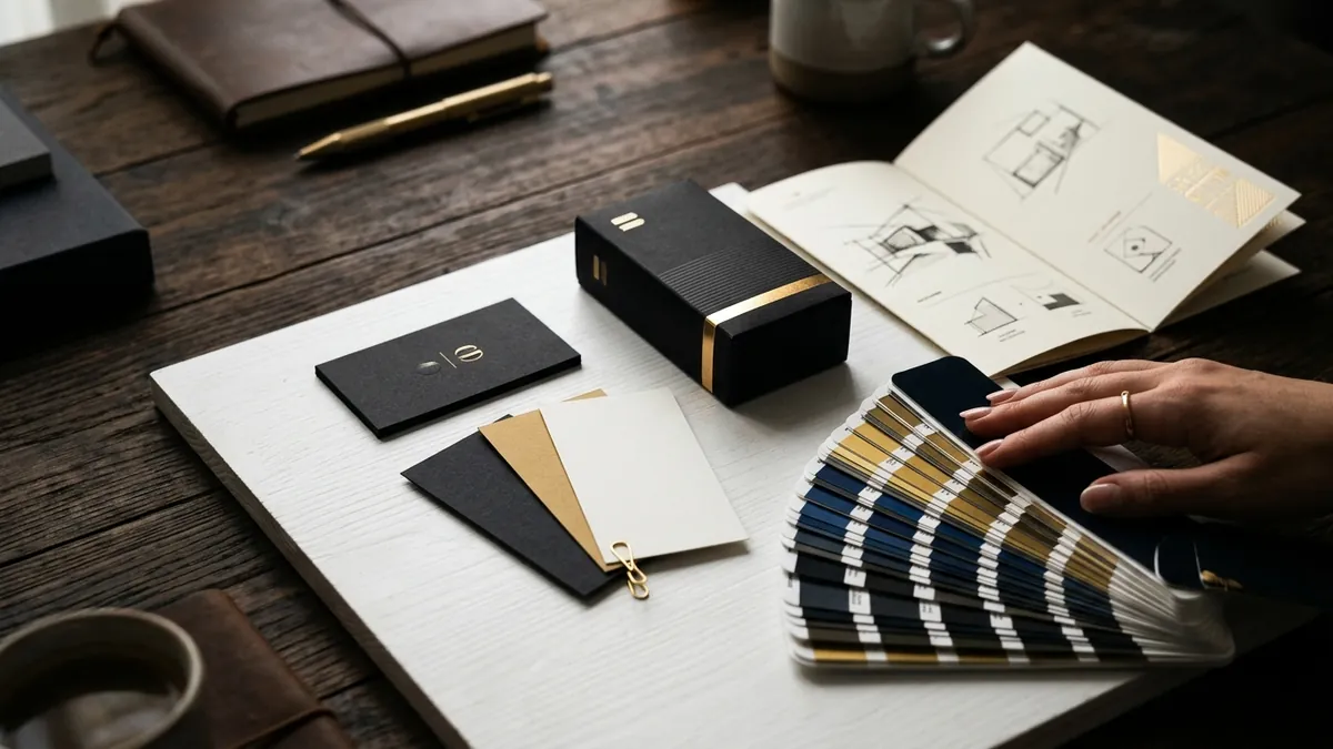
Colour psychology is not magic. It is not about picking the 'right' colour that guarantees success. It is about not picking the wrong colour that creates doubt. Here is a rough way to think about it. Blues and cool greys signal reliability, professionalism and calm — which is why banks, legal firms and tech companies use them. Earthy tones — warm beige, terracotta, forest green — signal natural, honest and rooted. This works well for food, wellness and handmade products. Black, dark navy and gold signal premium and exclusive. If you are positioning above the market, you need contrast and restraint in colour, not loudness. Loud, bright, saturated colours signal energy, fun and accessibility — great for youth brands, food delivery or street retail, but damaging for anything trying to feel considered or premium.
The second mistake I see regularly is using too many colours. A founder builds a brand and then keeps adding colours — one for Instagram posts, another for the website banner, a different one for the brochure, and the salesperson prints visiting cards in yet another shade. Within a year, the brand has six colours and no identity. Buyers cannot remember you because there is nothing consistent to remember. Pick a primary colour, a supporting neutral and one accent. That is your system. Hold it across every single touchpoint.
The third mistake — and this one is common with businesses that have been around for five to ten years — is that the original colours made sense then but do not match where the business is today. A business that started as a budget option but now serves mid-market or premium clients often still carries the colour language of its early days. The brand looks like who you were, not who you are. If you feel your entire visual identity needs a relook beyond just colour, attending one of the business growth workshops where I cover brand positioning and design systems for founders might give you a clearer framework.
Now, the practical part. How do you fix this without spending a large amount of money? Start by auditing what you already have. Pull up your website, your social media grid, your PDF proposal, your packaging and your business card — all at the same time. Ask yourself honestly: does this feel like one brand, or five different experiments? Is the colour telling buyers we are credible and established, or are we still figuring things out? Then do this one test. Show your brand to five people who are not your family or employees. Ask them only this — what kind of business does this look like, and what do you think it charges? If the answers do not match what you actually offer and charge, your colours (along with your overall visual identity) are working against you.
If you decide to make changes, do not just swap colours randomly. Bring a designer into that conversation who understands your business category, your buyers and your positioning. Reference brands in your category that are one level above where you are today. Not to copy them — to understand what visual signals that market responds to. The goal is not to look trendy. The goal is to look credible, consistent and right for your specific buyer. If you want to think this through with someone who has worked with Indian MSMEs and product businesses on exactly this, book a one-to-one consultation and we can look at your brand practically.
Colour is one of those things that feels like a small detail until you realise it is the first impression your business makes — every single time, before anyone reads a word. Get it right, and everything else you do in marketing and sales gets a little easier. Get it wrong, and you will keep wondering why good buyers are not taking you seriously.
Want to understand where your business growth is stuck?
Book a Business Growth Diagnostic with Abhijit JK — an honest, focused 60-minute one-to-one session with Abhijit JK on your brand, website and growth.
Book a Business Growth Diagnostic