Why Your Brand Colours Are Costing You Sales
Most business owners I meet chose their brand colours the same way they chose their office paint. Whatever felt nice at the time. Sometimes it was the designer's default template. Sometimes it was a favourite colour from childhood. Nobody sat down and asked: what does this colour say to my buyer?
Here is what most founders do not realise. Before a customer reads your tagline, before they hear your pitch, before they even look at your product — they have already formed a feeling about you. That feeling comes largely from colour. Research in consumer psychology has consistently shown that colour influences purchasing intent within seconds. This is not theory. I have seen this play out with packaging clients, service businesses and even B2B manufacturers who wondered why their proposals felt 'off' to enterprise buyers.
Let me give you a real example. A food ingredient supplier I worked with had built a genuinely strong product. But their brand used bright orange and yellow — colours that read 'fun snack brand' to most buyers. Their actual customers were procurement heads at large food companies. Those buyers expected something that looked clinical, reliable, process-driven. The mismatch in colour language was quietly undermining every sales conversation. Once we corrected the palette to cleaner, more industrial tones, the same product started getting taken more seriously in B2B pitches.
The problem is not just about looking pretty. It is about category fit. Every product category has a visual language that buyers expect. Healthcare leans on blues and whites because they signal cleanliness and trust. Luxury uses deep, muted tones because they signal restraint and quality. Organic and natural products tend to use earthy greens and warm beige because they signal honesty and origin. When your brand colour fights against category expectations, buyers feel something is wrong — even if they cannot name it. You lose the deal and never find out why. If you want to understand where your brand currently stands, a brand analysis can surface these mismatches clearly.
There is another mistake I see constantly with growing Indian businesses. They use too many colours. A website with five different accent colours, a brochure with three gradients, packaging that introduces a new shade every product line — all of this fragments the visual identity. Colour discipline is what separates brands that look established from brands that look busy. Premium brands typically use two core colours, one neutral, and nothing else. Every additional colour you add dilutes the signal. It tells the buyer your brand has no clear personality.
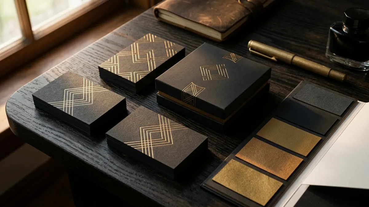
Colour also needs to work across different materials and surfaces. A colour that looks vibrant on screen often dies on uncoated paper. A dark background that feels luxurious on a website becomes unreadable on a kraft box. I have worked with manufacturers who approved a brand palette on a laptop screen and then printed ten thousand units of packaging only to find the colour came out muddy and dull. Good colour decisions require understanding where the colour will actually live — print, screen, fabric, signage, embossing — before you finalise anything. This is one of the things I walk founders through during a one-to-one consultation.
Another issue that often goes unnoticed is colour consistency across touchpoints. Your Instagram feed uses one version of your brand blue. Your business card uses a slightly different shade printed by a local press. Your website uses a screen-rendered version that looks different again. By the time a buyer has seen your brand in three places, it looks like three different companies. This is not a minor detail. Colour consistency is how large brands build recognition over time. A buyer who sees your exact same colour combination repeatedly starts to associate it with reliability and professionalism. Inconsistency does the opposite — it signals that nobody is minding the details.
If you are unsure whether your current colour choices are helping or hurting you, here is a practical exercise. Print your existing brand materials — business card, brochure, packaging, a screenshot of your website — and lay them side by side next to three competitors. Ask someone outside your business which brand looks the most trustworthy and which looks the most relevant to the category. You will often get a very clear and uncomfortable answer. This kind of structured review is exactly what a business growth diagnostic helps you do systematically.
Fixing your brand colours does not always mean a full rebrand. Sometimes it is a refinement — adjusting the shade, removing two unnecessary accent colours, establishing one clear primary. But it does require intention. Choose colours because they say the right thing to the right buyer in the right category. Not because they looked good on a mood board in 2018. Your colour palette is working for you or against you every single day. It is worth getting it right.
Want to understand where your business growth is stuck?
Book a Business Growth Diagnostic with Abhijit JK — an honest, focused 60-minute one-to-one session with Abhijit JK on your brand, website and growth.
Book a Business Growth Diagnostic

