Why Your Brand Colours Are Driving Customers Away
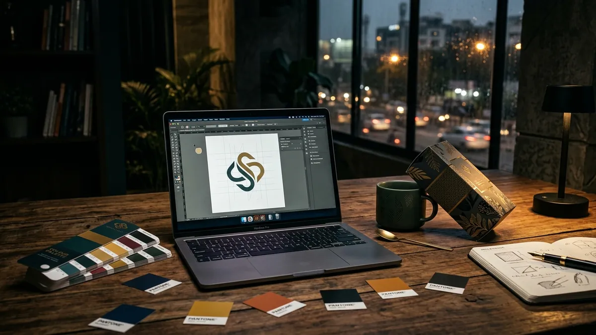
Most business owners I meet chose their brand colours the same way they chose their home's wall paint. They liked the shade. Maybe it felt lucky. Maybe it matched the owner's personality. And that is exactly the problem. Your brand colour is not about you. It is about what your customer feels the moment they see it.
Colour is the first thing the brain processes. Before the logo shape, before the tagline, before the product photo — colour lands. It creates a mood. It signals a category. It tells a buyer whether to stay or scroll away. In a crowded market like India where buyers are comparing three suppliers in the same WhatsApp chat, your colour palette can make or break that first impression in under two seconds.
I have seen this with manufacturers especially. A machine parts company uses bright red and yellow because it looks energetic. A chemical supplier uses a gradient of blue and purple because it felt modern when they got it done in 2011. Neither of these choices were made with the customer's trust in mind. Both end up looking like they belong to a different industry entirely. A buyer looking for a reliable industrial supplier expects a different visual signal than a buyer looking for a consumer snack brand.
The problem is not just aesthetics. Wrong colour choices carry real business costs. If your brand looks like a pharmacy when you are a food company, people are confused before they even read your name. If you run a premium legal services firm and your colour palette screams fast food delivery, your fees feel hard to justify. Colour misalignment creates a gap between what you charge and what customers believe you are worth. If you want to understand why customers perceive your business the way they do, a proper brand analysis often reveals that colour is one of the first signals working against you.
There are a few specific colour mistakes I see repeatedly with Indian MSMEs. First, using too many colours. Three strong colours with no hierarchy means the eye does not know where to go. Second, choosing colours that are trendy but not ownable. Everyone went teal and coral for two years. It meant nothing stood out. Third, picking colours that look fine on screen but print badly — a critical issue if you have packaging, brochures, invoices or trade fair standees. And fourth, having no rules about how the colours are used, so every designer, every vendor and every intern uses a slightly different shade and slowly the brand starts looking like it was assembled by a committee.
Here is how to start fixing this. First, define your primary colour and commit to its exact hex code (for digital) and Pantone or CMYK values (for print). Not approximately — exactly. Second, choose one secondary colour that supports the primary without competing with it. Third, define a neutral — a white, off-white, charcoal or dark tone — that holds everything together. These three are your complete palette for most use cases. Fourth, document it in a simple brand style guide. Even a one-page PDF that goes to every vendor, every designer and every team member is enough to stop the slow drift that happens over years.
Colour also needs to be tested across contexts, not just in a presentation file. How does your colour look on a mobile screen in sunlight? How does it look on a printed flex banner? How does it look as a favicon — that tiny square icon on a browser tab? How does it look on a yellow kraft paper bag or a corrugated shipping box? Most businesses I have worked with never tested these. They discover the problems at the worst possible time — at a trade fair, at a retail launch, after ten thousand boxes have been printed.
If you are a founder who has been in business for five years or more and you have never seriously reviewed your colour palette with a professional, that conversation is overdue. You do not need a full rebrand. Often, small calibrations — adjusting the tone, adding a neutral, retiring a cluttered secondary colour — make a significant difference to how your brand is perceived. You can book a one-to-one consultation to do exactly this kind of focused review without committing to a large project.
A brand that looks right earns trust before anyone reads a word. Colour is not decoration. It is communication. Treat it that way and you will start noticing the difference — in enquiries, in conversions, in the way customers refer to you. Get it wrong and your brand keeps working against you silently, every day, on every screen and every surface your business touches.
Want to understand where your business growth is stuck?
Book a Business Growth Diagnostic with Abhijit JK — an honest, focused 60-minute one-to-one session with Abhijit JK on your brand, website and growth.
Book a Business Growth Diagnostic

