Why Your Brand Colours Feel Off Across Every Medium
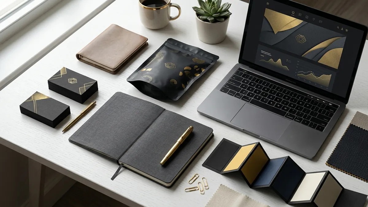
Most business owners I meet have a logo file, a brand colour they love, and zero idea what the actual colour code is. They tell the printer 'match it to the website'. They tell the web developer 'match it to the brochure'. And slowly, over months and years, the brand colour drifts into five slightly different shades of the same hue. No one is to blame. It just happens when no one owns the colour.
Here is the core problem. Colour behaves differently depending on the medium it lives in. A screen glows — it mixes red, green and blue light (RGB) to create colour. A printer applies ink on paper — it mixes cyan, magenta, yellow and black (CMYK) to create colour. These two systems do not match perfectly. A vivid electric blue on your laptop screen will come out duller and slightly different on a printed business card. That is not a mistake by the printer. That is physics.
I have seen this hurt manufacturers and product brands the most. A spice brand in Coimbatore spent good money on packaging design. The saffron colour on the Photoshop file looked warm and premium. When the actual pouches arrived from the press, the colour had shifted towards orange. The designer had not converted the colour to CMYK before sending files to print. The printer printed what they received. The brand owner was unhappy but did not know who to blame. The answer was: no one had set a proper colour standard.
The fix is simpler than most people think, but it requires one decision upfront. Every brand needs a colour specification document — even a one-page note. It should list your primary and secondary brand colours in at least three formats: HEX code for web and screens, RGB values for digital design tools, and CMYK values for print. If you use a Pantone colour for premium print or signage, include that reference too. This one document removes all the guesswork when you brief a vendor, a new designer, or a social media team member.
Signage is another place where colour breaks down. Outdoor flex boards, acrylic signs and fabric banners each reflect and absorb light differently. A navy blue that looks sophisticated on your visiting card can look almost black on a backlit acrylic sign. I always recommend business owners ask their signage vendor for a physical sample before finalising any large installation. Never approve based on a photo on a phone screen. The phone screen is itself adding its own colour rendition.
Digital platforms add one more layer of confusion. Instagram slightly saturates images. WhatsApp compresses them. PDFs viewed on a phone can shift colours depending on the device settings. If your brand colour is a muted olive green, it might look yellow on one phone and muddy brown on another. You cannot control every device, but you can control the source file. Always work from the correct HEX code, always export at the right colour profile (sRGB for digital), and always keep your master brand files in a shared folder that your team and vendors can access.
If you are a founder managing this yourself, here is something practical you can do this week. Open your website, your last printed material, your latest Instagram post, and your packaging if you have one. Place them next to each other — physically or on screen. If the colour looks different across any two of them, you have a drift problem. Screenshot or photograph the variations and share them with whoever handles your design work. Ask them to audit your files and standardise all colour codes. If they do not know how to do this, that is useful information too. This is also one of the first things I look at when a founder books a one-to-one consultation with me — because colour drift is almost always a symptom of a larger identity management problem.
The businesses that look premium and consistent — and I am talking about Indian brands, not multinationals — are not necessarily spending more on design. They are just more deliberate. They have someone, even one person, who owns the brand guidelines and checks before anything goes to a vendor. It does not need to be a big company process. It just needs to be a habit. A single WhatsApp message to a designer saying 'use HEX code 2B4C8C for the blue, always' will save you months of inconsistency. If you want to understand how to build this kind of clarity across your entire brand, the business growth workshops I run for founders cover visual identity as a core module — not as a design exercise, but as a business decision.
Colour is not decoration. It is recognition. When a customer sees your brand across a banner, a brochure, your website and your packaging, the colour is the thread that tells their brain: same brand, trustworthy, consistent. Break that thread and they feel something is slightly off — even if they cannot explain why. Fix the colour, own the code, brief your vendors properly. That is the whole job.
Want to understand where your business growth is stuck?
Book a Business Growth Diagnostic with Abhijit JK — an honest, focused 60-minute one-to-one session with Abhijit JK on your brand, website and growth.
Book a Business Growth Diagnostic