Why Your Brand Font Choices Are Sending the Wrong Signal
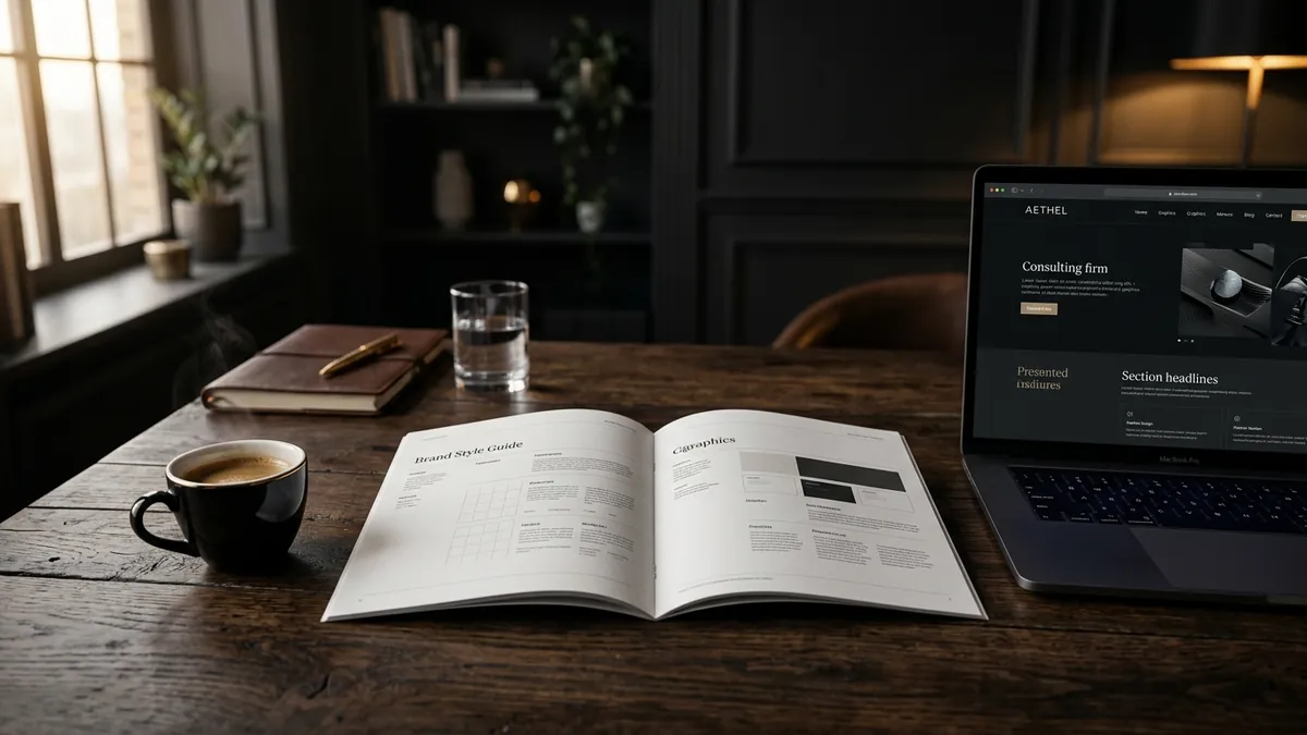
Most business owners I meet have never consciously thought about their font choice. They picked something during the logo design stage, went with whatever the designer suggested or whatever looked 'modern' at the time, and never revisited it. Years later, that same font is showing up on their brochures, WhatsApp messages, Instagram posts and website — working quietly against them.
Here is what most founders do not realise: typography communicates before your message does. Before a buyer reads 'We deliver in 24 hours' or 'Quality guaranteed,' they have already formed an impression from the way those words look. The font you use carries a tone. It signals your category, your seriousness and your price point — all before a single word is processed.
I have seen this with manufacturers especially. A factory producing industrial-grade equipment worth lakhs will have a brochure set in a thin, decorative script font that looks like it belongs on a wedding invitation. Or a B2B service firm using Comic Sans-adjacent fonts on their proposals. The product is excellent. The typography undermines it completely. Buyers either do not take it seriously or start questioning the price.
There are three common typography mistakes I see with Indian MSME brands. First, using too many fonts. When you have three different fonts on your website and a fourth on your brochure, the brand looks assembled, not designed. Second, using decorative fonts for body text. A stylised font might work for your brand name but it becomes unreadable at small sizes in paragraphs. Third, using fonts that belong to the wrong category. A children's education brand using sharp geometric fonts. A luxury service using heavy slab serifs. The mismatch creates friction in the buyer's mind even if they cannot name what feels off.
Font families carry category memory. Serif fonts — the ones with small strokes at the ends of letters — signal tradition, credibility and authority. Banks, law firms and premium consumer goods often use them. Sans-serif fonts signal modernity, clarity and accessibility. Tech companies, D2C brands and consultancies lean on them. Script fonts signal creativity and warmth but lose all professionalism in body text. Knowing which category your business belongs to is step one. If you are unsure about where your brand stands, working through it in a one-to-one consultation can save you a costly redesign later.
Here is a practical test you can do this week. Pull up your website, your latest brochure or proposal, and your Instagram grid. Write down every font you can see. If you count more than two font families, you have a problem. If any of them look like they came from a free download site with names like 'Fancy Bold' or 'Creative Script,' you have a bigger problem. A strong visual identity typically runs on one primary font for headings and one for body text — and they are chosen to complement each other, not compete.
The good news is that fixing your typography does not require a full rebrand. In most cases, you need to choose two reliable, professional font pairs, update your brand style guide if you have one, and apply them consistently starting with your most visible touchpoints — your website and your business proposals. Google Fonts offers professional-grade options for free. Pairs like Inter + Merriweather or Raleway + Lato are clean starting points for most business categories. If your team is unsure how to apply this consistently, our business growth workshops cover visual identity as part of a founder's complete brand audit.
One more thing worth saying plainly: your font choice affects how people perceive your price. Premium brands use clean, considered typography with generous white space. Budget brands often have cluttered, mismatched fonts that signal low effort. If you are trying to move upmarket — raise your fees, attract better clients, enter a new segment — your typography has to match that ambition. A five-lakh product sold through a brochure that looks like it was made on a free template will always face price resistance, no matter how good your product is.
Typography is not a decoration decision. It is a positioning decision. Every font you use is either building confidence in your buyer or quietly eroding it. Start with a font audit this month. Look at your brand across every touchpoint and ask honestly: does this look like a brand I would trust with a serious purchase? If the answer is uncertain, that is your answer. You can learn more about how I approach visual identity and brand positioning on the about Abhijit page, or simply get in touch if you want a direct conversation about where your brand stands.
Want to understand where your business growth is stuck?
Book a Business Growth Diagnostic with Abhijit JK — an honest, focused 60-minute one-to-one session with Abhijit JK on your brand, website and growth.
Book a Business Growth Diagnostic