Why Your Brand Has No Visual Consistency Across Touchpoints
Most business owners I meet have designed their brand in pieces. The logo was made three years ago by a college student. The website was built by a different vendor. The brochure was put together in a hurry before an exhibition. The Instagram page uses whatever looks good that week. Each piece might look decent on its own. Together, they look like four different companies.
This is the visual consistency problem. And it is one of the most common reasons a business fails to build trust at scale. When a buyer sees your Instagram, then visits your website, then receives your quotation — and each of these looks visually different — their brain registers something is off. They cannot name it. But they feel it. And that feeling makes them hesitate.
I worked with a Bengaluru-based manufacturer of industrial equipment. Good product, solid reputation in their circle, decent client list. But every time they went to a new client — someone who did not know them personally — the deal took months or fell through. When I did a brand analysis for them, the problem was obvious within ten minutes. Their website was dark blue and grey. Their brochure was white and green. Their business card had a completely different font. Their Instagram was full of casual photos with no consistent look. A new buyer had no visual anchor to hold on to. Nothing said 'this is one coherent, reliable company'.
Visual consistency is not about making everything look beautiful. It is about making everything look like it belongs to the same business. The same colours used in the same proportion. The same font family across all documents. The same tone in photography — whether product shots or team photos. The same logo version, not three different files saved at different times by different people. When all of this lines up, something shifts. Buyers start to feel that you are organised, professional and trustworthy — even before they speak to you.
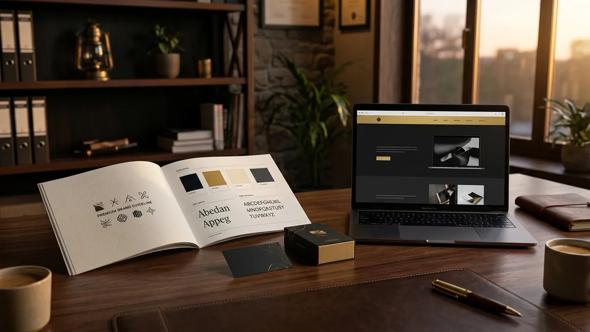
The fix is not expensive. But it requires a decision. You need a simple brand guideline document — even a one-page reference sheet — that lists your exact brand colours with their hex or Pantone codes, your approved fonts, your logo versions and minimum sizes, and basic rules for how your brand looks on a white background versus a dark background. Once that exists, every vendor you work with — the printer, the web developer, the social media person — has something to follow. Without it, everyone guesses. And every guess takes you further from consistency.
Here is a quick check you can do today. Pull up your website on one screen. Open your most recent quotation document on another. Hold your visiting card next to them. If someone covered the name and logo on each, could a stranger tell they came from the same company? If the answer is no, you have a consistency problem worth solving this month. For founders who want a structured way to look at this across all their brand materials, a one-to-one consultation can help you find exactly where the gaps are and what to prioritise first.
One thing I see often with retail brands and packaged goods — they invest well in the product but forget that every physical surface is a brand touchpoint. The box, the invoice, the sticker on the package, the thank-you card inside, the WhatsApp message the customer gets after purchase. Each of these is a chance to reinforce who you are. Each inconsistency chips away at the premium feeling you are trying to build. This is especially true for brands selling on platforms like Amazon or quick commerce, where the product itself is the only brand experience the buyer gets.
Typography is the most underestimated part of visual consistency. Most businesses use three or four different fonts across their materials — usually because someone downloaded a free font they liked or copied a competitor's style. Pick two typefaces. One for headings, one for body text. Use them everywhere. Nothing else. This single decision will make your brand look more put-together than 80 percent of businesses in your category. If you want to go deeper into how design decisions affect business outcomes, the 2-day business growth workshop covers this alongside positioning and sales — because design does not work in isolation from strategy.
Visual consistency is not a design problem. It is a leadership decision. Someone in your business needs to own the brand standards and make sure every vendor, every team member and every new piece of communication follows them. In small businesses, that person is usually the founder — at least in the beginning. Once you set the standard clearly, your brand starts doing quiet, consistent work for you every day. Every email, every package, every proposal becomes part of one recognisable story. And that is when buyers stop hesitating and start trusting.
Want to understand where your business growth is stuck?
Book a Business Growth Diagnostic with Abhijit JK — an honest, focused 60-minute one-to-one session with Abhijit JK on your brand, website and growth.
Book a Business Growth Diagnostic

