Colour and Typography: The Quiet Power of Good Design
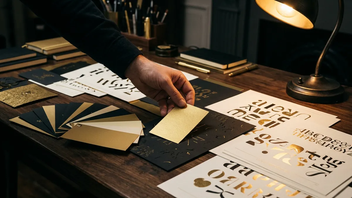
Before anyone reads a word about your business, they have already formed an impression from how it looks. Colour and typography do most of that quiet judging. Get them right and you look professional and trustworthy. Get them wrong and even great work looks amateur.
Colour carries feeling. Different palettes suggest different things, from premium and calm to bold and energetic. The goal is not to use many colours, but to choose a small, consistent set that matches the personality you want your brand to project.
Less is usually more. A strong brand often uses one or two main colours and a couple of neutrals, used the same way everywhere. Too many colours make a business look scattered and uncertain. Restraint looks confident.
Typography matters just as much. Clean, readable fonts make your content easy to trust and easy to consume. Hard to read or mismatched fonts quietly push people away, even if they cannot say why.
Consistency ties it together. When the same colours and fonts appear across your website, social media, and printed materials, your brand starts to feel familiar and established. Familiarity is the beginning of trust.
You do not need to be a designer to respect these basics. Pick a simple palette, choose readable fonts, and use them consistently. That alone will make your business look far more credible than most of your competitors.
Want to understand where your business growth is stuck?
Book a Business Growth Diagnostic with Abhijit JK — an honest, focused 60-minute one-to-one session with Abhijit JK on your brand, website and growth.
Book a Business Growth Diagnostic

