Why Your Business Looks Different on Every Platform
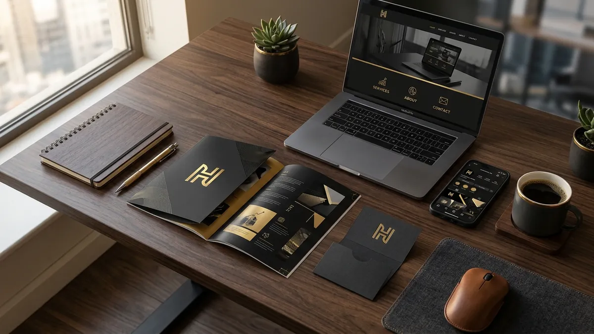
Most business owners I meet have spent real money on a logo. Some have also spent money on a website, a visiting card, and maybe even a brochure. But when you line all of these up together — the Instagram profile, the WhatsApp catalogue, the banner at an exhibition, the PDF quotation — they look like they were made by four different people in four different years. Because, honestly, they probably were.
This is one of the most common and most damaging problems I see with Indian MSMEs and growing startups. It is not that the individual designs are terrible. Some of them look decent on their own. The problem is that nothing connects. The logo on the visiting card is a slightly different shade of blue than the one on the website. The font on the brochure is completely different from the font on Instagram. The banner at the trade fair looks like it belongs to a cousin's business. Buyers pick up on this inconsistency immediately — not always consciously, but they feel it. And that feeling translates into doubt.
Think about it from your buyer's perspective. They see your Instagram page on Monday. They receive your WhatsApp catalogue on Wednesday. They visit your website on Friday. If the experience feels disconnected — different colours, different logo versions, different tone — they start to question whether this is a serious, established business. Premium brands do not look like this. And buyers know it, even if they cannot articulate it. The visual inconsistency signals that nobody is really in charge of how this business presents itself.
The root cause is almost always the same. The logo was designed first, probably by a freelancer or a small design shop. Then a nephew helped make the Instagram template. Then a printing vendor redesigned the brochure because 'the file was not print-ready.' Then someone in the team created a PowerPoint presentation for a client meeting using whatever fonts were available on their laptop. Each time, a small deviation happened. Over months and years, those small deviations compound into a completely fragmented identity. There was no document, no standard, no single source of truth that everyone referred to.
What you actually need is what designers call a brand guideline — but I prefer to call it a usage standard, because 'guideline' sounds like something that lives in a folder and never gets opened. A usage standard is a simple one or two page document that states your exact brand colours with their hex codes, your approved fonts, your logo versions and when to use each one, and the minimum spacing rules around your logo. That is it. Nothing fancy. But with that document, any vendor, any team member, any freelancer can produce something that looks like it belongs to your business. If you want to build this properly, a one-to-one consultation is often the fastest way to audit what you have and create a standard that actually gets used.
I have seen this make a visible difference for manufacturers entering modern retail, for service businesses pitching to corporate clients, and for D2C brands trying to build trust on Instagram. One textile manufacturer I worked with had three different logo files floating around — slightly different proportions, different colours — and their export buyers were receiving documents with mismatched branding. It looked sloppy. Once we standardised everything and locked down the usage rules, even their sales team felt more confident sharing materials. That confidence is real. Buyers feel it too.
The fix does not have to be expensive. You do not need to redesign your logo unless it is truly broken. What you need is to audit what exists, decide on the definitive versions, and enforce them going forward. Pull out every touchpoint — website, social media profiles, email signature, quotation template, packaging, visiting card, WhatsApp catalogue — and check them against each other. Where do the colours not match? Where is the wrong logo being used? Where is some random font appearing that has nothing to do with your brand? Make a list. Fix them one by one. This is not a one-week project, but it is absolutely manageable over a month if you are deliberate about it. Our business growth workshops often include a live audit session exactly like this for founders who want to work through it with a structured process.
The deeper issue is that visual consistency is a proxy for operational consistency in the mind of the buyer. When your brand looks organised and coherent everywhere, the implied message is that your business operates the same way. Buyers assume that a company with tight, consistent branding also has tight internal processes, quality control and professional delivery. It is not always true, but that is the signal being sent. Conversely, when your brand looks scattered, buyers wonder what else is scattered. In a market where trust is hard to build and easy to lose, this matters more than most founders realise.
Start with the basics this month. Find your original logo file. Confirm the exact hex codes for your brand colours. Pick two fonts — one for headings, one for body text — and commit to them. Write these down in a single document and share it with everyone who touches your brand materials. That one action, done consistently over the next six months, will do more for how buyers perceive your business than any new campaign or content strategy. Good design is not just about looking nice. It is about looking like yourself — clearly, everywhere, every single time.
Want to understand where your business growth is stuck?
Book a Business Growth Diagnostic with Abhijit JK — an honest, focused 60-minute one-to-one session with Abhijit JK on your brand, website and growth.
Book a Business Growth Diagnostic