Why Design Consistency Builds More Trust Than a New Logo
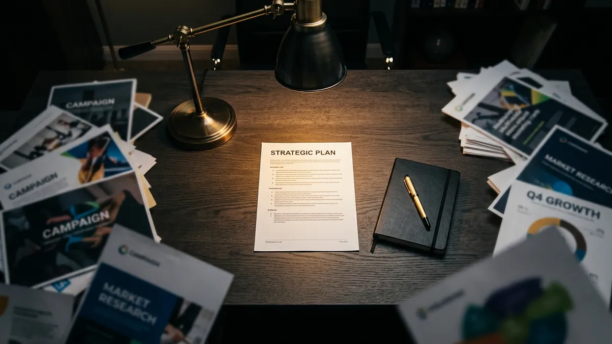
Most business owners I meet have spent good money on a logo. It sits proudly on their visiting card, maybe on a standee at their office entrance. But open their Instagram, visit their website, check their WhatsApp catalogue and their email signature — each one looks like it belongs to a different company. That is not a logo problem. That is a design consistency problem, and it is costing them business every single day.
Here is what actually happens in a customer's head. Before they call you, they have already looked you up in three or four places. They checked your Google listing, scrolled your Instagram, maybe landed on your website. If each touchpoint looks visually different — different fonts, different colour tones, different photo styles — their brain registers something is off. They cannot name it. They just feel uncertain. And uncertainty kills decisions. They move on to a competitor who looks more 'put together', even if your product or service is genuinely better.
I have seen this most clearly with manufacturers and industrial suppliers in Bengaluru and Pune. Their product quality is excellent. Their pricing is competitive. But their brochure uses one colour palette, their website uses another, their Instagram is a mix of WhatsApp forwards and phone photos, and their email has no visual signature at all. The prospect sees four different faces and trusts none of them. If you are not sure what this looks like for your own brand, a proper brand analysis will show you exactly where the inconsistencies are breaking trust.
So what does design consistency actually mean in practice? It is not complicated. It means your brand uses the same two or three colours everywhere — on print, on digital, on packaging, on signage. It means you use the same one or two fonts across all materials. It means your photos follow a consistent style: same lighting mood, same kind of composition, same colour grading. It means your logo appears in the same approved version — not stretched, not recoloured, not replaced with a blurry scan of your visiting card. When all of this lines up, customers start to feel something. They feel like you are a real, serious business.
Typography alone does more brand work than most founders realise. A headline font that is clean and bold signals confidence. A body font that is easy to read signals respect for the reader's time. When I see businesses mixing five different fonts across their materials — one on the website, another in the brochure, a cursive one on Instagram posts — it looks like nobody is in charge. Customers pick up on this. They may not say 'your typography is inconsistent.' They will just say 'something about them does not feel right.' Getting your type choices locked down to two fonts, used consistently, is one of the simplest and most powerful things you can do this month.
Colour is the fastest signal your brand sends. It works before words, before logic. If your brand colour is a deep navy blue on your letterhead but a bright royal blue on your website and a light blue on your packaging — that is three different emotional signals. The customer's brain is getting confused about who you are. Pick your exact hex codes. Write them down. Share them with anyone who designs anything for your business. This one step alone — standardising your colour values — can dramatically sharpen how your brand reads across all platforms.
Here is a practical starting point for any business owner reading this. Do a quick audit this week. Pull up your website, your Instagram profile, your last WhatsApp broadcast image, your visiting card and your invoice template. Place them side by side. Ask yourself honestly: does this look like one brand or five? If it looks like five, you do not necessarily need a rebrand. You may just need to create a one-page brand style guide — your colours, your fonts, your logo rules and your photo direction. That guide becomes your brief for every designer, every social media person and every vendor who touches your brand materials. If you want help thinking through this structure, a one-to-one consultation is a good place to start without committing to a large project.
The businesses I have worked with that improved design consistency — without changing their logo or doing a full rebrand — consistently report a shift in how customers respond. Enquiries started mentioning that the brand 'looks professional.' Clients from larger companies started engaging more comfortably. Retail buyers started taking them more seriously at trade fairs. None of this happened because of a new logo. It happened because everything finally started looking like it came from the same place. That coherence is what signals quality, reliability and seriousness to a buyer who does not know you yet.
Design consistency is not a luxury for big brands with large marketing budgets. It is the single most affordable and high-impact brand investment an MSME can make right now. You do not need a brand overhaul. You need one clear style guide and the discipline to follow it across every customer touchpoint. If you want to understand where your brand stands today across all these dimensions, start with a business growth diagnostic and see what the gaps are before spending anything on design work.
Want to understand where your business growth is stuck?
Book a Business Growth Diagnostic with Abhijit JK — an honest, focused 60-minute one-to-one session with Abhijit JK on your brand, website and growth.
Book a Business Growth Diagnostic

