Why Your Logo Is Costing You Business Without You Knowing
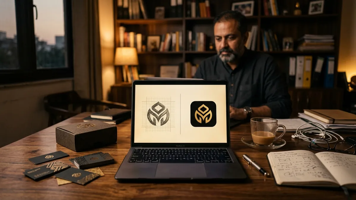
Most business owners I meet think their logo is fine. It has the company name, maybe a symbol, probably some colour. Job done. But when I look at how their business is actually performing — slow enquiries, difficulty charging higher prices, customers who say 'let me think about it' — the logo is often one of the first clues something is broken.
A logo is not decoration. It is the first thing a stranger uses to judge whether your business is worth their time. Before they read your tagline, before they visit your website, before they talk to your salesperson — they have already formed an opinion. And that opinion is built in under three seconds. Most logos I see from Indian MSMEs, manufacturers and service businesses fail that three-second test badly.
Here is the most common mistake I see: the logo was made by a nephew, a college student or a ₹500 freelancer on a Facebook group. There is no shame in that — most businesses start lean. But you are still using that logo five years later on your letterhead, your packaging, your GST invoices and your WhatsApp business profile. Every touchpoint is quietly telling the world that you do not take your own business seriously. If you do not take it seriously, why should your customer?
The second issue is technical. A logo that looks acceptable on a visiting card turns into a blurry mess on a flex banner. A logo designed only in dark colours becomes invisible on a dark background. A logo that is too detailed falls apart when printed small. I have done brand analysis for businesses where the logo file itself was a JPEG screenshot — not even a proper vector file. No designer can work with that. Your logo must exist in a proper format: SVG or AI vector, with versions for dark backgrounds, light backgrounds and single colour use.
Colour choice is another area where things go wrong quietly. Many founders pick colours they personally like, or copy what a competitor is doing, without thinking about what those colours communicate to a buyer. A logistics company using pastel pink is sending a confusing signal. A premium skincare brand using neon yellow and black looks aggressive rather than luxurious. Colour has psychology and your buyer responds to it emotionally before their brain catches up. Getting colour right is not about being artistic — it is about being strategically understood.
Typography inside a logo is equally underestimated. If your business name is written in a decorative, hard-to-read font, people will not bother deciphering it. If it is written in a generic free font like Calibri or Times New Roman, it signals that zero thought went into this. I have seen trading companies, manufacturers and professional service firms using fonts that look like they came from a 2003 wedding invitation. That font is the voice of your brand. What is yours saying right now?
Here is a practical test you can do this week. Pull up your logo on your phone. Reduce it to the size of a WhatsApp profile picture. Can you read the name clearly? Does it look sharp or pixelated? Now place it on a white background and a dark background. Does it hold up on both? Show it to someone who does not know your business and ask them what kind of company they think this is. Their answer will tell you more than any design audit. If you want a more structured view of where your brand stands, a proper brand analysis can surface issues you have been too close to notice.
Fixing a logo does not always mean throwing everything out. Sometimes it is about refining — cleaning up proportions, choosing better type, building a proper colour system, creating correct file formats. Sometimes a full redesign is the right call, especially if your business has grown past the version of itself that created the original logo. Either way, this work needs a professional who understands business positioning, not just someone who can draw in Canva. If you are not sure which direction your brand needs, a one-to-one consultation can help you figure that out before spending money on design work.
Your logo is working for you or against you every single day — on every proposal, every package, every Instagram post, every invoice. You do not get to opt out of that. The question is only whether it is building trust or quietly destroying it. Most Indian business owners I have worked with are surprised by how much shifts in customer perception once the visual identity is sorted properly. It is not magic. It is just removing a reason for doubt that you did not know you were handing to people.
Want to understand where your business growth is stuck?
Book a Business Growth Diagnostic with Abhijit JK — an honest, focused 60-minute one-to-one session with Abhijit JK on your brand, website and growth.
Book a Business Growth Diagnostic

