Why Your Logo Is Not Your Brand Identity
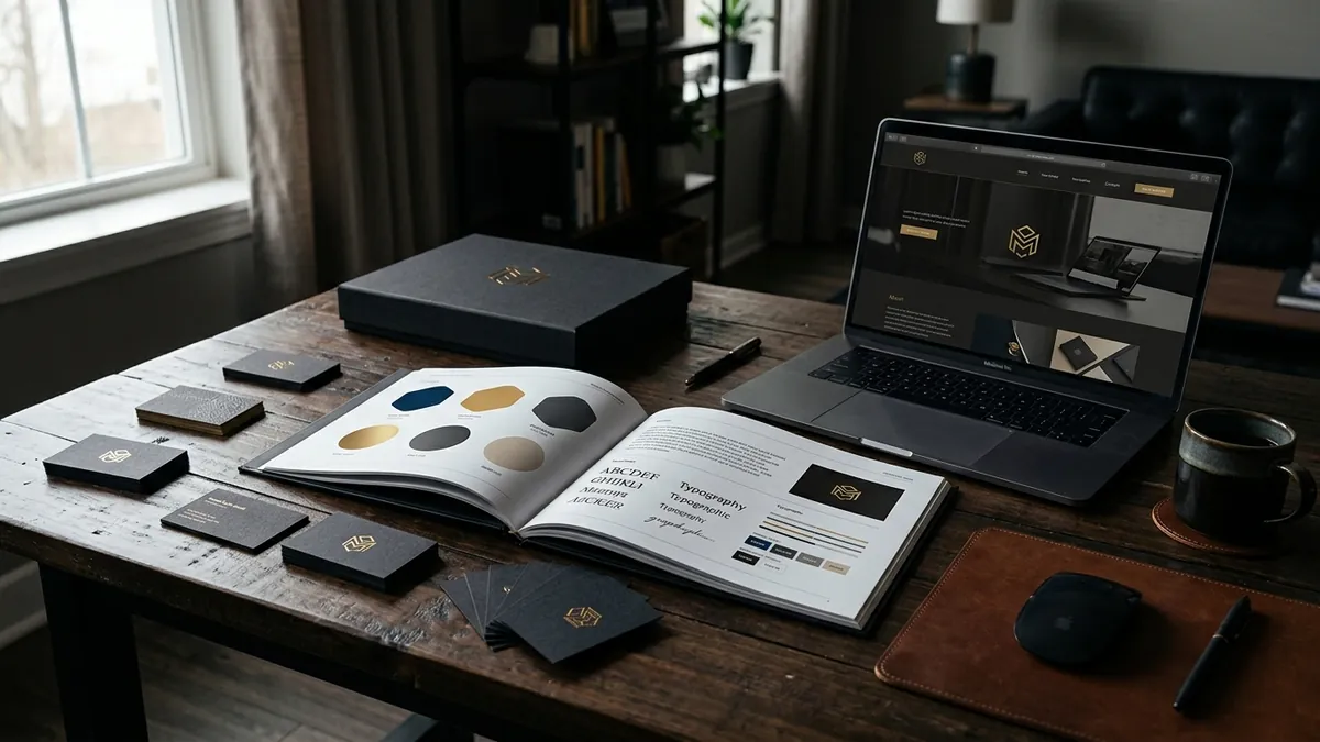
Most business owners I meet show me their logo when I ask about their brand identity. They say — 'Yes, we have a logo. We got it done on Fiverr for ₹500' or 'Our nephew designed it.' And then they wonder why their business does not look as credible as a competitor who is half their size but somehow appears more established. The logo is not the problem. The missing identity system is.
A logo is a mark. It is a symbol that represents your business. It is important, yes. But it is the starting point, not the finish line. Your full visual identity is everything that surrounds that logo — the colours you use consistently, the fonts on your documents and website, the style of images you post, how your packaging looks, the layout of your invoice, even the WhatsApp status banner you use to announce offers. All of it together creates the impression people carry in their heads about your business.
Here is a simple way to think about it. Imagine two plumbing supply companies in the same city. Same products, similar prices. One has a logo, uses Arial font everywhere, posts blurry photos on Instagram and sends a hand-typed invoice on plain paper. The other has a logo, a consistent blue-and-white colour palette, clean product photos with the same background style, and a professional PDF invoice. Both have logos. Only one has a visual identity. Guess which one gets asked fewer questions about price? I have seen this exact situation with manufacturers and distributors across Bengaluru, Pune and Ahmedabad.
Colour does more work than most founders realise. When you pick a colour for your logo and then use a different shade on your website, a completely different one on your packaging and yet another on your social media creatives, you are training your audience to feel nothing consistent about you. Colour recognition builds memory. Memory builds trust. Trust removes friction from buying. This is not theory — it is the reason you can identify a Zomato notification from across the room or spot a Fevicol ad before you read the headline. They have been brutally consistent for years.
Typography is the other thing businesses almost universally ignore. Most Indian business owners use whatever default font comes with Microsoft Word or whatever their graphic designer fancied that day. But fonts carry personality. A bold sans-serif says something different from an elegant serif. When you use five different fonts across your brochure, your website and your packaging, your business looks assembled rather than designed. Pick two fonts — one for headings, one for body text — and use them everywhere. That one decision alone will make you look more put-together than 80% of your competition. If you are not sure where your identity stands right now, a proper brand analysis will give you a clear picture.
Packaging is where I see the biggest missed opportunity with product businesses. A manufacturer I worked with was supplying a genuinely premium quality home care product. But the packaging looked like it came from a wholesale generic stall in Sadar Bazaar. Buyers were negotiating hard on price because nothing in the visual presentation signalled value. We rebuilt the packaging with a consistent colour, a clean layout, proper typography and some simple structural changes — no change to the product at all. The same product now sits in two modern retail chains. Packaging is not decoration. It is a salesperson that works without a salary.
Design consistency across all touchpoints is where the real compound interest happens. Your business card, your letterhead, your email signature, your Instagram grid, your pitch deck, your delivery box — when all of these share the same visual language, something powerful happens. People start to recognise you before they read your name. Recognition creates familiarity, and familiarity creates preference. This is not a luxury only large companies can afford. It is a discipline that any founder can build into their workflow with some upfront thinking. If you want to work through this systematically with a team, the 2-day business growth workshop covers exactly this kind of foundational brand-building work.
So where do you start if you have a logo but no real identity system? Begin with an audit. Open your website, your last WhatsApp broadcast, your printed brochure and your most recent social media post side by side. Ask yourself honestly — do these look like they came from the same company? Do the colours match? Are the fonts related? Is the tone of voice similar? If the answer is no to most of these, you do not need a new logo. You need to build a simple brand style guide — a one-page document that fixes your colours, your fonts and your photo style. That guide then becomes the brief for everything you produce from that point forward.
A logo gets you in the door. A consistent visual identity keeps you in the room. The businesses I have seen grow fastest are not always the ones with the most creative logos. They are the ones where every customer touchpoint — digital or physical — feels like it was made by the same thoughtful hand. That coherence signals professionalism, and professionalism signals that you are a business worth trusting with an order, a contract or a long-term relationship. If you are unsure where to begin with your own visual identity, feel free to reach out for a one-to-one consultation and we can figure out the right first step for your specific situation.
Want to understand where your business growth is stuck?
Book a Business Growth Diagnostic with Abhijit JK — an honest, focused 60-minute one-to-one session with Abhijit JK on your brand, website and growth.
Book a Business Growth Diagnostic

