Why Your Packaging Is Quietly Killing Your Brand
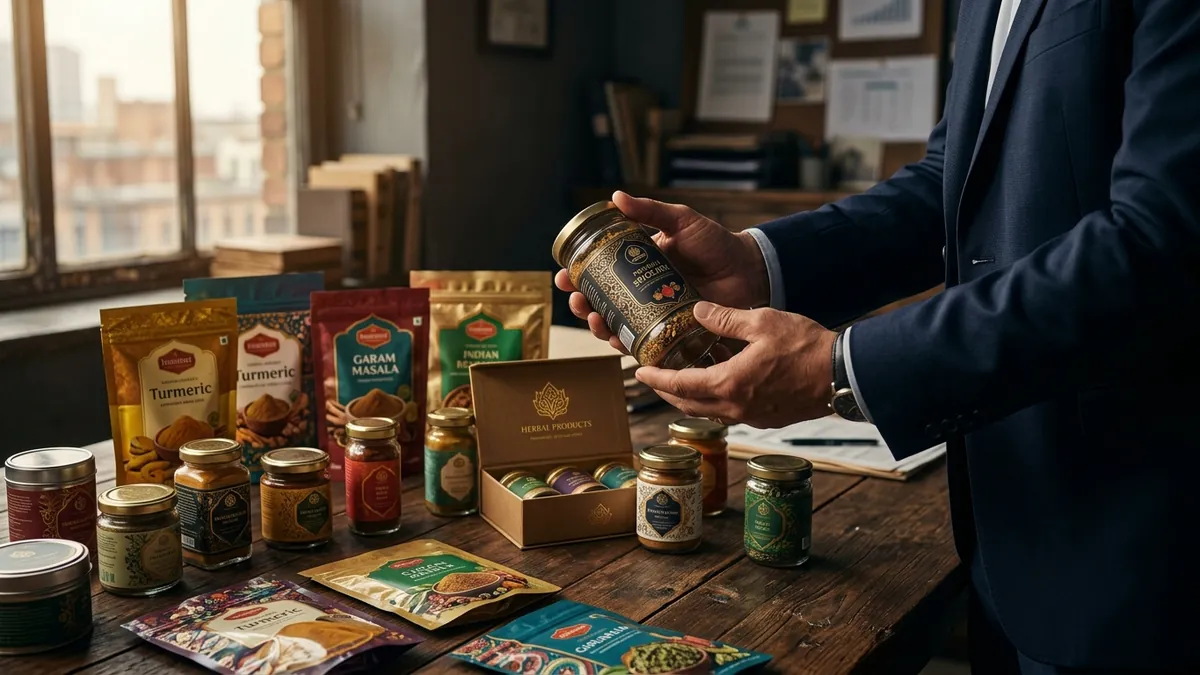
I visited a food manufacturing unit in Mysuru last year. The owner had spent over two crores building a modern facility. The product — a range of traditional spice blends — was genuinely excellent. But the packaging looked like it came off a desktop printer in 2009. Laminated pouches with misaligned text, a logo that seemed stretched, and colours that looked nothing like the photos on their website. He was struggling to get shelf space in modern retail and wondered why online sales were flat. The answer was sitting right in his hands.
Packaging is not decoration. It is your first salesperson. In a retail store, your packaging has about three seconds to make someone stop. Online, it has even less. A thumbnail-sized product image on Amazon or a quick-commerce app either earns a click or doesn't. Most founders I meet think about packaging only when something goes wrong — a retailer refuses to stock them, a customer returns a product saying it 'looked cheap', or a competitor with an inferior product outsells them. By then, months of sales have already been lost.
The most common problem I see with Indian MSME packaging is what I call the 'everything on the front' mistake. Founders are so worried the customer won't understand the product that they cram every claim, every ingredient, every certification, every phone number onto the front panel. The result is visual chaos. Good packaging design does the opposite. It leads with one clear identity — a strong logo, a confident colour, a readable product name. It makes the buyer feel something. Trust. Quality. Familiarity. The back panel is where information lives. The front panel is where the decision happens.
Colour and typography do more work than most founders realise. I have seen this with personal care brands especially. A brand selling a premium Ayurvedic hair oil uses muddy brown tones and a script font that looks like a wedding card. Meanwhile, a mass-market competitor with chemical-heavy ingredients uses clean white packaging, bold modern type, and commands shelf space at three times the price. The product story told by the packaging almost never matches what the founder believes about their own product. If you want to understand where your brand visuals are working and where they are not, a proper brand analysis is the most honest place to start.
Label printing quality is another conversation Indian founders avoid having. I understand why. Good printing costs more. But a beautifully designed label printed on cheap stock, with colour that bleeds or ink that scratches off when wet, destroys the entire effort. I always tell clients — design at the level you want to reach, not the level you are at. If you want premium retail placement in two years, your packaging needs to look like it belongs there today. Buyers at retail chains and export distributors make stocking decisions partly based on how professional your packaging looks, because that signals how serious you are about the business.
Consistency across your product range is something many growing brands get wrong. A founder starts with one SKU, designs packaging for it. Adds a second variant with a slightly different design. A third variant done by a different freelancer. Within two years, they have a product family that looks like it came from four different companies. On a retail shelf, this is damaging. A consistent design system — same logo placement, same colour logic, same font family, same label layout adapted per variant — makes your brand visible even when a customer is not looking for you by name. They just recognise the look. That recognition is worth more than any discount you could offer.
If you are selling online, here is something most product founders miss. Your packaging must photograph well. Not just look good in person — photograph well. Clean backgrounds, structured layout, a logo that reads at small sizes, colours that stay true under studio light. I have worked with brands whose packaging looked acceptable in the hand but disappeared completely in product photography. Light bounced off glossy lamination, text became unreadable, and the product looked generic. Before you finalise any packaging design, photograph it yourself with a phone under natural light. That image tells you more than any mockup your designer sends.
If you are unsure whether your current packaging is helping or hurting you, a business growth diagnostic can surface exactly where brand presentation is costing you conversions. I have worked with founders who discovered through this process that their drop-off on e-commerce product pages was almost entirely packaging-related — not price, not reviews, not advertising spend. Fixing the packaging alone lifted their conversion rate within a quarter. Sometimes the biggest revenue problem is sitting in a design file waiting to be corrected.
Packaging is a business decision, not a creative one. It should be made with the same seriousness as your pricing strategy or your distribution plan. If you want to talk through your specific situation — whether you are launching a new product, redesigning an existing line, or trying to break into retail — I am happy to think through it with you. You can book a one-to-one consultation and we will work through exactly what your packaging needs to do and whether it is doing it right now. Because every day your packaging is not working for you, it is working against you.
Want to understand where your business growth is stuck?
Book a Business Growth Diagnostic with Abhijit JK — an honest, focused 60-minute one-to-one session with Abhijit JK on your brand, website and growth.
Book a Business Growth Diagnostic

