Why Your Packaging Design Is Losing You Repeat Buyers
A soap manufacturer from Mysuru once told me this: 'Our product is genuinely good. Customers say so. But they do not always come back.' We sat down and looked at everything — pricing, distribution, follow-up. Then I asked him to show me the packaging. He pulled out a polythene-wrapped bar with a sticker printed on a basic inkjet printer. The sticker had six fonts, three colours and a logo that looked different on every batch. That was the problem. Not the soap.
Most business owners I meet think packaging is just protection — something to wrap the product in before it ships. But for the customer, packaging is the product experience. The moment someone opens a box, unwraps a bag or picks up a bottle, they are already forming an opinion about whether they will buy again. If that experience feels careless, mismatched or forgettable, the product quality alone cannot save your repeat sales.
The first mistake I see constantly is inconsistency across batches. A manufacturer does a small run, uses one printer. Next batch, different printer, slightly different colours. The logo shifts. The font weight changes. The customer who bought the first time and liked it picks up the new version and something feels off — even if they cannot name it. This is design inconsistency doing silent damage to your brand trust. If this sounds familiar, a brand analysis can help you identify exactly where the visual gaps are showing up.
The second mistake is trying to put everything on the label. I have seen packaging with the founder's photo, a paragraph of product benefits, a list of certifications, a QR code, a barcode, the price, a tagline in three languages and a decorative border — all on a 4x6 cm sticker. The customer sees noise. They see a brand that does not know what it wants to say. Good packaging design is editing. You decide the one or two things that matter most and let those breathe.
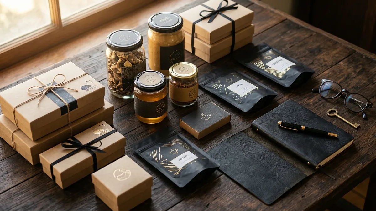
Colour and typography on packaging are not just aesthetic choices — they are signals. A warm almond oil with black and gold packaging says something very different from the same oil in a neon yellow pouch with a bold sans-serif font. Both might be good products. But one signals premium, the other signals budget. Customers buy signals first, product second. If your packaging sends the wrong signal, you will always compete on price even when your product deserves a higher shelf.
Here is something most founders do not expect: packaging affects how customers describe your brand to others. Word of mouth is not just verbal. When someone gifts your product or shares it at home, the packaging is part of the story they are telling. A well-packaged product gets mentioned. A poorly packaged one gets used quietly and forgotten. I have worked with a few Bengaluru-based food brands where improving the packaging alone led to more organic social sharing — customers started posting unboxing without being asked.
If you are not sure where your packaging stands, here is a quick exercise. Put your product next to two competitors on a table. Step back three feet. Without reading anything, which one looks like it belongs at a higher price point? Which one would you feel more confident recommending to someone? That instinct — that three-second visual judgment — is what your customers use every single time they choose between you and the alternative. If your packaging loses that moment, everything else becomes harder. You can do a more structured version of this as part of a business growth diagnostic.
What can you fix this month? Start with three things. First, standardise your brand colours into exact print values — CMYK for offset, Pantone if you can afford it — and share this with every vendor who prints for you. Second, reduce the information on your packaging to what is truly necessary: product name, key benefit or ingredient, contact or website, and required regulatory details. Third, pick one typeface for your product name and one supporting typeface for all other text — and stick to both. These three steps alone will make your packaging look more intentional and more trustworthy.
Packaging design is not a luxury for big brands. It is a basic business tool. If your product is good enough to earn a first sale, your packaging should be good enough to earn the second. If you want to think through what a stronger visual identity could do for your product line, I am happy to talk — reach out through the one-to-one consultation page and we can look at where to start.
Want to understand where your business growth is stuck?
Book a Business Growth Diagnostic with Abhijit JK — an honest, focused 60-minute one-to-one session with Abhijit JK on your brand, website and growth.
Book a Business Growth Diagnostic

