Why Your Packaging Design Is Losing You Repeat Buyers
Most product business owners I meet invest heavily in getting their formulation right, their pricing competitive and their distribution sorted. The packaging gets done at the end, often with a brief to the printer that sounds like this — 'make it look good, put the logo, keep it simple.' That brief produces packaging that blends into the shelf and disappears from the buyer's memory the moment they finish the product.
Here is the real problem. In Indian retail — whether you are selling on a kirana shelf, a supermarket gondola, an e-commerce listing or through a WhatsApp catalogue — your packaging is doing the sales job you are not physically present to do. It is your silent salesperson. When that salesperson has no personality, no story and no visual hierarchy, the buyer picks what they already know. Usually your competitor.
I have worked with manufacturers who have genuinely superior products — better ingredients, better process, better results — but whose packaging looks like a generic trade label. The product sits next to a brand that charges thirty percent more, looks polished and walks away with the sale. Premium perception is built before the product is even opened. Packaging is where that perception begins.
The first thing I check when a product brand comes to me is whether the packaging communicates a single clear idea within three seconds. Not the full brand story. Just one idea — natural, trusted, affordable, powerful, handmade, clinical. Most packaging fails this test because it tries to say everything. Claims stack up. Certifications crowd the front panel. The brand name fights for space with a product image, a tagline, a badge and four bullet points. The eye does not know where to look, so it moves on.
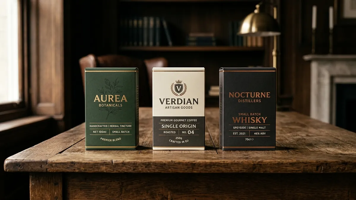
The second failure point is inconsistency across a product range. I see this often with food brands and personal care companies that have grown organically. SKU number three was designed by a different person than SKU number one. The fonts are different, the colour proportions shifted, the logo placement changed. Each product looks like it belongs to a different company. When a buyer picks up one item and likes it, they should be able to spot your other products instantly on the shelf. That visual family recognition is what builds a brand, not just a product.
Unboxing has become a real moment for D2C and gifting brands. I am not talking about over-engineered boxes with tissue paper and thank-you cards that cost more than the product margin allows. I am talking about the inside of your box feeling intentional. The tape, the filler, the inner label — these are cheap touchpoints most brands ignore. A buyer who feels cared for during unboxing shares it, repeats it and remembers the brand name. A buyer who opens a branded box to find a plain product shoved inside forgets the experience immediately. If you want to explore how these details show up in a full brand audit, a one-to-one consultation is a good place to start.
Typography and colour on packaging deserve more attention than most founders give them. The font choice signals everything — a serif in gold on dark green reads differently from a bold sans-serif in red and white. Both can work, but only if they match what your brand is actually promising. Colour is not decoration on packaging; it is communication. Colour temperature, saturation and contrast affect how a product reads on a bright shelf under fluorescent lights versus in a photograph on a phone screen. Both contexts matter now. Many brands design for one and lose on the other.
If you want to fix your packaging without a full redesign budget, start with three things this month. First, photograph your product next to two competitors and look at all three from arm's length. Ask yourself which one you would pick if you knew nothing about any of them. That honest answer tells you a lot. Second, check whether your packaging communicates the same visual identity as your website, your social media and your delivery box. If they look like three different brands, you have a consistency problem, not just a packaging problem. Third, read your front panel out loud in five seconds. Whatever you cannot say in five seconds, a buyer on a shelf will not read either. We cover exercises like these inside our business growth workshops for product founders who want structured clarity on brand decisions.
Packaging is not a one-time task you hand off to a printer. It is a brand asset that either builds trust with every product that leaves your warehouse or erodes it. The brands winning repeat buyers in India right now are not always the ones with the biggest advertising budgets. They are the ones whose packaging makes a buyer feel like the purchase was the right choice — before they have even used the product. That feeling starts with intentional design, and intentional design starts with treating your packaging as seriously as your product itself.
Want to understand where your business growth is stuck?
Book a Business Growth Diagnostic with Abhijit JK — an honest, focused 60-minute one-to-one session with Abhijit JK on your brand, website and growth.
Book a Business Growth Diagnostic