Why Your Packaging Is Losing You Sales on the Shelf
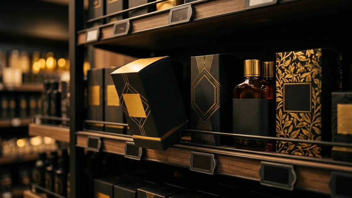
Most business owners I meet are proud of their product. And they should be. Years of work have gone into the formulation, the sourcing, the quality. But when I ask them when they last looked at their packaging the way a stranger in a shop would — most of them go quiet. That gap between how a founder sees a product and how a buyer sees it on a shelf is where a lot of sales quietly disappear.
Here is the hard truth. In a retail environment — whether it is a supermarket shelf, a pharmacy rack, a trade fair stall or even your product listing on an e-commerce platform — you get roughly three seconds. That is not a figure I made up. That is about how long it takes a person to scan a shelf and move on. In those three seconds, your packaging is doing all the talking. The quality inside does not matter yet. The buyer has not opened it, smelled it, tasted it or read your backstory. They are just looking. And if the packaging does not pull them in, they pick something else.
I have seen this with food manufacturers in Karnataka and Andhra who produce genuinely excellent products — better ingredients, honest processes, no shortcuts. But their packaging looks like it was done by someone who knew CorelDraw in 2009. Crowded layout. Three different fonts on the front panel. A logo that does not scale. Colours that clash. The product looks cheap before anyone has tried it. And when a distributor or a retail buyer sees it, they hesitate — not because of the product, but because they know their customers will hesitate too.
The most common mistake I see is trying to put everything on the front of the pack. Ingredients, benefits, certifications, brand story, tagline, quantity, offer — all fighting for space. When everything shouts, nothing gets heard. Good packaging design is about hierarchy. One thing must catch the eye first. Usually that is the brand name or a strong visual. Then a single benefit or descriptor. Everything else belongs on the back or side panel. If you cannot explain what your packaging is supposed to say in one sentence, your design brief was not clear enough to begin with. This is something I walk founders through in a one-to-one consultation when packaging is on the table.
Colour is probably the fastest signal your packaging sends. It tells the buyer what kind of product this is, who it is for and whether it belongs in the premium or budget section — all before a word is read. A skincare brand using muddy browns and clip-art florals signals mass and dated. A snack brand using neon green and bold black signals young and bold. Most MSME owners pick colours they personally like, or colours a designer suggested without any real brief. What you should actually ask is: what does this colour say to my buyer? What shelf does it belong next to? Does it look right on screen, in print and under fluorescent lighting in a grocery store? These are not aesthetic questions. They are sales questions.
Typography is the piece most founders underestimate. Fonts carry tone. A thick serif feels traditional and trustworthy. A geometric sans-serif feels modern and clean. A handwritten script feels artisanal and personal. The problem is that most MSME packaging mixes three or four fonts because the designer was trying to make different sections stand out. The result looks inconsistent and unfinished — which, to a buyer's eye, signals that the brand is not serious. Pick two fonts maximum. One for the brand name. One for all other text. That discipline alone will make most packaging look 40 percent more credible. If you want to understand how this connects to your overall visual identity, a brand analysis is a good starting point.
One thing that has changed significantly in the last few years is that packaging now needs to work in two worlds simultaneously. The physical shelf and the digital one. A product that looks fine in a shop might look completely flat as a thumbnail on Amazon or a WhatsApp catalogue image. The opposite problem happens too — bold, high-contrast designs that were built for digital can look garish in real life. When you brief a packaging designer, you need to ask them to design for both contexts and show you mockups in both. A photograph of the product on a real shelf. A screenshot of how it appears as a product listing. Both need to work.
If your packaging was designed more than three or four years ago and your business has grown since then, it is worth asking whether your packaging has kept up. I am not saying redesign everything every year. But if you are targeting a different buyer today, if you have moved into modern retail or export or D2C, if your competitors have visibly upgraded their look — your packaging may now be working against the positioning you have built everywhere else. There is no point spending money on marketing and distribution if the first thing a buyer sees on the shelf contradicts the premium signal you are trying to send. The 2-day business growth workshop I run covers this as part of brand-to-sales alignment, because packaging decisions and business decisions are not separate conversations.
Fixing packaging does not always mean an expensive full redesign. Sometimes it is cleaning up the front panel hierarchy. Sometimes it is standardising the font use. Sometimes it is just getting a better photoshoot of the product so digital listings actually look good. Start by standing in the aisle where your product is sold and looking at it the way a stranger would. Then look at two or three competitors you genuinely respect. You will almost always see the gap immediately. From that honest look, you can prioritise what needs to change first. That is the practical place to start.
Want to understand where your business growth is stuck?
Book a Business Growth Diagnostic with Abhijit JK — an honest, focused 60-minute one-to-one session with Abhijit JK on your brand, website and growth.
Book a Business Growth Diagnostic

