Why Your Product Packaging Drives Away Buyers at Shelf
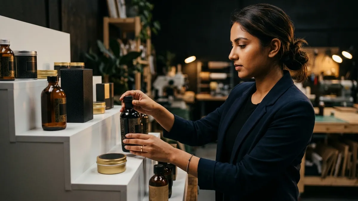
Most business owners I meet spend months perfecting their product. The formulation, the quality, the pricing. Then they spend two days on the packaging and wonder why it is not selling. This is one of the most common and expensive mistakes I see with food brands, personal care products, home goods and industrial consumables across India.
Here is what actually happens at the point of purchase — whether that is a retail shelf, a distributor's warehouse or a product photo on a WhatsApp catalogue. A buyer looks at your product for about three seconds before forming an opinion. In those three seconds, they are not reading your ingredients list or your company history. They are feeling something. Does this look like it is worth the price? Does this look trustworthy? Does this look like what I was searching for? Your packaging is doing that job. Or failing at it.
The most common problem I see is what I call the 'everything on the label' trap. A founder wants to communicate every feature, every benefit, every certification, the company's founding year, a tagline, a phone number, a website, a QR code, and a photograph of the product all on a 100mm by 150mm label. The result is visual noise. No single element stands out. The buyer's eye has nowhere to land. Compare that with a well-designed label where one clear brand name, one strong visual and one key benefit statement do all the work. That is what sells.
Typography is a bigger problem than most founders realise. I have seen small food businesses use four different fonts on a single label — one for the brand name, one for the flavour, one for the weight declaration and another for the tagline. It looks amateur even if each individual font is decent. Good packaging uses one primary typeface, maybe a secondary one for contrast, and applies them with discipline. If you have not thought about whether your fonts are consistent across your labels, boxes and cartons, it is worth doing a quick brand analysis to see where you stand.
Colour is the other area where Indian MSME packaging often falls apart. Not because the colours are ugly, but because they are inconsistent. The label on the bottle looks different from the master carton. The product photo on Amazon looks different from the physical product in the store. This happens because there is no colour standard defined — no Pantone reference, no CMYK breakdown that the printer is required to follow. Every print run varies slightly and over time your brand stops looking like a brand. It starts looking like a collection of random products from different manufacturers.
Premium appearance is not about spending more money on packaging. I have seen Rs 8 per unit packaging look far more premium than Rs 22 per unit packaging simply because of better design decisions. White space, a clean hierarchy, a consistent colour story, a font that fits the category — these things cost nothing extra to print. They cost design thinking. If you are wondering why your product looks expensive to make but cheap on the shelf, the answer is almost always in the design, not the material. I covered a related angle in my work with founders who struggle with overall visual identity — if your packaging problem is part of a larger inconsistency across your brand touchpoints, a one-to-one consultation helps you look at the full picture.
One thing many founders skip entirely is the hierarchy of information. Every label has a job to do. The front face has one job — make the buyer pick it up. The back panel has another job — confirm the decision to buy. The sides do compliance and logistics. When founders try to sell on every surface, they end up selling on none. I always ask: if someone sees only the front face of your pack from 60 centimetres away, what is the one thing they should read and remember? If your current packaging cannot answer that in one second, it needs work.
Another pattern I notice with D2C brands selling online: they design for the physical shelf and forget the digital shelf. On Amazon, Flipkart or your own website, your packaging appears as a 200 by 200 pixel thumbnail. If your brand name is small, if your background colour blends into the platform background, if the key visual is too detailed to read at that size, your product disappears. Good packaging today needs to work at both scales. This is not complicated to fix but it requires someone to actually test the design at thumbnail size before going to print.
If your product has been in the market for a year or more and sales have plateaued despite good quality and fair pricing, I would seriously look at the packaging before increasing your ad spend. Most of the founders I work with through the 2-day business growth workshop are surprised to discover that their packaging is the bottleneck — not their distribution, not their pricing, not their product. Fix the design, and the same product starts pulling better numbers from the same channels. That is what good packaging design actually does. It does not change the product. It changes what the buyer believes about the product before they ever open it.
Want to understand where your business growth is stuck?
Book a Business Growth Diagnostic with Abhijit JK — an honest, focused 60-minute one-to-one session with Abhijit JK on your brand, website and growth.
Book a Business Growth Diagnostic

