Why Your Typography Is Silently Killing Your Brand
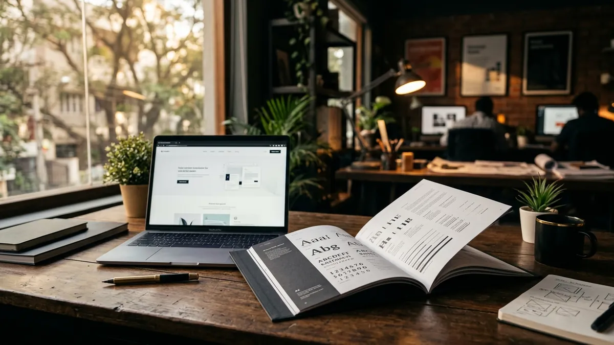
Most business owners I meet have spent real money on a logo. They have thought about colour. They have argued with a designer over which shade of blue feels more premium. But the moment I ask them about their fonts — the typefaces they use on their website, their brochure, their invoices, their social posts — I get a blank stare. Or worse, a confident answer: 'We just use whatever looks nice.' That right there is the problem.
Typography is not decoration. It is communication before a single word is read. The moment a buyer lands on your website or opens your catalogue, their brain is already forming an opinion — and a large part of that opinion comes from your fonts. A heavy gothic font screams one thing. A thin, airy serif whispers something completely different. If your font choice does not match what your business actually is, there is a friction in the buyer's mind that they cannot explain but absolutely feel. They just click away or set your brochure down.
I have seen this with manufacturers in Pune who make genuinely world-class industrial equipment but use the default Arial on every document and a mix of three different fonts on their website. Buyers from Europe and the Middle East are landing on that site and quietly downgrading their perception of the company before any conversation even begins. The product is excellent. The typography is telling a different story. This mismatch is more common than most founders realise, and it shows up in a brand analysis almost every single time.
The problem is not just ugly fonts. The problem is inconsistency. I see businesses in India that use one font on their letterhead, another on their visiting card, a third on their Instagram posts, and yet another on their packaging. Each touchpoint was probably designed by a different person at a different time — a nephew, a local printer, a freelancer on Fiverr. No one set a rule. No one said 'this is our font, use only this.' The result is that the brand has no visual voice. It sounds like five different people speaking at once. Buyers subconsciously register this as a business that is not serious or not organised.
There are also specific font mistakes I see repeatedly across Indian business categories. Service businesses — accounting firms, law offices, consultants — often use playful, rounded fonts that undercut their authority. Food and wellness brands go the opposite way, picking cold corporate fonts that feel clinical and uninviting. Retail brands trying to look premium pick thin, elegant fonts but then bold everything in caps on every post, which cancels out the effect entirely. The font may not be wrong on its own. It is wrong for what the business needs to communicate. Choosing the right typeface requires understanding your brand's personality first — something we work through in detail in the 2-day business growth workshop.
Here is a practical framework I give founders who are fixing their typography themselves. Choose two fonts — no more. One for headings, one for body text. Make sure they are from the same type family or are professionally paired combinations. Google Fonts has excellent free options. For a premium or professional feel, look at Inter, Lato, or Raleway for clean modern brands. For warmth and approachability, Poppins or Nunito work well. For heritage and authority, Playfair Display paired with a clean sans-serif is hard to beat. Write these two fonts down. Share them with every designer, every printer, every team member. Use them everywhere. On your website, your social media templates, your pitch decks, your packaging, your invoices. Everywhere.
One thing founders often miss is the relationship between font size, line spacing and readability — what designers call typographic hierarchy. If your website body text is too small, buyers over 40 will not read it — and in India, many key decision-makers are in that age group. If all your text is the same size, nothing stands out and the eye does not know where to go. If your line spacing is too tight, the whole page feels dense and exhausting. These are not aesthetic choices. They are functional choices that determine whether a buyer reads your content or bounces. If you are unsure how your current digital presence is performing, a business growth diagnostic can surface these gaps quickly.
I want to say something directly to the founder who is reading this and thinking 'this is too detail-oriented, I have bigger problems to solve.' I understand. But your typography is part of your first impression, and in most business categories today, you do not get a second one. A buyer comparing three vendors is going to choose the one that looks most credible, most organised, most trustworthy at a glance — before they have read a single word of your pitch. If your competitor has clean, consistent typography and yours looks assembled from leftover parts, you have already lost some percentage of potential business without even knowing it.
Fix your fonts this month. It does not require a full rebrand. It does not require a large budget. It requires a decision and a document — a one-page brand typography guide that tells everyone in your business which fonts to use and how. That one document, shared with every designer and team member, will make your brand look more professional across every touchpoint within weeks. If you want help building that foundation properly — along with your overall visual identity — reach out for a one-to-one consultation and we can start from exactly where your business is today.
Want to understand where your business growth is stuck?
Book a Business Growth Diagnostic with Abhijit JK — an honest, focused 60-minute one-to-one session with Abhijit JK on your brand, website and growth.
Book a Business Growth Diagnostic

