Why Your Typography Is Making Buyers Trust You Less
Most business owners I meet have spent real money on a logo. Some have even done a proper brand colour palette. But ask them about their fonts — the typefaces on their website, their proposals, their packaging, their presentations — and you get a blank look. That blank look is costing them business. Typography is not a design detail. It is a trust signal. And buyers read it before they read a single word you have written.
Here is what actually happens when someone lands on your website or receives your quotation PDF. Their brain processes the visual layout in under two seconds. In that window, before they read your company name or your price, they have already formed an opinion about whether you are serious or amateur. Fonts are a massive part of that opinion. A pharma distributor using Comic Sans on his invoice. A logistics company using five different fonts across their website. A boutique clothing brand using a heavy gothic font that feels aggressive. I have seen all of these, and in every case, the owner had no idea the fonts were doing quiet damage.
The problem is not that Indian founders do not care about design. They do. The problem is that most of us grew up treating fonts as a cosmetic choice — whatever looked nice in Microsoft Word. But in branding, fonts carry personality. A rounded, soft sans-serif says approachable and modern. A sharp serif says established and trustworthy. A hand-lettered script says artisanal and personal. These are not accidents. Global brands spend enormous amounts choosing typefaces that match exactly what their buyers need to feel. Your buyers have the same nervous system. They respond the same way.
The second mistake I see constantly is mixing too many fonts. A business will use one font on their letterhead, a completely different one on their website, a third on their social media graphics, and whatever the default is in their WhatsApp catalogue images. Each of those touchpoints feels like it belongs to a different company. Buyers notice this inconsistency even when they cannot name it. They just feel something is off. That feeling of 'something is off' translates directly into hesitation before placing an order or signing a contract. If you want to understand how inconsistency across platforms erodes brand credibility more broadly, the idea is the same whether we are talking fonts or colours or image style.
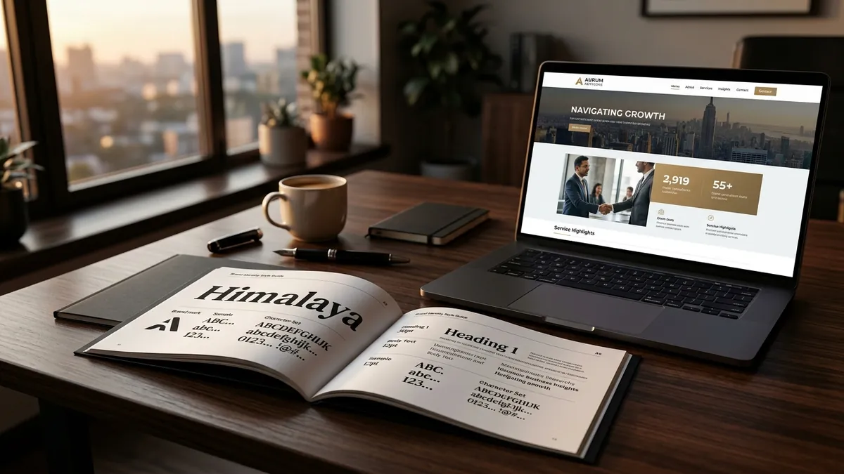
So what should a founder actually do? Start with two fonts and commit to them. One for headings, one for body text. That is it. Choose them intentionally. If you are a B2B manufacturer or a service business that wants to signal reliability and professionalism, look at clean geometric sans-serifs like Inter, DM Sans or Nunito for a modern feel, or a refined serif like Playfair Display for your headings if you want gravitas. If you are in food, wellness or lifestyle retail, you have more room to use expressive or hand-styled fonts for headings — but your body text should still be completely clean and readable. Pick your two fonts, document them, and enforce them everywhere. Website, proposals, social media graphics, packaging — everything.
Readability is the other thing that gets ignored. I have reviewed dozens of websites where the body copy is set in a thin light-weight font at 13 pixels on a white background. The founder thinks it looks elegant. The buyer is squinting and leaving. On the other hand, some founders go the opposite direction and use heavy bold text for everything, making the page feel like it is shouting. Good typography breathes. Enough white space between lines. Adequate font size — 16px minimum for body on web. Contrast between your text colour and background that does not strain the eye. These are not aesthetic preferences. They are conversion factors. A buyer who can read your page comfortably stays longer and trusts more.
Packaging is where I see the most expensive typography mistakes in Indian product businesses. A manufacturer will invest in beautiful packaging material — good board, nice lamination — and then slap a product name in a default font that looks like it came from a 2005 desktop printer. The physical quality of the box says premium. The typography says local and unpolished. The buyer picks it up, feels the disconnect, and reaches for the competitor product that costs thirty rupees more but looks completely resolved. If you are working on packaging or want to audit your full visual identity properly, a one-to-one consultation is often the fastest way to find exactly where your design is leaking credibility.
One practical thing you can do this week — open every document, template and social media graphic your business sends out or posts. List every font you see. If you count more than three, you have a problem to fix. If any of them are Comic Sans, Papyrus, Impact or default system fonts used without intention, fix it immediately. Go to Google Fonts, pick one heading font and one body font that feel consistent with what your brand should communicate, and start replacing. It will take time to update everything, but start with what your buyers see first — your website homepage, your email signature, and your proposal template.
Typography is one of those brand decisions that works invisibly when it is right and loudly against you when it is wrong. Most founders will never hear a buyer say 'I didn't trust your fonts.' But they will feel the hesitation, the slow reply, the 'let me think about it' that never comes back. Getting your typography right is not about being fancy. It is about removing unnecessary friction between your offer and your buyer's decision. If you want to work through your full visual identity — fonts, colours, layout and how they all connect — I run business growth workshops that include brand identity sessions for exactly this kind of work. The businesses that take this seriously look and feel different within a month.
Want to understand where your business growth is stuck?
Book a Business Growth Diagnostic with Abhijit JK — an honest, focused 60-minute one-to-one session with Abhijit JK on your brand, website and growth.
Book a Business Growth Diagnostic