Why Your Typography Is Quietly Undermining Your Brand
Most business owners I meet have spent serious money on their logo, their product photography, maybe even a new website. But when I look at their visiting card, their proposal document, their WhatsApp catalogue and their social media posts — all four use different fonts. Some are bold. Some are thin. Some are decorative. One is Comic Sans. This is not a small detail. Typography is the single most overlooked reason why an otherwise decent brand feels inconsistent, cheap or untrustworthy to a buyer who has never met you.
Here is the real problem. Fonts carry personality — whether you intend them to or not. A hospital using a curly, script font on their signage feels irresponsible. An engineering firm using bubble letters on their brochure feels like a hobby business. A premium clothing brand using a generic free-download font on their hang tag feels mass-market. Buyers pick up on these signals without being able to name what is wrong. They just feel something is off. And when something feels off, they hesitate. They look for a second option. They negotiate harder.
I have seen this specifically with manufacturers and B2B service firms in India. The product is solid. The team is experienced. The pricing is fair. But the quotation comes in Times New Roman with bold red headings and a footer in Calibri. The buyer — especially if they are from a larger company or a metro city — reads the quotation and mentally places the vendor in the unorganised sector. Not because of the price. Not because of the content. Because the document does not look like it came from a business that pays attention to detail. Typography is detail. And buyers equate detail with competence.
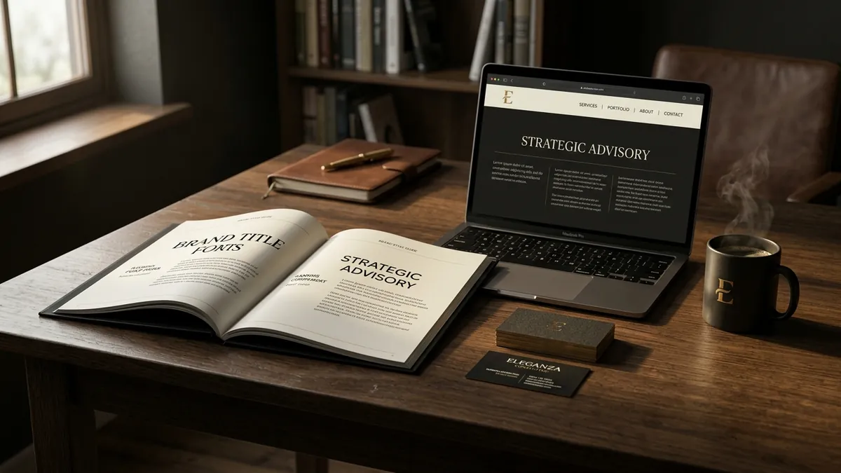
The good news is this is one of the easiest brand problems to fix — if you approach it systematically. Start by picking two fonts and sticking with them everywhere. One for headlines and one for body text. That is it. No mixing. No exceptions. These two fonts should work together visually, meaning they should have different weights and styles but still feel like they belong to the same family. A simple pairing like a geometric sans-serif for headings and a clean serif for body text can immediately lift the professional feel of any document, website or social post. Google Fonts has free options that work well — Montserrat, Inter, Lato, Merriweather, Playfair Display. You do not need to pay for premium fonts to look professional. You need to stay consistent.
The second fix is discipline across formats. Most Indian business owners use one font on their website, another in their PowerPoint template, another in their WhatsApp status, and whatever Word defaults to in their letters. Every touchpoint where a buyer sees a different font is a touchpoint where your brand feels less established. If you have a team creating content or documents, write down your two fonts in a single-page brand guide and share it with everyone who touches any customer-facing material. I discuss this as part of building a complete visual identity system in my one-to-one consultation — because the fix is fast but only if the whole team follows the same rules.
Now, colour and typography are deeply connected. A strong, dark navy heading font communicates authority. The same font in pastel pink communicates softness and approachability. Your font choice and your colour choice together set the tone. If these two are not aligned, your brand sends a mixed signal. A premium skincare brand with beautiful product photography but a harsh, bold sans-serif in orange on their website is creating conflict in the buyer's mind. That conflict does not close sales. If you have not thought about this pairing deliberately, now is the time. And if you want to learn this alongside other founders who are rebuilding their visual identity from the ground up, have a look at the business growth workshops — we cover typography and colour together because they cannot be separated.
There is one more font mistake that I see constantly among retail brands and food businesses in India — using decorative or display fonts in small sizes. A decorative font looks beautiful on a wedding card at 48pt. At 10pt on a product label or a business card, it becomes unreadable. Buyers should not have to squint to know what your product is called or what your tagline says. Legibility is not a compromise. It is a requirement. Decorative fonts belong in logos and large headline spaces only. Everything else — ingredient lists, descriptions, contact information, pricing — should be in a clean, readable body font at an appropriate size.
A quick self-audit you can do today: pull up five pieces of customer-facing material your business has produced in the last three months. Your visiting card, a social media post, a WhatsApp message to a customer, a quote or invoice, and your website homepage. Count how many different fonts appear across these five. If the number is more than three, you have a consistency problem. If any of those fonts is a default system font used without a conscious decision, you have a brand perception problem. The solution is not to hire a expensive designer immediately — start by simply deciding on your two fonts and updating your most frequently seen materials first.
Typography is not decoration. It is communication before communication. The way your words look shapes how your words are received. If you want buyers to take your pricing seriously, your documents need to look like they come from a business that is serious. If you want partners to trust your expertise, your proposals need to look like they were made with intention. This is not about being fancy. It is about being consistent and considered — which is exactly what a trustworthy business looks like. To understand how typography fits into the larger picture of your brand's visual identity, read more about Abhijit and the kind of work we do with Indian businesses at every stage of growth.
Want to understand where your business growth is stuck?
Book a Business Growth Diagnostic with Abhijit JK — an honest, focused 60-minute one-to-one session with Abhijit JK on your brand, website and growth.
Book a Business Growth Diagnostic