Why Your Business Card Still Cannot Close a Deal
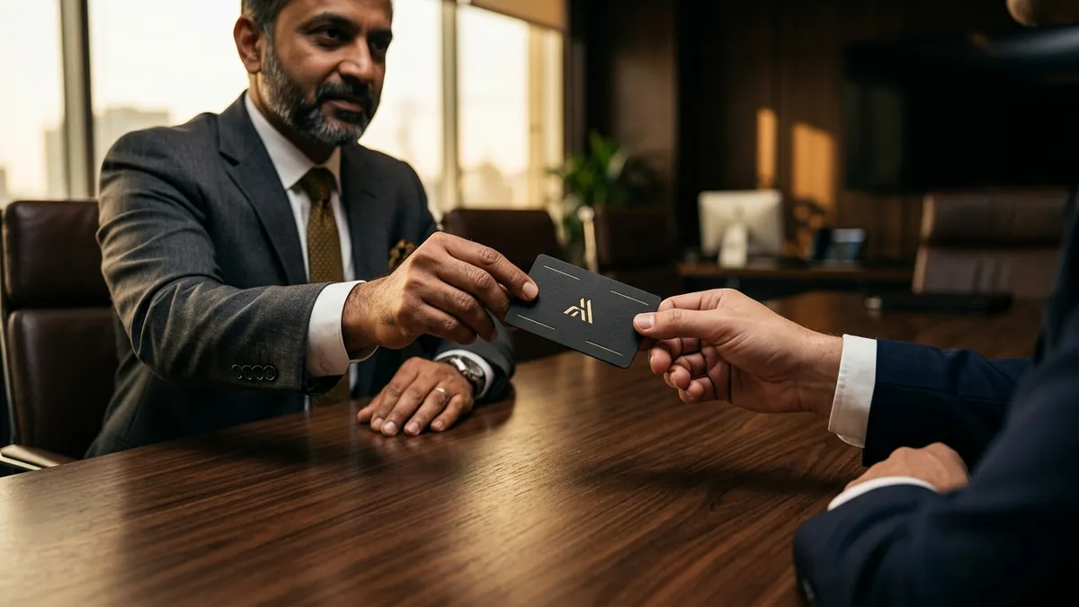
Most business owners I meet carry a card they printed quickly at a local print shop three years ago. The font is cramped, the logo is pixelated, and the paper feels like it came out of a home printer. They hand it over at a meeting or an industry event, and within thirty seconds that card is forgotten. Sometimes it gets lost inside a pocket. Sometimes it goes straight into the bin. The meeting felt fine, but nothing moves forward.
Here is the thing most people do not want to hear. A business card is not just contact information. It is the physical version of your brand. When someone holds your card, they are forming a judgment about your business, your prices, and whether they can trust you with a serious project. That judgment takes about five seconds. A bad card plants doubt that your conversation cannot always undo.
The most common problem I see is not bad design exactly — it is no design thinking at all. Founders list every possible piece of information on the card: office address, mobile, WhatsApp, email, website, Instagram handle, tagline, and sometimes a photo. The card becomes a notice board. There is no hierarchy, no breathing room, and the eye does not know where to go. Good design is about making decisions on what stays and what goes. Most business cards are made by someone who could not make those decisions.
The second problem is cheap paper. This is painfully common. I have seen manufacturers running five-crore operations handing out cards printed on 250 GSM matte stock that curls at the corners. Your client runs a palm over that card and registers something — maybe they cannot name it, but they feel it. Premium clients expect a certain quality in the details. A thicker card, a soft-touch lamination, a simple spot UV on the logo — these are not expensive upgrades. They are signals. If you are going to spend money anywhere on your physical brand identity, spend it here.
Colour and font choices deserve more attention than founders give them. A business card should use the same colours and fonts you use on your website, your packaging, your invoices, and your social profiles. If your card looks completely different from your website, you are telling the client that nobody is in charge of your brand. That inconsistency creates a small but real anxiety in a buyer's mind. They wonder if your operations are just as disorganised. If you have not yet sorted this across your materials, a one-to-one consultation is often the fastest way to get clarity on what your identity system should look like.
One thing I always check when I look at a founder's card is whether the logo holds up at that small size. Many logos are designed to look good on a screen or on a hoarding but fall apart when printed at 3.5 by 2 inches. Fine details get muddy. Text inside the logo becomes unreadable. The icon loses its shape. A good logo should work at every size — and if yours does not, the business card is where that failure shows up most visibly, most frequently, in the hands of the most important people.
What does a card that actually works look like? Simple. Confident. The logo sits cleanly. One or two contact details — mobile and website are usually enough. A clear role or positioning line that tells the receiver what you actually do for them. White space that makes the card feel considered rather than hurried. And a print quality that makes someone want to keep it. I have had clients tell me that a prospect kept their old card in their wallet for two years before calling. That only happens when the card earns its place.
If you want to test how your current card is performing, try this. Show it to five people who do not know your business and ask them what they think you do, who you serve, and whether they would take a meeting with you based on that card alone. Their answers will tell you more than any design audit. Most founders are surprised by how little their card communicates. If you are at the stage of revisiting your full identity — card, website, social look — our business growth workshops cover this ground with real examples from Indian businesses across sectors.
Your business card is not a formality. It is the one piece of your brand that physically travels with someone after they meet you. Make it do the work. Get the paper right, clean up the layout, align it with the rest of your brand, and put a version of your logo on it that actually holds together at small size. These are not big investments. They are the kind of small, deliberate decisions that separate a business that looks like it has its act together from one that is still figuring it out.
Want to understand where your business growth is stuck?
Book a Business Growth Diagnostic with Abhijit JK — an honest, focused 60-minute one-to-one session with Abhijit JK on your brand, website and growth.
Book a Business Growth Diagnostic