Why Your Visual Identity Looks Inconsistent Across Channels
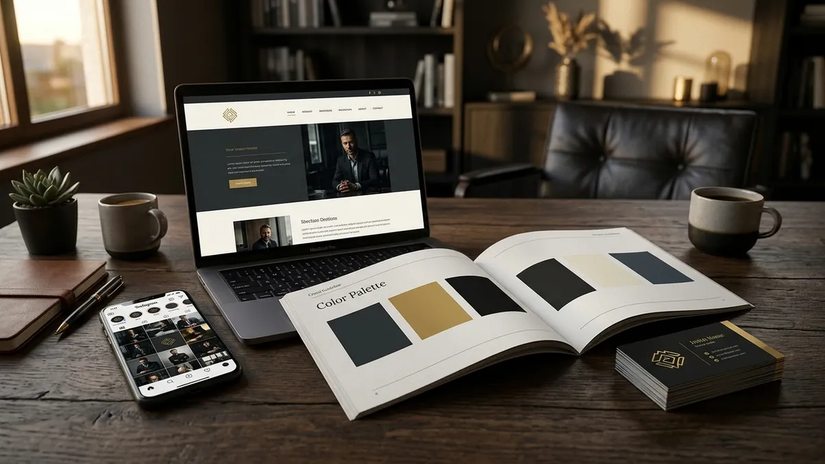
Most business owners I meet have spent real money on a logo. A designer delivered files, the owner paid, and everyone moved on. Six months later, the logo on the visiting card is one version. The WhatsApp display picture is a slightly different crop. The banner at the trade fair was designed by someone else entirely. The website header shows yet another variation. Nobody planned for this. It just happened. And now the brand looks like four different companies.
This is one of the most common and most damaging problems I see with Indian MSMEs and growing startups. It is not that the original design was bad. The problem is that there was never a system built around it. A logo file is not a visual identity. A visual identity is the complete set of rules — colours with exact codes, fonts with specific weights, spacing, logo placement rules, image styles — that tells every person who touches your brand exactly how it should look. Without that, every designer, every printer, every social media freelancer will make their own interpretation. And slowly your brand stops looking like a brand.
I have seen this with manufacturers who exhibit at expos. Their stall looks polished because they spent on a proper designer. But their Instagram posts look like they were made in a free app at midnight. Their quotation PDFs use a different font. Their packaging uses a colour that is close to the brand colour but not quite the same. Buyers notice this even if they cannot name what feels off. What they feel is doubt. And doubt kills decisions.
The root cause is almost always the same — there is no brand guideline document. Or there is one, but it lives on one person's laptop and nobody else has seen it. When you do a brand analysis, this is one of the first things I check. How does the brand look across five touchpoints? If the answer varies, the brand has a consistency problem regardless of how good the original design was.
Here is what design inconsistency actually costs you. It costs you perceived value. When a buyer compares you to a competitor who looks sharp and consistent on every platform, they assume that competitor is more organised, more reliable, more professional. They may not say this out loud. They will just choose the other vendor. Premium pricing is impossible when your brand looks different every time someone encounters it. People do not trust what keeps changing shape.
Fixing this does not always require a full rebrand. In many cases the original logo and colours are perfectly fine. What is missing is documentation and discipline. Start by listing every single place your brand appears — website, Instagram, LinkedIn, WhatsApp, visiting card, letterhead, invoice, packaging, signage, presentation decks, email signature. Now ask honestly: does it look like the same brand across all of these? Then get your designer to create a one-page brand guideline that specifies your exact primary and secondary colours in HEX and CMYK, your fonts and which weight to use for headings versus body copy, how much white space should surround your logo, and what your logo must never be placed on. This one document, shared with everyone who creates anything for your business, will solve eighty percent of your consistency problems.
The other issue is vendor management. Many founders use five different freelancers for different jobs. The Instagram person, the packaging printer, the web developer, the exhibition stall designer — none of them talk to each other. Each one gets a brief in a WhatsApp message and does their best. Without brand guidelines, their best will always look like a different brand. When I work with founders in a one-to-one consultation, I help them build a simple vendor brief template that includes all brand specifications. Every vendor gets the same template before starting any job. This one habit dramatically reduces visual drift over time.
Typography is a smaller problem that causes a surprisingly large amount of damage. When you use three different fonts across your materials — one from the logo, one your team likes, one that came default in the PowerPoint template — your brand starts to look amateur even when individual pieces look fine. Decide on two fonts maximum. One for headings, one for body text. Use them everywhere, always. Consistency in typography alone makes a brand look significantly more put together without spending a rupee on redesign.
If you are serious about building a brand that grows with your business rather than fighting against it, start this month with one action. Pull up your business WhatsApp, your Instagram profile, your website header and your latest quotation PDF side by side on your screen. Look at them together. If they do not feel like one brand, that is your starting point. You do not need a full rebrand. You need a system. If you want help figuring out exactly where the gaps are and what to prioritise, a business growth diagnostic is often the fastest way to get clear on this without spending months guessing.
Want to understand where your business growth is stuck?
Book a Business Growth Diagnostic with Abhijit JK — an honest, focused 60-minute one-to-one session with Abhijit JK on your brand, website and growth.
Book a Business Growth Diagnostic

