Why Your Visual Identity Looks Different Everywhere
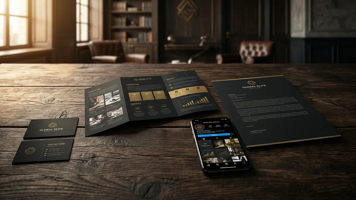
Most business owners I meet have not intentionally changed their brand. But somewhere between the first logo they got made on Fiverr, the visiting card their printer designed for free, the Instagram template their social media vendor chose, and the letterhead their accountant formatted — the brand quietly fell apart. Everything looks slightly different. Different shades of the same colour. Different fonts on different materials. The logo stretched on a banner and squeezed on a mobile screen. Nobody decided this. It just happened.
This is the most common design problem I see with Indian MSMEs, manufacturers and service businesses. Not a bad logo. Not ugly colours. Just total inconsistency across every touchpoint. And here is the thing — customers cannot always put their finger on what is wrong. They just feel something is off. The business looks unorganised. Unserious. Small. Even if the product or service is genuinely good.
Think about it from a buyer's perspective. They find your business on Google. They see your website. Then they check your Instagram. Then a vendor sends them your brochure. Then they get a quotation on your letterhead. If each of these looks like it came from a different company — different logo version, different blue, different font style — their brain registers inconsistency as unreliability. This is not theory. I have seen this cost businesses real orders, especially in B2B, where the decision-maker is comparing you with a more put-together competitor.
The root cause is almost always the same. The business never had a proper set of brand guidelines. Not a 40-page brand bible — just a simple one-page document that says: this is our exact logo file, this is our primary colour with the HEX code, this is the font we use for headings and the one we use for body text. Without this, every vendor — your printer, your web designer, your social media person — makes their own interpretation. And after two years, you have six versions of your brand floating around.
I did a brand analysis for a Bengaluru-based industrial equipment manufacturer last year. Their website had their logo in navy blue. Their brochure had it in black. Their trade fair standee had it in dark teal. All three looked close but were clearly not the same. When I asked the owner which was correct, he genuinely was not sure. That is how far the drift had gone. The fix was not expensive. It was just a clear decision — made once, documented properly, and shared with every vendor going forward.
Here is how to fix this practically. First, pick one final version of your logo and get it in vector format from your designer — an AI or EPS file. Not a JPG. A vector file. This is the master. Everything else comes from this. Second, write down your exact brand colours as HEX codes for digital use and Pantone or CMYK values for print. If you do not know these, your original designer should. If they cannot provide them, that is a problem worth solving now. Third, decide on two fonts maximum — one for headlines and one for body text — and document them. Google Fonts are fine if you want free options that any vendor can access easily.
Once you have that one-page brand reference document, share it with every vendor before any new project starts. Make it a condition of working with you. Your web designer, your packaging printer, your social media team — all of them should be working from the same file. This single step will do more for how professional your business looks than any new logo ever will. If you want help structuring this properly, a one-to-one consultation is a good starting point — especially if you have existing materials that need to be audited before you standardise.
The businesses that look premium — not just expensive, but genuinely trustworthy — are not always the ones with the most creative logos. They are the ones that look the same everywhere. Same energy on the website as on the packaging. Same fonts in the proposal as on the signage. That consistency tells the customer: this business has its act together. And in a market where most of your competitors are inconsistent, this is easier to achieve than you think. It just requires one decision and a small amount of discipline.
If you are unsure where your brand currently stands — whether the inconsistency is minor or has gone quite deep — a proper brand analysis will show you exactly where the gaps are and what to fix first. You do not need to redesign everything. Most businesses just need to standardise what they already have. Start there. Get one clean set of files. Document the rules. Then enforce them across every vendor and every platform. Your brand will look like a different business within thirty days — without spending anything on design.
Want to understand where your business growth is stuck?
Book a Business Growth Diagnostic with Abhijit JK — an honest, focused 60-minute one-to-one session with Abhijit JK on your brand, website and growth.
Book a Business Growth Diagnostic

