Why Your Brand Looks Cheap Even With a Good Product
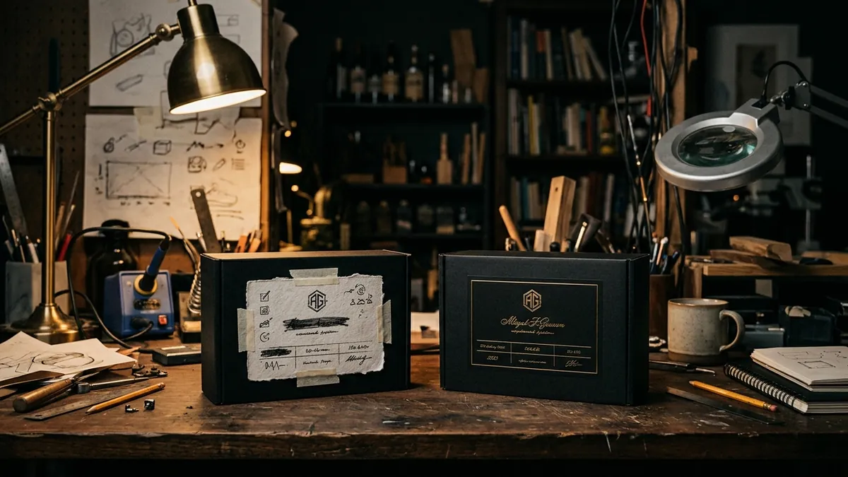
Most business owners I meet have put real effort into their product or service. The quality is there. The experience is solid. Customers who buy once usually come back. And yet — when a new prospect lands on their website, sees their brochure, or checks their Instagram page, something feels off. The brand looks cheap. Not because the owner is cheap. Because nobody sat down and built the visual identity with intention.
This is one of the most common problems I see with Indian manufacturers, service firms and retail brands. The product or service is genuinely competitive. But the way the business presents itself visually — the logo, the colours, the fonts, the layouts, the photos — gives the impression of a small, casual operation. And in business, perception is reality at the first touchpoint. The prospect does not know your quality yet. All they can go by is how you look.
Here is what usually happens. The business starts. Someone's nephew designs the logo over a weekend. The WhatsApp profile picture becomes the brand identity. Visiting cards are printed at the local press in whatever template they offer. The website is built by a freelancer who picked colours and fonts without any brief. Over five years, the business grows. But the visuals never get revisited. So you end up with a ten-crore business that looks like a two-lakh startup. That mismatch is quietly costing you every day.
The specific things that make a brand look cheap are usually not about the logo alone. I have seen this with packaging manufacturers, B2B service firms and even premium food brands. The real culprits are inconsistency and randomness. Four different font styles across different materials. Brand colours that shift slightly between print and digital. Stock photos that have nothing to do with the business. A logo that is blurry when scaled up. These individual problems are small. Together, they create a visual impression that says — this business is not serious. And serious buyers walk away without telling you why.
Colour is where I see the most damage. Many business owners pick colours they personally like, or whatever the designer suggested without a proper brief. But colour in branding is not about aesthetics — it is about signal. A logistics company using pastel pink, a legal firm using neon green, a premium food brand using dull grey — these are mismatches between what the business does and what the visual signals say. Buyers feel this mismatch even if they cannot name it. If you have not thought through what your brand colours communicate, a proper brand analysis is often the fastest way to find where the visual disconnect is happening.
Typography is another silent problem. Most small business owners have never thought about fonts as part of brand identity. So they use whatever is available — Times New Roman in the proposal, Arial on the website, some decorative font on the signage. This randomness signals lack of attention to detail. And attention to detail is exactly what a buyer is trying to assess when they evaluate a new vendor or service provider. Two or three consistent fonts, used correctly across everything, can shift the perceived quality of a brand significantly. It sounds small. The impact is not.
Photography and imagery choices matter more than most founders realise. If your website or catalogue uses generic stock photos — the same smiling businesspeople that appear on ten thousand other websites — it creates distance between your brand and the buyer. Buyers want to see the real product, the real team, the real workspace. I have worked with manufacturers where replacing stock photos with actual factory and product shots made an immediate difference to enquiry quality. Real images build trust. Generic images build nothing. If you want to think this through with someone who has done this with product businesses specifically, a one-to-one consultation is a good starting point.
The fix is not a complete rebrand. Most of the time, it is a visual audit followed by a clean-up. Settle on a primary logo version and stick to it. Lock down your two or three brand colours with exact codes. Choose two fonts — one for headings, one for body — and use them everywhere. Get real photographs of your product, team or workspace. Apply these consistently across your website, social profiles, proposals and printed materials. This is not glamorous work. But it is foundational. Brands that look consistent and clean get taken more seriously, get quoted better rates, and close faster.
Your product deserves to be judged on its merit. But that only happens if your visual identity gives the buyer permission to take you seriously in the first place. If you are not sure where your brand's visual identity is letting you down, start with an honest look at how your business appears to someone who has never met you. Or if you want a structured way to look at the whole brand and business picture, the business growth diagnostic covers this alongside the commercial gaps. Either way, do not let a fixable visual problem keep a genuinely good business invisible.
Want to understand where your business growth is stuck?
Book a Business Growth Diagnostic with Abhijit JK — an honest, focused 60-minute one-to-one session with Abhijit JK on your brand, website and growth.
Book a Business Growth Diagnostic

