Why Your Brand Looks Different on Every Platform
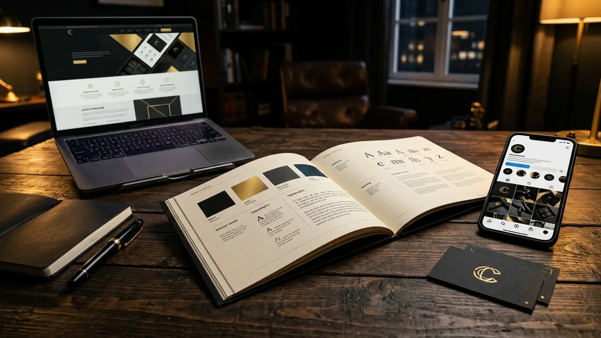
Most business owners I meet have collected their brand assets over years, not built them. A logo designed in 2018 by a freelancer. A brochure made by a printing vendor who added his own fonts. A website built by someone who used the logo but changed the colours slightly. An Instagram profile where the marketing intern picked a new colour palette because it looked 'fresh'. By the time I sit across from a founder and open five tabs — website, Instagram, LinkedIn, brochure PDF, and packaging photo — I am looking at five different brands. And the founder is usually surprised.
This is not a vanity problem. Inconsistent visual identity is a trust problem. When a buyer sees your Instagram, then visits your website, then receives your invoice — and all three feel different — something in their brain flags it. They cannot name the feeling, but they hesitate. The hesitation might show up as a delayed reply, a vague 'we'll think about it', or a call that never happens. I have seen this pattern with manufacturers, consultants, retail shops, coaching businesses and exporters. The surface reason is always 'the design looks off'. The deeper reason is that the brand does not feel dependable.
The most common cause is that no one ever defined the rules. Most small businesses in India have a logo file and maybe a colour code written somewhere on an old email. That is not a brand identity. A real visual identity has a primary logo and its variations, a defined colour palette with exact codes, one or two approved fonts and how to use them, spacing rules, and guidance on what the logo should never sit on top of. Without this, every vendor, every employee, every agency you hire will make their own interpretation. They are not being careless. They simply have no reference.
The second cause is file format chaos. If your logo was shared as a JPG on WhatsApp, it has already been compressed, possibly stretched, and saved again by four different people. By now, the version your social media person is using is a low-resolution file with a white background baked in. Your printer is using a different version he saved from your website. Your website developer used whatever he found in your email. None of them are wrong. You just never gave them the correct files. A proper brand file set includes the logo in SVG or EPS vector format, transparent PNG versions for light and dark backgrounds, and a colour-accurate PDF. Most founders I work with have never had these.
The third cause is that brands grow by addition, not by design. You started with a logo. Then you added social media. Then you hired someone to do packaging. Then you built a website. Each person made their own decisions about colours, fonts, button styles and photography. No one stepped back to ask if everything looked like it came from the same family. This is how a business can spend three to four lakhs on design work over five years and still look inconsistent. If you want a clear picture of where your brand identity is today, a brand analysis is usually the best starting point.
Here is what you can do this month, even before hiring anyone. Open your five most visible touchpoints — website homepage, Instagram profile, a brochure or flyer, your visiting card, and one invoice or letterhead. Put them side by side, physically or on screen. Ask yourself: do these use the same logo? The same two or three colours? The same fonts? The same general tone in the photography or illustrations? If the answer to more than two of those is no, you have a consistency problem. Document what you see. That becomes your brief for whoever you bring in to fix it.
Building a basic brand guideline document does not require a large agency or a big budget. It requires one clear decision-making session. You define your primary colour, your secondary colour, your font for headlines, your font for body text, your logo in its correct forms, and three or four rules about what not to do. A single well-structured PDF, even four or five pages, changes everything for your team and your vendors. Every designer you hire from that point has a reference. Every social media post your intern creates has a boundary. If you want help thinking through what your identity needs, a one-to-one consultation is a practical next step.
I have worked with an apparel exporter in Bengaluru whose product photos, swing tags, catalogues and website all used slightly different shades of their brand blue. The buyer's eye catches this, especially in the export market where buyers compare ten vendors at once. After we standardised the colour across all print and digital outputs, the founder told me that one European buyer specifically mentioned that their catalogue 'looked more put-together than before'. Nothing else had changed. Not the product, not the price, not the sales conversation. Just the visual consistency. That is the business value of getting this right.
Your brand is not your logo. It is the complete experience a buyer gets every time they see anything from you. If that experience keeps shifting, they cannot build a reliable mental picture of your business. And if they cannot picture you clearly, they will not choose you confidently. Consistency is not a design luxury. For Indian founders competing in crowded markets, it is one of the cheapest and most effective ways to look more trustworthy than your competition. You do not need a rebrand. You need a standard. Start by setting one.
Want to understand where your business growth is stuck?
Book a Business Growth Diagnostic with Abhijit JK — an honest, focused 60-minute one-to-one session with Abhijit JK on your brand, website and growth.
Book a Business Growth Diagnostic

