Why Your Homepage Confuses Visitors Instead of Converting Them
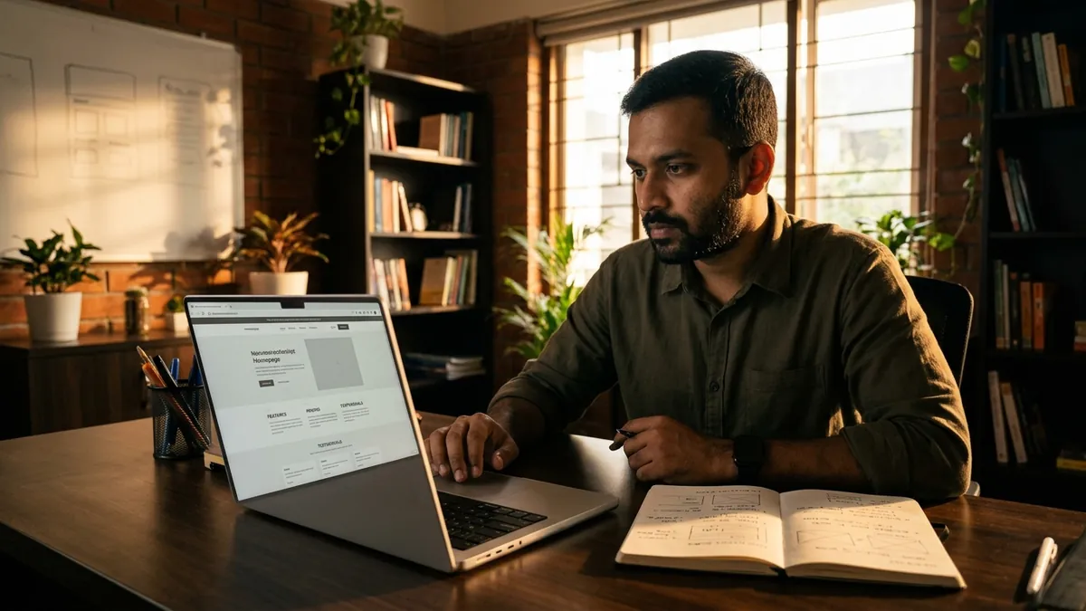
Most business owners I meet are proud of their website. They spent good money on it. The design looks clean. The photos are decent. But when I ask them how many enquiries they got from it last month, the answer is usually the same — 'Very few' or 'Not sure, actually.' The website exists. It just does not work.
The most common reason is this: the homepage tries to say everything at once. I have seen this with manufacturers in Pune, service businesses in Bengaluru and retail brands across tier-2 cities. The homepage has a big banner with a tagline nobody understands, three sliders showing different things, a long paragraph about the company's history, a list of fifteen services, and somewhere buried at the bottom, a contact form. A visitor lands on this page and their brain immediately asks one question — 'What does this business actually do for me?' If they cannot answer that in under ten seconds, they leave.
Here is the truth about how people actually behave on your homepage. They do not read. They scan. They look at the top section first, then quickly scroll to see if anything catches their attention. If nothing speaks directly to their situation, they go back to Google and click the next result. Your competitor just got that enquiry. This is not a traffic problem. This is a communication problem. And it is entirely fixable.
The top section of your homepage — what people see before they scroll — has one job. It must answer three things immediately: what you do, who you do it for, and why someone should contact you instead of anyone else. Most homepages answer none of these clearly. They say things like 'Delivering Excellence Since 2008' or 'Your Trusted Partner for Growth.' These lines mean nothing to a first-time visitor. They want to know if you solve their specific problem. If you want a structured look at what your homepage is actually communicating, a brand analysis can surface these gaps quickly.
Another mistake I see constantly is burying the call to action. A visitor who is interested needs to know what to do next — right now, without hunting around. Many homepages have a phone number in tiny text in the header, a contact form at the very bottom and no clear button in between. By the time the visitor reaches the contact form, they have either lost interest or got distracted. Your call to action — whether it is 'Call us,' 'Get a quote' or 'Book a free consultation' — needs to appear in the top section and again at least once or twice as the visitor scrolls down.
Images also do more damage than most founders realise. Stock photos of people shaking hands, generic office buildings, or abstract graphics with blue gradients — these kill trust silently. Visitors are looking for signals that this is a real business with real people. Photos of your actual team, your actual workspace, your actual product or delivery process — these convert far better. I once worked with a food manufacturer who replaced one generic banner image with a real photo of their production floor. Enquiry form submissions went up noticeably within weeks. Nothing else changed.
Speed and mobile experience are also part of homepage communication. If your page takes more than three seconds to load on a mobile phone, most visitors are already gone. In India, a large share of your visitors are on mobile networks. If your homepage looks broken on a phone screen — text too small, buttons too close together, images not loading — the message it sends is that your business does not pay attention to detail. That is not the impression you want. Running a proper business growth diagnostic often reveals that website speed and mobile usability are silently killing enquiries for businesses that look perfectly fine on desktop.
Fix this in steps. First, rewrite your top section. Use plain language that describes exactly what you do and for whom. Second, add a clear, visible call to action button — not just a phone number in the header. Third, replace stock photos with real images of your business. Fourth, check your website on a mobile phone right now and note everything that feels broken or hard to use. Fifth, run your homepage URL through Google PageSpeed Insights and fix the issues it flags. These five steps alone can change how your homepage performs. If you want to go deeper, a one-to-one consultation can help you work through your specific homepage communication issues with fresh eyes.
Your homepage is not a brochure. It is a conversation starter. It needs to speak clearly to the right person, make them feel understood and give them an easy next step. Most homepages in India are still built like brochures — everything on display, no clear direction. The businesses that fix this stop losing enquiries they never knew they were losing.
Want to understand where your business growth is stuck?
Book a Business Growth Diagnostic with Abhijit JK — an honest, focused 60-minute one-to-one session with Abhijit JK on your brand, website and growth.
Book a Business Growth Diagnostic

