Why Your Logo Is Not Doing Any Business Work
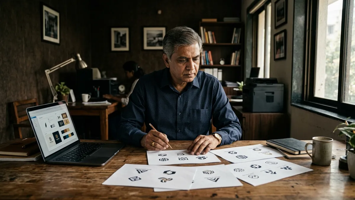
Most business owners I meet have a logo. Many have spent decent money on it — anywhere from five thousand to a few lakhs. And when I ask them what their logo communicates about their business, they go quiet. Some say 'it looks professional.' A few say 'our designer made it.' Almost none can tell me what job their logo is supposed to do. That is the problem right there.
A logo is not a trophy. It is not something you put on a visiting card and forget. It is the first silent signal your business sends to every buyer, every partner, every visitor who lands on your website or walks past your shop. That signal either builds trust or kills it. In most cases I have seen — especially with manufacturers, service businesses and growing retail brands — the logo is sending the wrong signal without the founder even knowing it.
Here is what a working logo actually does. It communicates the nature of your business at a glance. It holds up at any size — on a ten-foot banner and a WhatsApp profile picture. It looks right in both colour and black-and-white. It ages well, meaning it does not feel dated in three years. And most importantly, it is distinctive enough that your buyer can picture it in their mind even when they are not looking at it. Most logos I review fail at least three of these five.
One of the most common mistakes I see is founders choosing a logo because it 'looked good on the designer's screen.' The font was elegant, the colours were rich, the mock-up on a coffee cup was beautiful. But shrink it down to forty pixels — the size of a browser tab icon — and it becomes a smudge. Or put it on a yellow invoice background and suddenly it disappears. A logo has to be designed for real-world use, not just a Behance portfolio. If you are unsure how your current brand identity is holding up across touchpoints, a proper brand analysis will show you exactly where it is failing.
Another issue is generic design. I have sat with food brand founders whose logos look like an IT company, and with engineering firms whose logos look like a kindergarten. This happens when the designer does not understand the business or the buyer, and the founder approves whatever looks 'modern.' A logo should feel native to your industry while still standing apart from your direct competitors. That balance is difficult to get right, but it is the difference between a logo that positions you and one that confuses people.
Then there is the colour problem. Many business owners pick their logo colours based on personal preference — 'I like blue' or 'red feels powerful.' Colour in branding is not about what you like. It is about what your buyer reads into it instantly. A children's brand in dark maroon sends the wrong signal. A premium service firm in neon green struggles to be taken seriously. Colour carries meaning, and that meaning has to match your buyer's expectations before they read a single word. If you want to understand how your current visual choices are landing with your audience, consider booking a one-to-one consultation where we can go through this in detail.
The fix is not always a full rebrand. Sometimes it is a logo refinement — cleaning up the font, simplifying the icon, fixing the colour palette, creating proper usage rules. Sometimes it is building a basic brand guide so your logo is being used consistently across your website, social media, packaging, stationery and sales materials. Inconsistency is often the bigger crime. A decent logo used consistently beats a beautiful logo used differently everywhere.
What you can do this month is straightforward. Pull up your logo and test it: shrink it to forty pixels and see if it still reads clearly. Put it on a white background, a dark background and a coloured background. Ask three people outside your business — not friends, ideally — what they think your company does just from looking at the logo. Their answers will tell you more than any designer presentation will. If the answers are wrong or vague, you have a real problem worth fixing.
I have worked with businesses that added no new service, spent nothing on ads, but saw enquiry quality improve just by cleaning up how their brand looked — because buyers make trust decisions in seconds. Your logo is part of that split-second judgment. If it is not doing active work for your business, it is quietly working against you. If you want a structured way to think through your full identity and growth picture, the 2-day business growth workshop covers brand positioning, identity and the business levers that connect them.
Want to understand where your business growth is stuck?
Book a Business Growth Diagnostic with Abhijit JK — an honest, focused 60-minute one-to-one session with Abhijit JK on your brand, website and growth.
Book a Business Growth Diagnostic

