Why Your Logo Is Not Making You Any Money

Most business owners I meet have a logo. Some spent five thousand rupees on it. Some spent five lakh. And almost all of them will tell me the same thing — it looks fine, but it has not really done anything for the business. They are not wrong. And the problem is almost never the logo itself.
Here is what most founders believe: a logo is a one-time job. You brief a designer, you pick a concept, you pay the invoice, and your brand is sorted. That thinking is exactly why the logo ends up doing nothing. A logo is not a brand. It is the entry point to a brand. If everything behind it — how you communicate, what your materials look like, how your team presents itself — does not match what the logo promises, the logo becomes a decoration. Expensive wallpaper.
I have seen this pattern repeatedly with manufacturers and service businesses across Bengaluru and other Indian cities. A precision engineering company with a sharp, modern logo. But their quotation document is in Times New Roman on a plain Word file. Their WhatsApp profile picture is blurred. Their site was last updated in 2019. When a buyer sees all of this together, the logo does not save you. It actually makes the gap more obvious. The buyer notices the mismatch even if they cannot name it. They just feel something is off.
The second problem is that most logos in India are designed to look good in isolation — on a white background, in a PDF, maybe on a visiting card. They are not stress-tested across real business situations. What does it look like as a tiny icon on a mobile browser? How does it appear on a dark background? Does it reproduce clearly on a flex banner printed in Rajajinagar? If your logo only works perfectly in one situation, it is going to look inconsistent everywhere else. And inconsistency is the fastest way to signal that you are not a serious operation.
There is also a deeper issue around meaning. Many logos in the Indian MSME space are generic — a swoosh, a globe, two hands shaking, a gear wheel. These symbols have been used so many times that they carry no specific meaning for your business. A buyer who lands on your website or picks up your brochure should have some sense of who you are within seconds. If your logo could belong to any one of two hundred businesses in your industry, it is not communicating anything. It is just filling space. If you want to work through what your logo should actually communicate about your specific business, a one-to-one consultation is the most direct way to get clarity on that.
Now let me be direct about what a logo actually needs to do. It does not need to win a design award. It does not need to look like it belongs to a Fortune 500 company. It needs to do three specific things well. First, it needs to signal the right category instantly — so buyers know what kind of business you are without reading a single word. Second, it needs to feel appropriate for the buyer you are trying to reach. A logo that works for a streetwear brand will not work for a B2B industrial supplier, even if both look modern. Third, it needs to hold up consistently across every surface where your business appears. That third one is where most logos fail in practice.
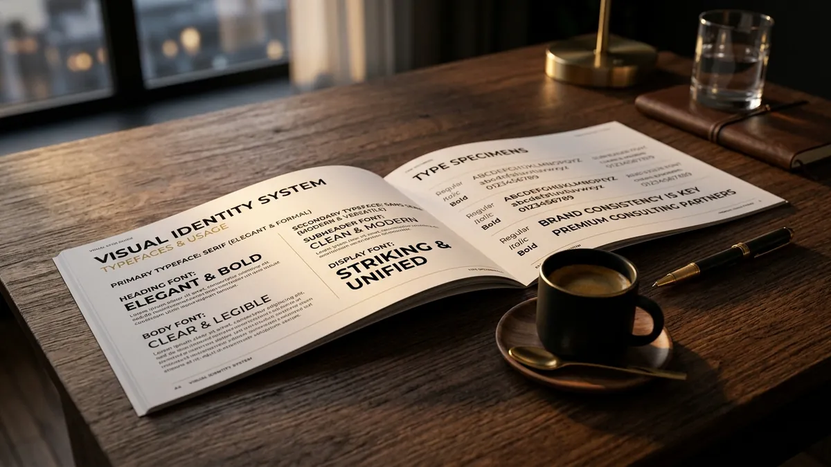
What should a founder actually do about this? Start by auditing where your logo currently lives. Pull up your website header, your WhatsApp Business profile, your Instagram page, your email signature, and your invoice or quotation template. Put them all on one screen. Ask yourself honestly — do these all look like they belong to the same business? If they do not, that is the problem to fix first. Not the logo itself, but the consistency of how it is used. A strong logo used inconsistently will always underperform a simple logo used with discipline. I cover this and other practical identity decisions in my business growth workshops for founders who want to build credibility without starting from scratch.
If after that audit you genuinely feel the logo itself is the problem — it is pixelated, it was made in Canva with a free font, it looks nothing like your actual business — then yes, invest in a redesign. But go in with a brief, not just a mood board. Tell the designer what you do, who your buyer is, what feeling you want to create, and where the logo will actually be used. A designer who does not ask those questions before starting will give you something that looks nice but does not work. And you will be back at the same problem in two years.
A logo is the beginning of trust, not the proof of it. The businesses I have seen grow steadily are not the ones with the most beautiful logos. They are the ones who took their logo seriously enough to use it consistently, pair it with professional materials, and make sure every customer touchpoint felt like it came from the same place. That is what turns a logo into a brand. And that is when it starts making you money. If you are unsure where to begin with your own identity, you can always reach out through the contact page and we can figure out the right starting point together.
Want to understand where your business growth is stuck?
Book a Business Growth Diagnostic with Abhijit JK — an honest, focused 60-minute one-to-one session with Abhijit JK on your brand, website and growth.
Book a Business Growth Diagnostic