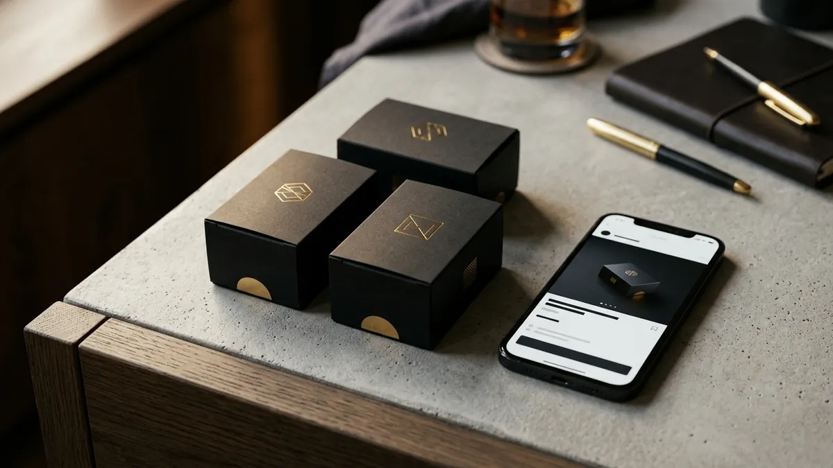
Why Your Logo Is Not Making Your Business Memorable
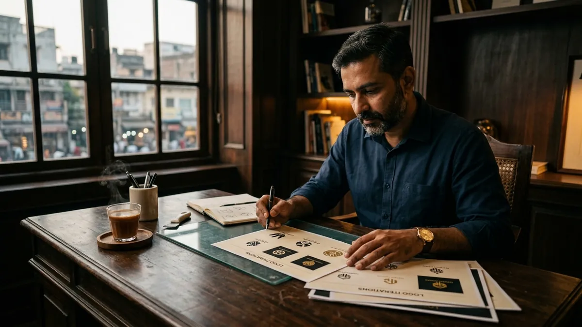
Most business owners I meet have a logo. They paid someone to make it — sometimes a designer, sometimes a relative who is good with computers, sometimes a freelancer found on a WhatsApp group. The logo got made. It went on the letterhead, the board outside the shop, the WhatsApp display picture. And then nothing changed. Customers still do not remember the brand. The business still has to explain itself every single time. The logo exists, but it is not working.
A logo is not decoration. It is a memory trigger. When someone sees your logo three, four, five times across different places — your van, your packaging, your invoice, your Instagram — their brain starts forming an association. 'This is that business. I know them.' That association is trust before a single conversation happens. If your logo is inconsistent, forgettable or disconnected from what you actually do, that association never forms. You are starting from zero every single time.
The most common problem I see is a logo that is trying to say too many things. A gear icon for a manufacturer who also does trading and wants to look tech-forward. A globe because 'we want to go international someday.' A lotus because it feels Indian and premium. Each of these might make sense in isolation. Together, they produce a logo that says nothing clearly. Simplicity is not laziness. It is the hardest thing to get right. The logos you remember — think of any brand you buy from regularly — are almost always simple. One clear shape, one clear idea.
The second problem is colour. I have written separately about why your brand colours matter, but with logos specifically, the issue is usually too many colours or colours chosen for personal preference rather than buyer psychology. A stone quarry owner once showed me his logo — bright pink and yellow, because those were his favourite colours. Nothing wrong with that personally. But his buyers were construction contractors and architects. That colour combination signalled everything except reliability, durability and strength. Your logo's colours need to speak to your buyer's brain, not your own.
Then there is the font problem. Many logos in India use a typeface that came bundled with a software, or one that the designer had on their system, or whatever was trending that year. Five years later, the font looks dated. Or worse, it looks identical to fifty other businesses in your category. The typeface inside your logo carries as much meaning as the symbol. A rounded, friendly font says something different from a sharp, geometric one. Neither is wrong — but one of them is right for your specific buyer.
Here is a practical test you can do this week. Print your logo in black and white, at the size it would appear on a visiting card. Show it to five people who do not know your business. Ask them: what kind of company do you think this is? If their answers are all over the place, or if they describe something completely unrelated to what you do, your logo is failing the basic test. A good logo should communicate your category and character even without colour, even without your business name next to it. Most logos in the MSME space fail this test badly.
Fixing this does not always mean starting over. I have worked with founders where a small intervention — simplifying the icon, changing the font weight, adjusting one colour — made a significant difference in how the brand was perceived. A full rebrand is sometimes necessary, but not always. What matters more than having a perfect logo is having a consistent one. Same version. Same colours. Same proportions. Everywhere. The moment your logo looks different on your banner versus your packaging versus your website, the memory trigger breaks. Buyers feel a vague unease they cannot name, and they walk away. If you are unsure where to begin, a one-to-one consultation can help you identify exactly what is working and what is silently costing you.
I see this most often with businesses that have been running for ten or fifteen years and have accumulated multiple versions of their logo across different materials. The original EPS file is lost. The board painter used an older version. The packaging vendor used a JPG someone sent on WhatsApp. Nobody is tracking it. The result is a brand that looks like it has no idea what it is. Buyers sense this even if they cannot articulate it. It reads as a business that does not take itself seriously. Which means they will not take it seriously either.
Your logo is often the first thing a buyer sees and the last thing they remember when they are deciding who to call. Getting it right — simple, relevant, consistent, correctly coloured — is not a vanity project. It is the foundation of everything else you do in marketing. If you want to go deeper on this with your team, I occasionally run business growth workshops where visual identity is covered as part of how buyers make decisions. Start by doing the black and white test this week. You will learn something useful, I promise.
Want to understand where your business growth is stuck?
Book a Business Growth Diagnostic with Abhijit JK — an honest, focused 60-minute one-to-one session with Abhijit JK on your brand, website and growth.
Book a Business Growth Diagnostic