Why Your Logo Looks Fine But Your Brand Looks Cheap
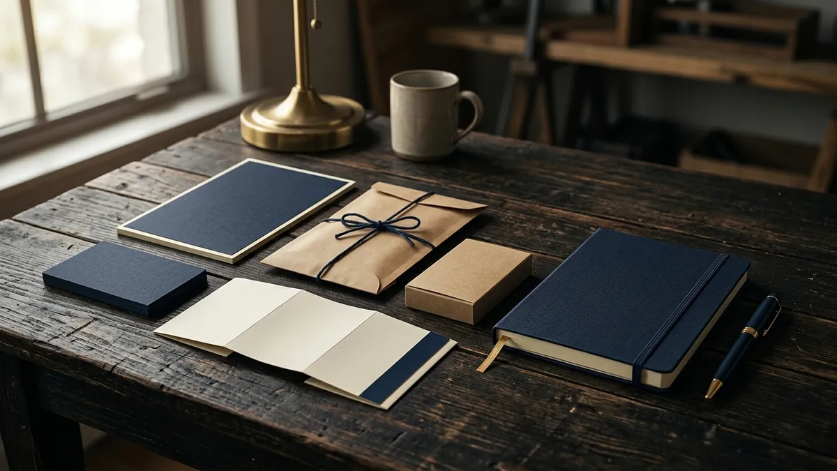
Most business owners I meet are proud of their logo. They spent real money on it. A designer worked on it for two weeks. It looks clean, modern, sometimes even premium. And yet — something feels off when a customer lands on their website, opens their catalogue, or receives their quotation email. The logo is fine. The brand is not. That gap is exactly what this article is about.
Here is the thing most designers do not tell you when they hand over your logo files: a logo is just one piece. It is the face, yes. But the face alone does not dress you. The clothes, the posture, the way you speak, the room you walk into — all of that creates the impression. In brand terms, that means your fonts, your colours, your photographs, your layout, your stationery, your social media posts, your packaging, your invoice. All of it together is your visual identity. And most Indian MSMEs only have one part — the logo.
I have seen this clearly with manufacturers and service businesses across Bengaluru and other cities. The owner invests in a decent logo. Then a nephew or a junior team member builds the website using whatever template they find. The catalogue gets designed by the printing vendor. The social media posts are made by an intern with Canva and no brief. Each piece looks okay in isolation. Together, they look like four different companies. Customers sense this without being able to name it. What they feel is: this business does not look serious.
The problem is not that your logo is weak. The problem is that your logo exists alone in a visual vacuum. Premium brands — whether it is a Rs 200 crore FMCG company or a boutique consultancy — look consistent everywhere. Same typeface family. Same colour palette used the same way. Same photo style. Same tone. When a customer moves from your Instagram to your website to your brochure, it feels like the same brand is speaking. That coherence is what trust is built on. Without it, even a great logo cannot save you. If you want to understand where your brand actually stands today, a brand analysis is a useful place to start.
Let me give you a practical example. I worked with a textile manufacturer in the apparel space who had a sharp, professional logo — deep navy, clean serif typeface, very premium feel. But their product images were shot on a phone with no lighting. Their email signature used Comic Sans. Their WhatsApp catalogue was a JPEG with a yellow background. Buyers from modern retail chains were walking away. The logo said Rs 5,000 a metre. Everything else said Rs 500. The buyer believed everything else.
So what do you actually fix? Start with what I call the non-negotiables of visual identity. First, pick two or three typefaces and use them everywhere — one for headings, one for body text, never more. Second, define your brand colours as exact codes — not 'dark blue', but #1A2E4A — and apply them consistently across every material. Third, decide on a photo style. Do you use bright, airy images or moody, dark ones? Lifestyle or product-only? Pick one direction and stick to it. Fourth, create a simple one-page brand reference sheet that your designer, your social media person and your printer all follow. This is not complicated work. But it is disciplined work, and most founders skip it because it does not feel urgent. If you want structured help thinking this through, consider joining the 2-day business growth workshop where we work on exactly this kind of foundation.
Typography deserves a separate mention because it is the most underestimated element in Indian business design. Fonts carry personality. A thin, geometric sans-serif says modern and minimal. A heavy slab serif says robust and confident. Script fonts say handcrafted and personal. Most businesses pick fonts based on what looks nice to the founder that afternoon, with no thought to what it communicates to the customer. Then they use three different fonts across their materials because no rule was ever set. The result is visual noise. Customers do not read this noise consciously — they just feel unsettled and move on.
Colour consistency has the same issue. I have seen brands use six different shades of green across their materials because nobody standardised the code. One shade on the website, another on the brochure, a third on the visiting card. Separately, each looks fine. Together, they signal carelessness. And carelessness in design makes buyers wonder about carelessness in your product or service. This is not a small thing. Premium perception is built in the details. If a customer is choosing between you and a competitor at a similar price point, the one who looks more put-together wins — almost every time.
If you have been in business for a few years and feel like your brand is not getting the respect or the price it deserves, do not immediately commission a new logo. Audit what you already have first. Lay out your website, your social media, your email footer, your quotation document and your packaging side by side. Do they look like they belong to the same family? If not, you do not need a new logo — you need a consistent visual identity built around the one you have. That work is less expensive than a rebrand and far more impactful than another round of ads. You can book a one-to-one consultation to walk through your materials and get a clear picture of what to fix first.
Want to understand where your business growth is stuck?
Book a Business Growth Diagnostic with Abhijit JK — an honest, focused 60-minute one-to-one session with Abhijit JK on your brand, website and growth.
Book a Business Growth Diagnostic

