Why Your Logo Looks Good But Your Brand Feels Cheap
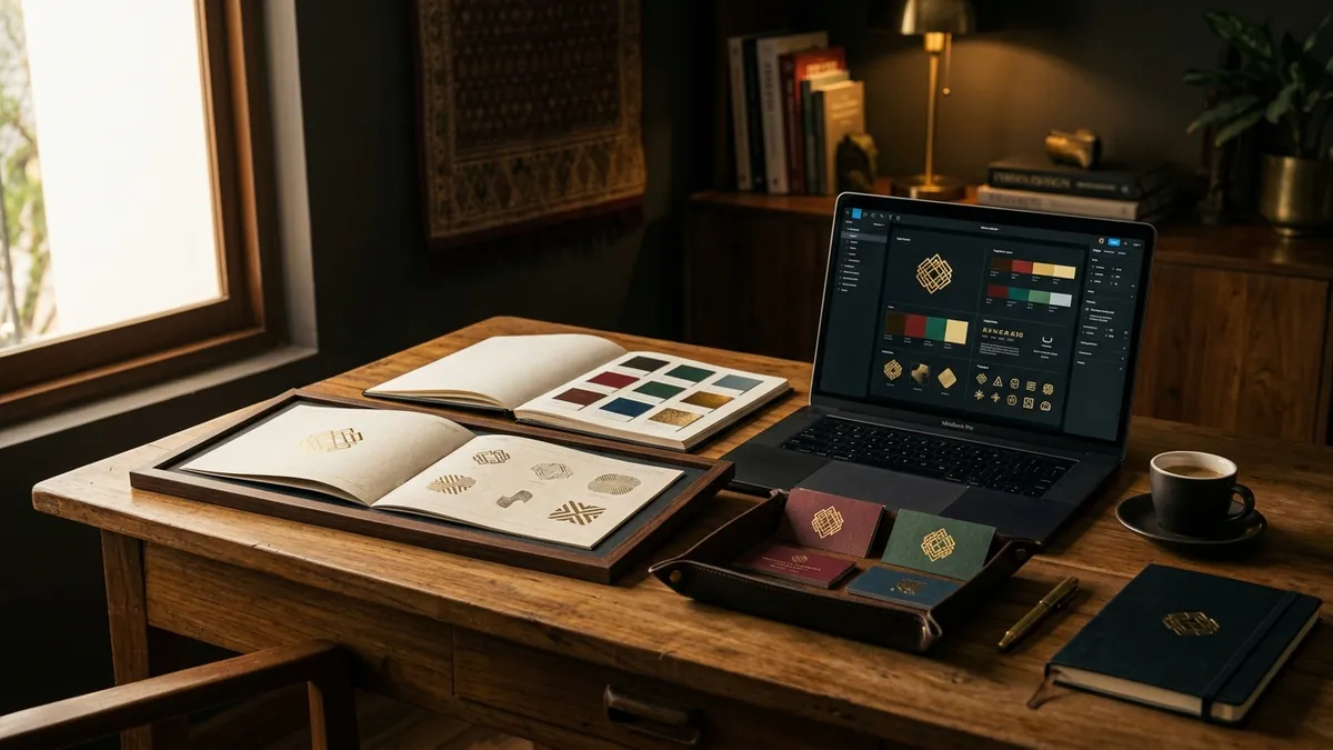
Most business owners I meet have already spent money on a logo. Sometimes decent money. A designer on Behance, a freelancer from Instagram, maybe even a small agency. The logo looks fine. It has clean lines, a proper font, maybe a sharp icon. But when a potential customer lands on the website, visits the office, or opens a proposal — something feels off. It does not feel premium. It does not feel trustworthy. And the owner cannot figure out why.
The problem is almost never the logo. The logo is just one piece. A visual identity is everything the customer sees — your logo, yes, but also the fonts used on your website, the colours on your invoice, the photographs on your Instagram page, the way your visiting card is laid out, the email footer, the packaging if you have one. When any of these are inconsistent or careless, the whole thing falls apart. A beautiful logo sitting on top of a poorly designed website is like wearing a tailored suit with rubber chappals. People notice.
I have seen this pattern repeatedly with manufacturers and service businesses across India. The founder invests in a logo but then builds the rest of the brand piecemeal — one designer for the brochure, a different freelancer for the website, the sales team creating their own PowerPoint decks with random fonts and clip art. The result is a brand that looks like it was assembled in a hurry, because it was. Customers pick up on this signal even if they cannot name it. What they feel is: this business is not serious.
Colour is one of the biggest culprits. If your logo has a specific shade of blue, that exact shade needs to carry through everywhere — website, social media posts, packaging, letterheads, signage. Not an approximation. Not whatever blue the printer had in stock. When colours drift, even slightly, it tells the customer that nobody is in charge of the brand. A brand analysis is often the fastest way to see exactly where your visual identity is breaking down and what it is costing you.
Typography is just as important, and almost completely ignored by most Indian small businesses. Founders use one font on the logo, another on the website, a third on the brochure, and whatever default font Microsoft Word loads for the proposal. Customers do not consciously read fonts, but they feel the inconsistency. A business that uses two clean, intentional fonts everywhere — and uses them consistently — looks more organised, more credible and more worth paying a premium to.
Photography and imagery do more damage than most founders expect. You can have the best logo in your industry. But if your website has stock photos of white foreigners shaking hands in a glass building, or blurry photographs taken on someone's phone in bad lighting, it undercuts everything. Real, good-quality photographs of your team, your workspace, your product or your process are worth far more than a clever logo. If budget is limited, even a single half-day shoot with a competent photographer will transform how your brand looks online.
Here is what I recommend founders do this month. Pull up your website, your latest proposal, your most recent Instagram post and your visiting card. Lay them side by side — physically or in separate tabs. Ask yourself honestly: do these look like they came from the same business? Do they use the same colours, the same fonts, the same visual style? If the answer is no, that is your problem. Not the logo. If you want a structured way to work through this, a one-to-one consultation can help you build a clear visual identity system without needing to redo everything from scratch.
The businesses I have seen build real brand equity in India are not always the ones with the fanciest logos. They are the ones that are ruthlessly consistent. The same font on the gate board and on the website. The same tone in the Instagram caption and in the sales email. The same colour in the product packaging and on the delivery vehicle. Consistency is what makes a brand feel premium — not the design budget. Consistency signals that someone in this organisation cares about every detail. And that signal is exactly what makes customers trust you before they have even spoken to you.
If you are a founder reading this and you recognise your own brand in what I have described, the fix is not a new logo. The fix is a proper visual identity system — a one-page brand guide that specifies your exact colours, your fonts, your photography style and how your logo can and cannot be used. Once your team has that document, every designer, every printer and every marketing vendor works from the same page. Your brand stops looking assembled and starts looking intentional. That is when customers stop asking you to justify your price.
Want to understand where your business growth is stuck?
Book a Business Growth Diagnostic with Abhijit JK — an honest, focused 60-minute one-to-one session with Abhijit JK on your brand, website and growth.
Book a Business Growth Diagnostic

