Why Your Logo Looks Outdated Before You Even Print It
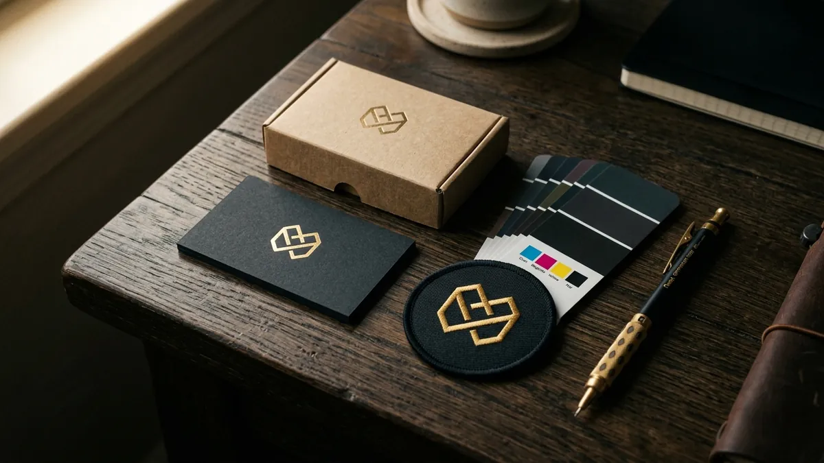
Most business owners I meet went through the same process. They found a designer — sometimes a local studio, sometimes a freelancer on Instagram, sometimes a cousin who 'does Photoshop' — got a logo made for somewhere between ₹2,000 and ₹15,000, and then felt something was off the moment they saw it on their visiting card. They couldn't explain what was wrong. It just didn't feel right. That feeling was correct. The logo was already outdated before a single card was printed.
The problem starts at the brief. Most founders say things like 'make it look professional' or 'I want something clean and modern.' These are meaningless instructions for a designer and meaningless promises back to the client. Without understanding what the business actually does, who it serves, how it wants to be perceived and where the logo will be used — the designer has no real brief. They go to Google Images, search your industry, find references, pick fonts and colours that feel safe, and hand you something generic. It is not bad design. It is design without direction.
Then there is the font problem. Rounded sans-serif fonts with gradients were considered modern in 2015. Thin geometric fonts felt premium in 2018. By the time most small businesses in India adopt a design trend, that trend has already moved on internationally. The logo a founder receives in 2024 often looks like it belongs to a business that started in 2016. Designers who work at low price points do not have time to study current brand design thinking. They work fast, deliver fast, and move to the next client. The result is a logo that was already behind before it left the designer's folder.
Colour is another area where things go wrong early. I have seen manufacturers in the industrial and engineering space use bright blue and yellow because 'it stands out.' Service businesses pick green because it feels trustworthy. Everyone picks red to feel energetic. Nobody thinks about what the colour communicates to the specific customer they are trying to attract. A premium B2B brand in a conservative sector using neon orange is not standing out in a good way. Colour without strategy is just noise. If you want to understand how your current brand identity is actually reading to the market, a proper brand analysis will show you where the gaps are.
The single biggest technical mistake I see is logos built only for digital. The designer creates a square or rectangle layout that looks fine on a mobile screen. Then the business owner tries to use it on a banner, a packaging box, an embroidery patch on a uniform, or embossed on stationery — and the logo falls apart. Logos need to work in multiple formats. Horizontal, vertical, stacked, single colour, reversed on dark backgrounds, black and white for stamps and faxes, simplified for very small sizes. A logo that cannot do all of these is not a finished logo. It is a starting point that was never completed.
Most business owners only discover this at the worst possible time. Right before a trade show. When a hotel or hospital client asks for a print-ready file. When a packaging vendor asks for vector artwork and the founder has only a JPG. These are avoidable situations. The solution is not to spend more money on design every time. The solution is to build a proper logo and visual identity system once — correctly — with clear documentation. Font names, colour codes in CMYK and RGB, clear space rules, what not to do with the logo. One file that your printer, vendor, web developer and social media team can all work from without guessing.
I want to say something that some designers may not like. Price alone is not the problem. I have seen expensive logos that are just as directionless as cheap ones, because the brief was still vague. And I have seen straightforward, well-reasoned logos made at modest budgets that hold up across every touchpoint for years. What matters is clarity of thought before the design work begins. What does your business stand for? Who are you trying to attract? Where will your logo live? What feeling should it create? If you cannot answer these questions clearly, no designer — at any price — can make a logo that will serve you well. A one-to-one consultation is often the right starting point before you brief any design studio.
If you already have a logo and something feels off, here is what I suggest. Print it in black and white. Shrink it to the size of a thumbnail on your phone. Place it next to one from a business you genuinely admire in your category. Ask yourself honestly — does this feel like it belongs to the same league? If the answer is no, you do not necessarily need a full redesign. Sometimes a logo just needs refinement. Better font choice. Cleaner spacing. A more deliberate colour. But sometimes it needs to be started again from a proper brief. The worst thing a founder can do is keep printing and publishing a logo they are not proud of, hoping nobody notices. Customers notice. They may not say it, but they notice.
A logo is not decoration. It is the first signal your business sends before anyone reads a word you have written. It tells a customer whether you are serious, whether you have put thought into your business, and whether you are the kind of brand they want to be associated with. Indian MSMEs and manufacturers are competing increasingly against larger brands and organised players — both online and on the shelf. A weak logo is not just an aesthetic problem. It is a business problem. Get it right once, document it properly, and it will work for you for years without asking for anything in return.
Want to understand where your business growth is stuck?
Book a Business Growth Diagnostic with Abhijit JK — an honest, focused 60-minute one-to-one session with Abhijit JK on your brand, website and growth.
Book a Business Growth Diagnostic

