Why Your Packaging Is Losing You Shelf Space
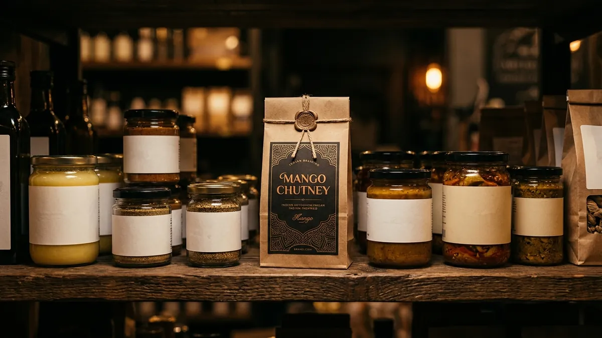
Most product business owners I meet spend months perfecting their formulation, sourcing, and pricing. Then they put everything into a generic box with a sticker printed at the local print shop. They wonder why distributors are not excited, why retail buyers are not calling back, and why their product sits at the back of the shelf. The answer is almost always the packaging.
Packaging is not just a container. It is the first sales conversation your product has — without you being in the room. In a retail environment, you have about two seconds before a buyer's eye moves to the next product. If your packaging does not arrest attention in those two seconds, you have already lost. This is true for supermarkets, pharmacy shelves, gift stores, and even online product listings on Amazon or quick-commerce apps.
I have seen this pattern with food and beverage manufacturers in particular. The product tastes genuinely good. Home users love it. But when they go to a modern trade retailer or try to get listed on Blinkit or Zepto, the buyer says 'your packaging is not shelf-ready.' What that means in plain language: it looks like a home-made product, not a brand. The font is mismatched, the colours look dull in store lighting, the hierarchy of information is all wrong. The buyer cannot trust it enough to put it next to established brands.
There are four specific packaging problems I see repeatedly with Indian MSME product brands. First, too much text on the front panel. Founders want to explain everything — ingredients, benefits, story, certifications — all on the front face. But the front panel has one job: make someone stop and pick it up. Everything else goes on the back or side. Second, fonts that were never meant for packaging. Decorative fonts downloaded free from the internet look blurry at small sizes, lose readability under store lighting, and signal that nobody with professional experience was involved. Third, colours chosen because the founder likes them, not because they communicate the right thing on a shelf surrounded by competitors. And fourth, no clear visual hierarchy. The eye does not know where to look first — the brand name, the product name, the variant, or the claim.
The fix is not always a complete redesign. Sometimes it is one focused intervention. I usually ask my clients to do this first: stand in the aisle of a store that stocks your competitors and photograph their products next to yours. Then look at the photos on your phone at arm's length. That distance and that small screen mimic how a buyer genuinely sees products. You will immediately see whether your packaging holds its own or disappears. This exercise alone changes how founders think about their packaging. If you want a more structured assessment, a brand analysis can map exactly where your visual identity is breaking down.
Online is a different challenge but the same principle. On a marketplace listing, your product thumbnail is roughly the size of a postage stamp in a grid of twelve similar products. If your packaging does not read clearly at that size — if the brand name is not visible, if the colour does not stand out — your listing gets skipped. This is why brands that invest in clean, high-contrast packaging consistently get better click-through on D2C and marketplace platforms. It is not magic. It is visual communication doing its job.
Premium positioning in packaging comes from restraint, not decoration. The brands that look expensive typically use fewer fonts, more white space, cleaner colour palettes, and better paper or material finishing. You do not need a massive budget to look premium. You need intentional design decisions. I have worked with a boutique spice brand that upgraded from a generic plastic pouch to a kraft paper pack with a single-colour stamp and clean typography. Their average order value went up by forty percent because buyers perceived it as artisanal and worth paying more for. The product did not change. The perception did.
If you are a manufacturer looking to expand into modern trade or export markets, your packaging will be scrutinised harder than your product specification in many initial conversations. Buyers in modern trade have planograms — pre-planned shelf layouts — and they need your packaging to fit visually and dimensionally. Your packaging design needs to work in that context. This is something worth discussing in detail if you are planning that expansion. A one-to-one consultation is often where these packaging strategy conversations happen most productively, because every product category and every retail channel has its own visual language.
The practical starting point this month: pull out your current packaging and ask three honest questions. Does a stranger understand what this product is within two seconds? Does it look like it belongs next to the top three brands in my category? Does it photograph well on a white background for an online listing? If the answer to any of these is no, you have a packaging problem that is costing you revenue right now — not in theory, but in actual missed sales. The good news is that packaging is one of the most fixable brand problems a product business has. It just needs the right attention, in the right order.
Want to understand where your business growth is stuck?
Book a Business Growth Diagnostic with Abhijit JK — an honest, focused 60-minute one-to-one session with Abhijit JK on your brand, website and growth.
Book a Business Growth Diagnostic

