Why Your Packaging Looks Cheap Even With a Good Product
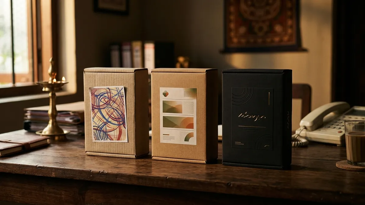
Most business owners I meet are proud of their product. They should be — they have spent years perfecting the formulation, the quality, the sourcing. But when I ask them who designed their packaging, I usually hear one of two things: either a local printer did it, or a nephew who knows Photoshop. That is where the problem starts.
Packaging is not decoration. It is the first sales conversation your product has — without you in the room. When a customer picks up your product on a shelf, or sees it arrive in a courier box, or spots it on a retailer's counter, they are making a judgment in under three seconds. That judgment is almost entirely visual. If the packaging looks cheap, the product feels cheap — regardless of what is inside.
I have seen this most sharply with food and personal care manufacturers in Bengaluru and smaller cities. They produce genuinely good products — better than some national brands — but they lose shelf space and customer confidence because their label looks like it was printed at a stationery shop. And sometimes it was. The printer gave them a template, they added their logo and ingredient list, and called it done. That is not packaging design. That is label printing.
There are a few specific things that make packaging look cheap even when the product is not. The first is font overload — too many typefaces, none of them chosen with intention. The second is low-resolution images, especially product photography that was shot on a mobile in bad lighting. The third is colour choices that were made by the printer's default palette rather than by someone who understands what your target buyer responds to. And the fourth — which almost nobody talks about — is inconsistency between the packaging and every other visual touchpoint the customer sees. If your Instagram looks different from your box, which looks different from your invoice, you have no brand — you have a collection of disconnected visuals. If you want to understand where your brand identity currently stands, a proper brand analysis can reveal exactly this.
The premium feeling customers associate with a product is built through a combination of structure, surface, and detail. Structure is the box shape, the container form, the unboxing experience. Surface is the material quality — matte vs gloss lamination, paper weight, tactile finishes. Detail is typography, spacing, hierarchy, and the small visual cues that tell a buyer this brand pays attention. You do not need an expensive agency to get this right. But you do need someone who understands visual identity, not just printing. Most MSME founders conflate the two and end up spending money on printing a design that should never have gone to print.
Here is a practical way to audit your own packaging before you spend on a redesign. Put your product next to the top three competitors in your category — or next to a brand your target customer already trusts and buys. Look at it honestly. Does yours look like it belongs in the same tier? Or does it look like the budget version? If a customer is comparing the two on a shelf or a marketplace listing, which one would they pick up first? This comparison exercise tells you more than any survey. I often walk through this with founders during a one-to-one consultation because the honest answer is sometimes uncomfortable but always clarifying.
If a full redesign is not possible right now, there are three things you can fix without rebuilding everything. First, get proper product photography done — even one well-lit, clean hero shot changes how everything looks online. Second, reduce the text on your front panel. Most Indian MSME packaging tries to say too much. A cleaner front label with just the product name, one line of benefit and your brand mark looks more premium immediately. Third, choose one typeface and use it consistently — across the label, your website, your WhatsApp catalogue and your social media. Consistency creates credibility, even before a customer reads a single word.
If you are planning a packaging redesign in the next six months, treat it as a brand decision, not a print decision. Involve someone who understands your customer, your category and your positioning — not just someone who can operate design software. The packaging should reflect where you want the brand to go, not where it has been. And it should be part of a cohesive visual identity system. If you are not sure where your brand identity needs the most work, a business growth diagnostic is a good starting point to understand the full picture before you invest.
Good packaging does not have to be expensive. It has to be intentional. That is the real gap I see in most Indian MSME brands. The product investment is serious and considered. The packaging investment is rushed and treated as an afterthought. Until you close that gap, you will keep losing sales that your product deserved to win.
Want to understand where your business growth is stuck?
Book a Business Growth Diagnostic with Abhijit JK — an honest, focused 60-minute one-to-one session with Abhijit JK on your brand, website and growth.
Book a Business Growth Diagnostic

