Why Your Brand Colours Are Costing You Customers
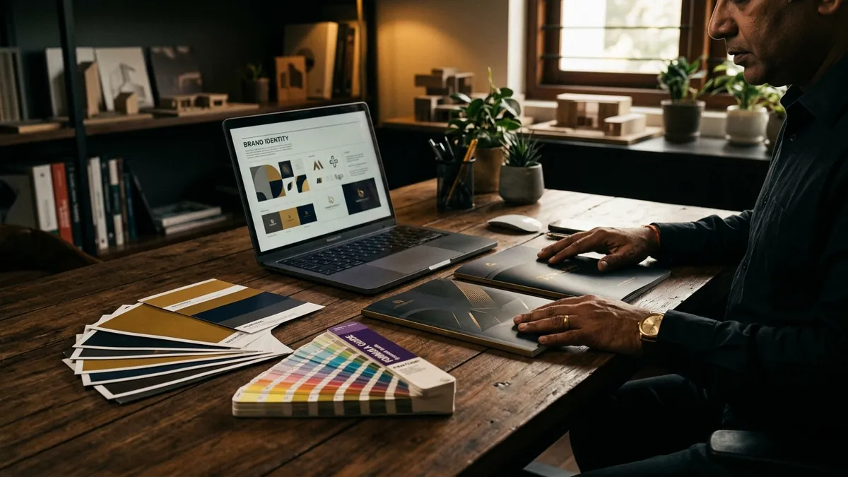
Most business owners I meet spend weeks deciding on their logo but choose their brand colours in under ten minutes. They pick what looks nice on a phone screen, or whatever their designer sent first, or worse — the colours they personally like. Then they wonder why their brand feels inconsistent, why customers cannot remember them, and why their packaging looks amateur next to competitors who are charging twice the price.
Colour is not decoration. It is communication. Before a buyer reads a single word on your brochure, your website or your packaging — they have already felt something about your brand. That feeling comes from colour. A pharma company using neon orange will make buyers uncomfortable. A premium saree label using clip-art gradients signals that the business is not serious. A B2B manufacturer using baby pink on their website loses credibility in the boardroom before the pitch even starts. These are not opinions. I have seen this play out with real businesses across Bengaluru and beyond.
Here is what most founders do not realise: colour affects perceived price. Buyers unconsciously connect certain colour combinations with quality levels. Clean, restrained palettes — often two or three colours used consistently — read as premium. Loud, mismatched, overloaded palettes read as cheap, even if the product itself is excellent. I worked with a textile exporter who had a genuinely world-class product but was using five clashing colours across his catalogue, his letterhead and his Instagram. Buyers were quoting him 30 percent lower than he deserved. We cleaned up the palette. The product did not change. The perception did.
Colour also has to match your category. This is where a lot of service businesses and manufacturers go wrong. They copy colours from brands they admire, which are often in completely different industries. An IT services company inspired by a fashion brand's coral and gold palette will confuse buyers. A food startup copying the dark, moody tones of a luxury whisky brand will look off. Your colours need to make sense inside your industry category first — and then differentiate you within it. That balance is the work. Anyone promising you a colour palette without understanding your category and your buyer is guessing.
There is also the consistency problem. You pick a shade of blue at the time of your logo design. Then your social media person uses a slightly different blue because they cannot find the exact hex code. Your printer uses a different blue because you did not share the Pantone reference. Your banner at an exhibition uses a completely different blue because the vendor adjusted it 'to make it look brighter.' After six months, your brand looks like four different businesses. Buyers cannot hold a clear image of you in their minds. Trust erodes. This is one of the issues I address directly in my one-to-one consultation — building a simple brand standards document that prevents this from happening.
Let me give you a practical framework. Your brand palette should ideally have three roles. First, a primary colour — this is your brand's dominant signal, the one that appears most and should be immediately associated with you. Second, a secondary colour — this supports the primary, used for contrast, highlights or backgrounds. Third, a neutral — white, off-white, a light grey, or a warm cream — that gives everything room to breathe. That is it. Three colours used with discipline will always look more premium than seven colours used randomly. Most Indian MSMEs I work with are using too many colours because no one told them that less is genuinely more.
A note on colour and digital versus print. Colours behave differently on screens compared to print. The bright saffron that looks bold on your phone screen can print as a washed-out orange on an uncoated paper brochure. The deep navy that looks sophisticated on your website can turn almost black on a flex banner. If your business uses both print and digital — and most do — your colour choices need to be tested in both environments before you lock them in. This is not complex work, but it does require someone who understands production, not just design software. At my business growth workshops, this is one of the practical exercises founders find most eye-opening.
The colours you choose also send signals about your values, whether you intend them to or not. Green implies sustainability, health or freshness — which is fine if that is genuinely part of your positioning, but misleading if it is not. Red implies urgency, energy or appetite — which works for food and retail but can feel aggressive in a professional services context. Black implies luxury and authority — but used without skill, it can feel heavy and unwelcoming. Gold implies premium — but overused in Indian branding, it now often reads as generic. The question is not which colour is best. The question is which colour combination is true to your brand, right for your category and different enough from your competitors.
Here is what I recommend you do this month. Open your website, your Instagram profile, your business card, your WhatsApp catalogue and one printed brochure. Put them all in front of you — physically or in separate tabs. Ask one simple question: do these all look like they belong to the same business? If the answer is no, you have a colour consistency problem that is quietly costing you credibility with every buyer who encounters more than one of these touchpoints. Start there. Fix the foundation. If you are unsure where to begin or what your colours should actually say about your brand, that is a conversation worth having — reach out through the contact page and let us look at it together.
Want to understand where your business growth is stuck?
Book a Business Growth Diagnostic with Abhijit JK — an honest, focused 60-minute one-to-one session with Abhijit JK on your brand, website and growth.
Book a Business Growth Diagnostic