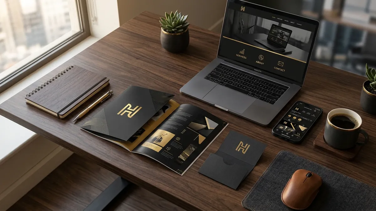
Why Your Business Card Still Kills Your First Impression
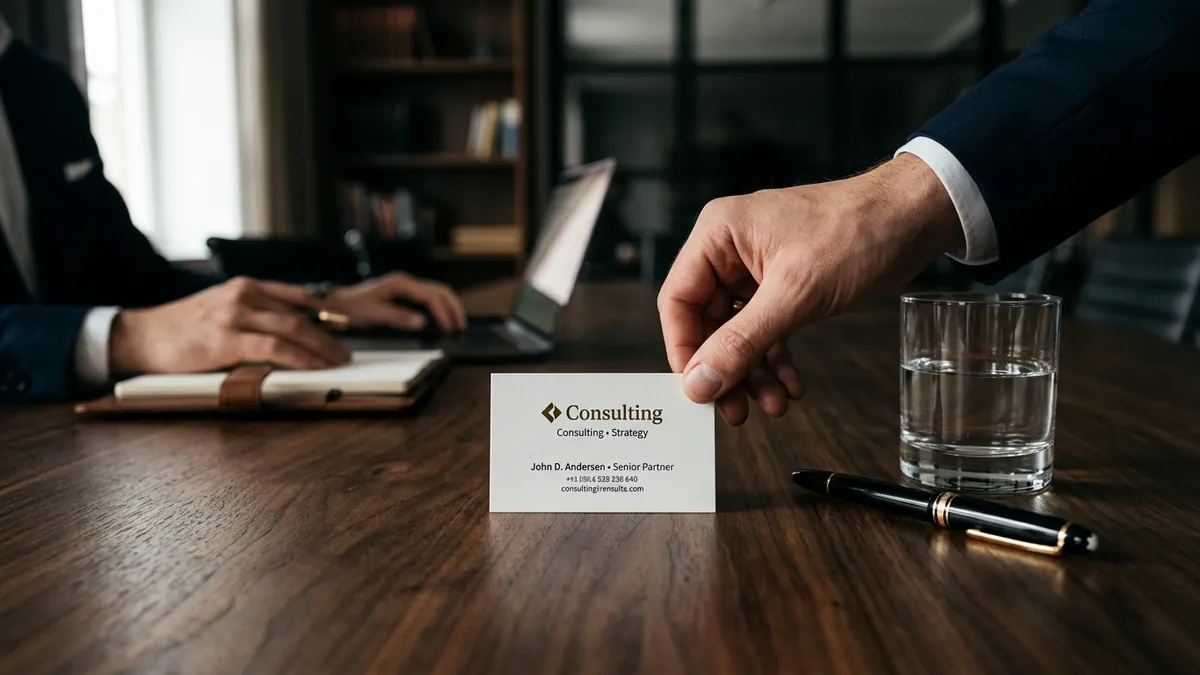
Most business owners I meet have a business card. Almost none of them have thought about what it is supposed to do. They got it designed five years ago at a print shop near their office, added their phone number, logo and designation, and printed five hundred copies. Job done. Except it is not done. That card is still doing damage every time it changes hands.
Here is the real purpose of a business card. It is not a contact sheet. It is a five-second brand impression. When someone holds your card after meeting you, they are forming a judgment about your business — whether you are serious, whether you are worth calling back, whether you belong in the league you are claiming. A card printed on 85 GSM stock with a pixelated logo and four different font sizes is telling that person something you did not intend to say.
The most common mistake I see with Indian MSMEs and service businesses is information overload. The card has a mobile number, a landline, a WhatsApp number, two email IDs, a website, an address, a tagline, a QR code and sometimes a small photograph. The person receiving it does not know where to look first. A cluttered card signals a cluttered business. Simplicity is not laziness. It is confidence. Put only what is necessary — one number, one email, your name, your role, your website. That is enough.
The second issue is logo quality. Many founders hand me a card where the logo looks blurry or stretched. This usually happens because the original logo file was designed at low resolution or only in JPEG format. Print needs vector files — typically AI or EPS formats — that scale without any quality loss. If your designer never gave you a vector file, that is a problem worth fixing this week. I have written about how logo quality connects to overall brand perception, and the same principle applies in print as it does on screen.
Typography is the part most people completely ignore. A card that uses three different fonts — one for the name, one for the designation, one for the contact details — in three different weights looks accidental. It shows that whoever designed it was filling space rather than making a deliberate choice. Good cards use one font family, maximum two weights. The hierarchy is clear — name is the largest, designation next, contact details smallest. Your eye should travel through the card in one smooth movement, not jump around trying to find what matters.
Colour is the other place where things go wrong fast. I have seen cards with neon green text on a white background, dark navy backgrounds with small grey text that nobody can read in poor light, and gradient backgrounds that print completely differently from what was shown on screen. Your card colour should match your brand colours exactly — using the same CMYK values your brand guidelines specify. If you do not have brand guidelines yet, that is a larger conversation worth having. I work through this with founders directly in a one-to-one consultation when we are building or fixing a visual identity from the ground up.
Paper stock and finish matter more than most people expect. A thick 350 GSM matte card feels different in the hand than a flimsy 130 GSM glossy one. The physical weight of the card transfers a feeling about your business. Premium paper is not expensive — the price difference between standard and good stock across five hundred cards is usually under five hundred rupees. Founders who spend two lakhs on a stall at a trade exhibition and then hand out cheap cards are wasting the impression they just paid to create. I cover this kind of brand touchpoint thinking in my business growth workshops for manufacturer and service business teams.
One thing that often gets overlooked is the back of the card. Most cards have a blank back. That is wasted space. Not wasted in the sense that you need to fill it with more information — but wasted because a well-designed back, even a solid brand colour or a single powerful line about what you do, makes the card feel considered. Considered design is the fastest signal of a trustworthy business. It tells the other person that you pay attention to details. And people hire and buy from businesses they believe pay attention.
If your card has not been updated in more than three years, or if it was designed by the same shop that printed it, it is worth a proper redesign. This does not mean spending a fortune. It means sitting down, deciding what your card is supposed to say about your business, and getting it designed with intention. Start with a clear brief: who are you handing this to, what do you want them to do after receiving it, and what feeling should the card leave them with. Answer those three questions before you brief any designer. That single exercise will improve the outcome more than any design trend you find on Pinterest. You can always reach out through the contact page if you want a quick opinion on where your current card stands.
Want to understand where your business growth is stuck?
Book a Business Growth Diagnostic with Abhijit JK — an honest, focused 60-minute one-to-one session with Abhijit JK on your brand, website and growth.
Book a Business Growth Diagnostic