Why Your Business Card Still Does Not Reflect Your Brand
Most business owners I meet carry a business card that was designed in a hurry. Someone in the family knew 'a design guy.' The card got made in two days. It had a logo, a phone number, the designation — done. That card has been reprinted three times since then with minor tweaks. The font is slightly different each time. The colours have shifted. Nobody noticed. Or so they think.
Here is what actually happens. You hand that card to a potential client or a buyer at a trade fair. They look at it for three seconds. Subconsciously, they are reading more than your name. They are reading whether you are serious, whether your business is organised, and whether the quality of your work matches the quality of that card. A card that looks like it was pulled from a free template tells them something — even if you never intended it to.
I have seen this with manufacturers in particular. Their product is genuinely good. Their factory is ISO certified. Their clients include decent-sized companies. But their business card has a clip art globe on it, five font styles, and a neon blue gradient that was fashionable in 2009. The card undermines everything their business has built. That gap between what you are and how you look is what I call a brand credibility leak.
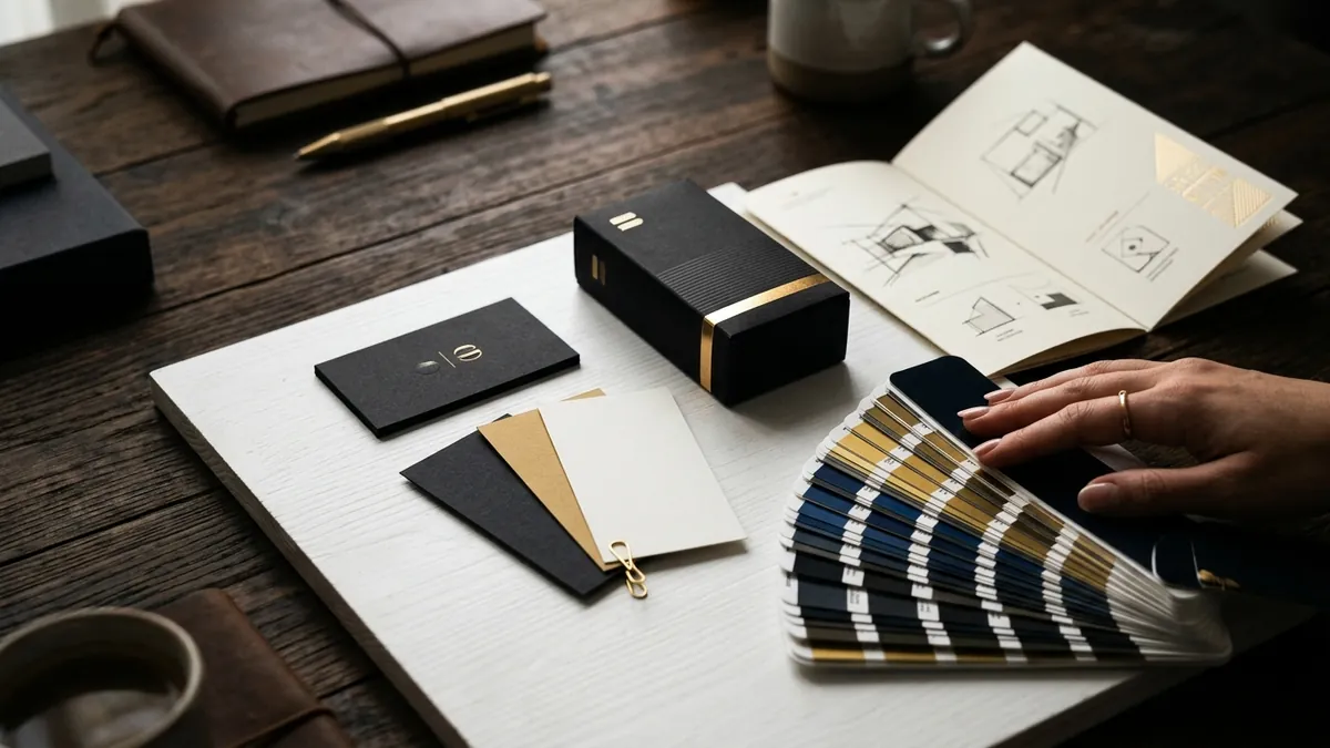
The most common mistake is treating the business card as a contact sheet. It is not. It is a designed object that represents your brand identity in physical form. Every element on it — typeface, colour, spacing, paper stock, finish — communicates something. When these elements are inconsistent with how your brand looks on your website, your WhatsApp profile, your letterhead or your packaging, buyers pick up on the disconnect even if they cannot name it. If you want to understand how to tighten this kind of inconsistency across your brand, a one-to-one consultation can help you identify exactly where the gaps are.
Let me give you a specific example of what goes wrong. A founder chooses a logo in dark green and gold because it looks premium. But when they get the card printed, the printer says gold is expensive so they substitute it with yellow. The green shifts slightly in CMYK. Now the card looks olive and mustard — which is a completely different personality. This is not a printing problem. This is a brand standards problem. Most small businesses have no defined colour codes, no specified fonts, no rules. So every vendor makes a different call and the brand drifts.
Another thing that costs founders more than they realise is the information hierarchy on the card. I see cards where the tagline is in the largest font, the name is somewhere in the middle, and the phone number is in 6-point text at the bottom. Or cards that list eight different services in a paragraph because the founder wanted to cover everything. A business card is not a brochure. It should have one job — make the right person want to call you or remember you clearly. Everything else is noise.
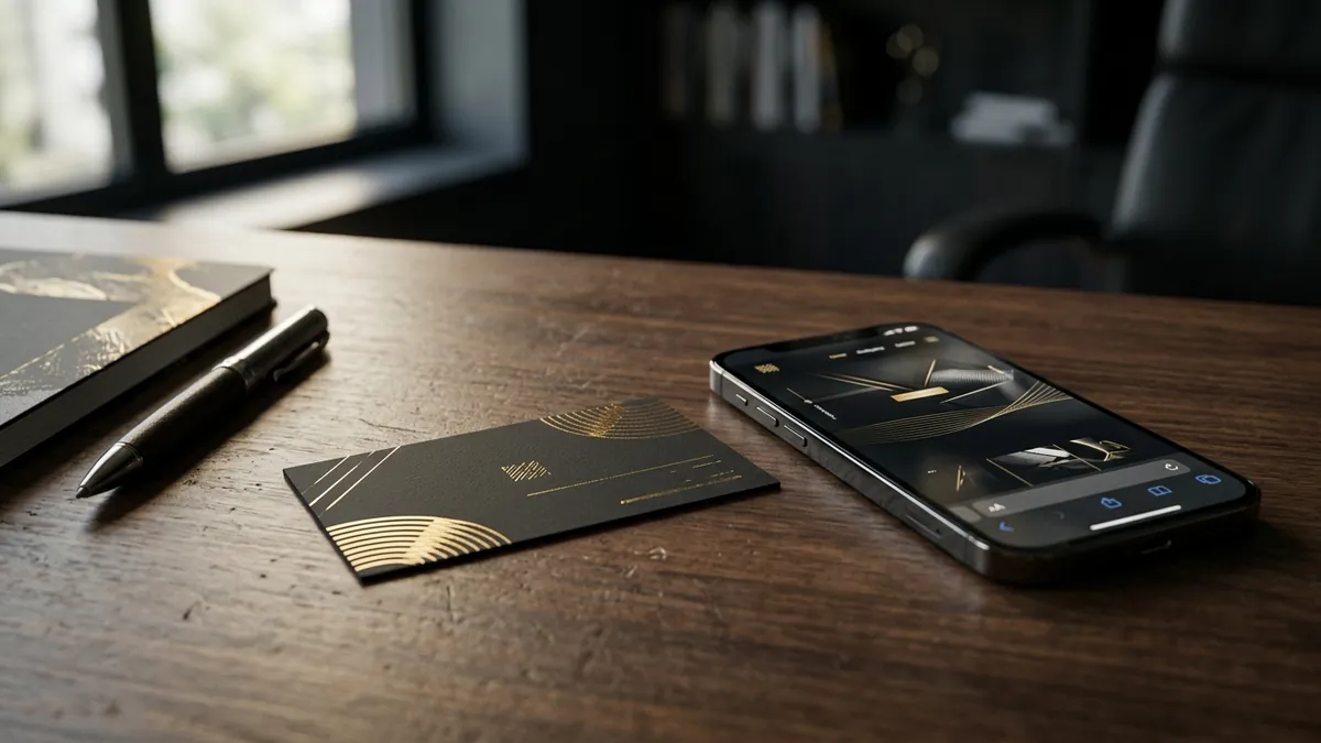
If you are redoing your card or reviewing your brand identity more broadly, here are a few practical things to fix before you print the next batch. First, get your brand colours in HEX, RGB and CMYK — not just 'blue and white.' Give these codes to every vendor and every designer who works with you. Second, decide on one or two typefaces that represent your brand and use only those. Third, print a physical sample before you approve a batch of 500. Look at it next to your website on your phone. If they feel like two different businesses, something is wrong. If you want to go deeper into how design and business positioning connect, our business growth workshops cover visual identity as part of the full brand-building process.
Paper and finish matter more than most founders think. A matte laminate card with clean typography signals something very different from a glossy card with embossed text from a neighbourhood press. Neither is universally right — it depends on your industry and your audience. A law firm, an interior designer and a street food brand all need cards that feel right for what they do. The card should feel like a natural extension of the business, not an afterthought.
The business card is a small thing. But it is one of the few brand assets that gets handed directly to a human being who could become your next client. It sits on their desk. It goes into their wallet. It gets photographed and saved. Getting it right is not about spending more money — it is about being intentional. If you are unsure where your current brand identity stands and whether your materials are working for or against you, you can always contact me and we can take a look together.
Want to understand where your business growth is stuck?
Book a Business Growth Diagnostic with Abhijit JK — an honest, focused 60-minute one-to-one session with Abhijit JK on your brand, website and growth.
Book a Business Growth Diagnostic