Why Your Packaging Is Costing You the Sale at the Shelf
Most business owners I meet spend months perfecting their product. The formula, the quality, the pricing. Then they pack it in a box that looks like it was designed in 2009 and wonder why sales are slow. The packaging is not an afterthought. It is the first salesperson your product has — and in many cases, the only one.
I have seen this with food manufacturers, skincare founders, home care brands, agro-product exporters. The moment I ask them to show me their packaging, there is always a pause. Sometimes embarrassment. They know it does not look right but they cannot quite name what is wrong. The truth is usually one of four things: the typography is unclear, the colour sends the wrong signal, there is too much text, or the design has no hierarchy — no single thing the eye lands on first.
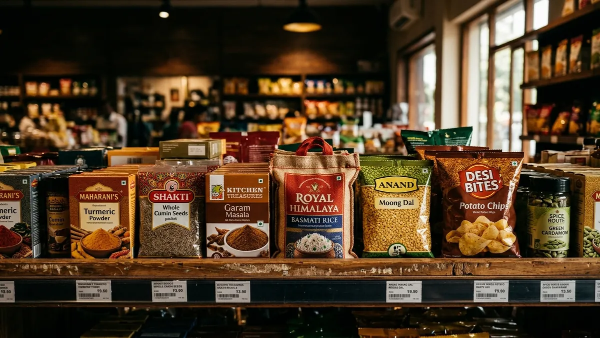
Here is a simple test. Put your product next to three competitor products on a table. Step back two metres. Which one draws your eye first? Which one communicates what it is and who it is for within three seconds? If your product is not in the top two, you are losing sales every single day — not because of quality but because of visual communication. Retailers know this. Modern trade buyers especially know this. They have rejected good products purely because the packaging looked cheap.
Shelf presence is a designed outcome, not an accident. It is built through contrast, clear focal points and consistent brand language. Contrast means your packaging stands out against the visual noise around it. A clear focal point means there is one thing — the product name, a hero image, a colour block — that the eye sees first. Brand language means the fonts, colours and tone feel like they belong to a real, thought-through brand and not a last-minute desktop publisher job. When all three work together, buyers pick up the pack. Once they pick it up, the back panel and your product story can do the rest of the work.
Colour is probably the most misused element in Indian MSME packaging. I have seen premium honey packed in a jar with a bright red-and-yellow label that reads 'discount grocery' to any trained eye. I have seen artisan coffee in packaging so dark and minimal it confused buyers into thinking it was something else entirely. Colour carries meaning before a single word is read. Cool blues signal hygiene and care. Earthy tones signal natural and artisanal. Gold and deep jewel tones signal premium. None of these are absolute rules but ignoring them creates friction. If your brand analysis has never included a packaging colour audit, that is a gap worth closing.
Typography is the other silent killer. Most small business packaging uses three to five different fonts. Each one chosen because it 'looked nice' at the time. The result is visual chaos that reads as unprofessional even to customers who could not explain why. The fix is straightforward: one font family for your brand, used consistently. A clear hierarchy — product name largest, variant or flavour second, claim or descriptor third. The body copy on the back should be legible at arm's length. If someone needs to squint to read your ingredients or weight, you have a legibility problem and a trust problem at the same time.
For founders who are ready to fix this properly, I usually start with what I call a packaging brief before any design work begins. This brief answers five questions: Who is the buyer? Where will they encounter this product? What is the one thing we want them to feel when they see the pack? What do competitors look like and how do we need to stand out? And what practical constraints exist — material, size, print process, budget? Without these answers, a designer is just guessing. With them, even a mid-range design budget produces something genuinely effective. If you want to work through this kind of thinking for your brand, a one-to-one consultation is the fastest way to get clear.
One more thing that gets ignored: packaging consistency across your product range. If you have five products and each one looks like it was made by a different company, you are leaving brand equity on the table. Every SKU is a chance to reinforce recognition. When a customer sees your second product on a shelf they have never shopped before, they should immediately recognise it as yours. That recognition is worth more than any individual product feature. It is what turns a one-time purchase into a customer who actively looks for your brand.
Packaging is not just about aesthetics. It is a business asset. Done well, it earns shelf space, commands a higher price point and builds the kind of trust that turns a first-time buyer into a repeat customer. Done poorly, it undermines everything else you have built — the product quality, the pricing, the distribution effort. If you are not sure where your packaging stands, start with that two-metre shelf test this week. What you see will tell you everything you need to know. And if you want a structured way to look at the full picture, the business growth diagnostic is a good starting point before committing to any redesign.
Want to understand where your business growth is stuck?
Book a Business Growth Diagnostic with Abhijit JK — an honest, focused 60-minute one-to-one session with Abhijit JK on your brand, website and growth.
Book a Business Growth Diagnostic