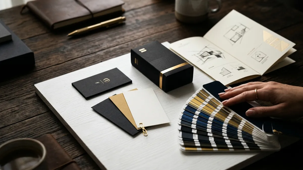
Why Your Product Photos Kill Sales Before Anyone Reads a Word
Most business owners I meet spend weeks deciding their price and hours writing a product description. Then they upload a photo clicked on a marble kitchen slab with a tube light overhead and wonder why nobody buys. That one photograph does more damage than a wrong price ever could. Buyers form a trust opinion in under three seconds. If your image looks careless, your entire business looks careless.
I have seen this pattern repeat constantly with manufacturers and product-based founders in Bengaluru, Coimbatore, Surat and Rajkot. They have a genuinely good product. Sometimes a better product than their competitor selling on the same platform. But the competitor's listing has clean, well-lit, consistent images — and is outselling them three to one. The product is not the problem. The visual presentation is.
Here is the real issue: most founders treat product photography as a cost, not a sales tool. So they postpone it, DIY it badly or use whatever image the supplier sent them. That supplier image is often the same one twenty other resellers are using. There is zero visual differentiation. Zero identity. When your buyer opens four browser tabs comparing options, you look identical to everyone else — except you look cheaper. Not affordable. Cheaper.
What does a good product photo actually need to do? First, it needs to remove doubt. A buyer who cannot see the size, the texture, the actual colour or the finish in your image will not buy. They will move on. Second, it needs to signal quality without a single word. A shoe photographed on a clean white sweep with correct lighting tells the buyer this brand is serious. The same shoe on a bedsheet tells them the opposite. Third, it needs to feel consistent with the rest of your brand. If your logo and packaging look professional but your photos look rushed, it creates cognitive discomfort. Buyers cannot name that feeling, but they act on it.
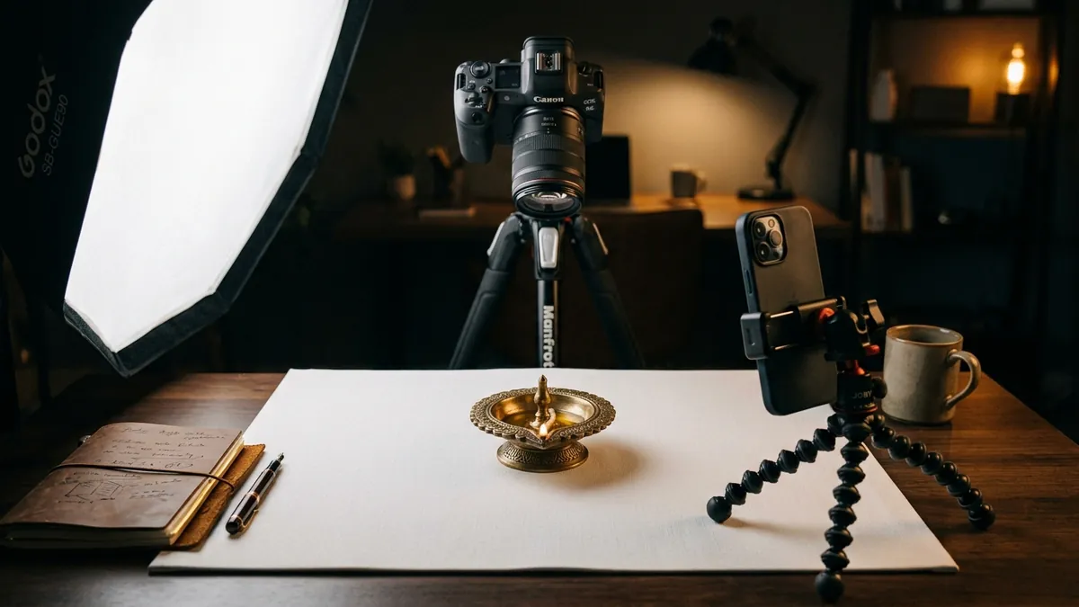
The fix is not always expensive. I am not telling you to hire a studio for ten lakh rupees. I am telling you to be deliberate. A white or light grey seamless background, one good light source — even a large window with diffused daylight — and a phone with a decent camera will take you seventy percent of the way. What matters more than equipment is consistency. Same background. Same lighting angle. Same framing style across every product. That consistency is what creates a visual identity. Buyers see your thumbnail on a marketplace and recognise it as yours without reading the brand name. That is the goal. If you want help auditing what your current visual presence communicates, a one-to-one consultation is where we usually start.
Lifestyle images are the second layer. Once you have your clean product shots, you need at least one image that shows the product in use or in context. A stainless steel water bottle sitting alone on white tells me nothing emotionally. The same bottle on a hiker's backpack strap on a trail tells me who this is for and why it matters. Indian buyers, especially D2C customers, are now extremely used to seeing lifestyle photography. If you are not doing it, you are leaving an emotional connection on the table. The context image does not need to be fancy. It needs to be honest and relevant.
There is also a consistency problem that goes beyond photography. I work with founders who have good product images on their website but blurry screenshots on their WhatsApp catalogue, stretched thumbnails on Instagram and a completely different look on Flipkart. Every platform where a buyer encounters your product is a brand touchpoint. When those touchpoints look inconsistent, your buyer's brain registers it as a reliability problem. Not a design problem. A reliability problem. That is the hidden cost of treating design channels as separate tasks instead of one coherent system. This is exactly the kind of ground-level identity work I cover in my business growth workshops.
One practical exercise you can do this week: open your top five product listings or your Instagram grid and look at them on your phone. Do they look like they belong to the same brand? Is the background consistent? Is the lighting similar? Does the framing feel deliberate? If you cannot answer yes to at least three of these, your visual identity has a gap that is silently costing you conversions. Make a list of which images need to be retaken and block one weekend for a proper shoot. Not perfect. Just intentional.
Visual identity is not about looking fancy. It is about looking trustworthy. When a buyer who has never met you, never visited your factory and never spoken to your team sees your product photo, that image is your handshake. Make it firm. If you want to understand how your full visual presence — photography, design, packaging and digital presence — works together or against you, you can read more about how I approach this on the about Abhijit page, or simply reach out through the contact page and we will figure out where to start.
Want to understand where your business growth is stuck?
Book a Business Growth Diagnostic with Abhijit JK — an honest, focused 60-minute one-to-one session with Abhijit JK on your brand, website and growth.
Book a Business Growth Diagnostic