Why Your Brand Colours Are Costing You Trust
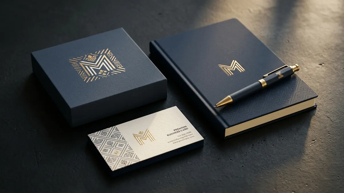
Most business owners I meet have spent serious time choosing their logo colour. They picked something they personally liked, or something that looked good on screen that day. What they did not think about was what that colour communicates to a stranger seeing their brand for the first time. That gap — between what you intended and what your buyer feels — is where trust quietly breaks.
Colour is not decoration. It is the first thing the human brain processes before text, before your tagline, before your offer. Research across buyer behaviour studies consistently shows that colour alone influences up to 85 percent of a purchase decision at the point of first impression. I have seen this play out with a pharma distributor in Hyderabad who used bright orange across all his materials because it matched his favourite cricket team. His buyers — doctors and hospital procurement heads — found the brand too casual for the kind of trust their field requires. He was losing credibility before the conversation started.
The problem is not just picking the wrong colour once. It is what happens after. When you use one shade of blue on your visiting card, a slightly different one on your website banner, and a third on your packaging — because different vendors matched it differently — your brand starts to look unreliable. Buyers cannot articulate why, but they sense something is off. Inconsistency at the colour level reads as inconsistency at the business level. If you have not run a proper brand analysis recently, this is usually one of the first things that shows up.
There is a specific pattern I see with Indian manufacturers and B2B service businesses. They often use colours that work for consumer brands — bright reds, electric greens, vivid yellows — because those feel energetic and visible. But their buyers are procurement managers, business owners or institutional clients who associate those colours with retail FMCG, not with a serious supply partner. The colour palette you need depends entirely on who is buying from you and what emotional state they need to be in to say yes. A trust-first category needs calm, confident colours. An impulse-buy category needs energy and warmth. These are not interchangeable.
Here is a common scenario. A Bengaluru-based interior fit-out company came to me after struggling to position themselves as a premium contractor for corporate offices. Their brand used lime green and dark grey. The green was chosen because it felt modern. But corporate clients associated it with eco-brands and wellness spaces — not precision contractors. After shifting to a deep slate blue with warm off-white, the brand's proposals started getting read differently. Nothing else changed. Same capability, same pricing, different colour signal. That is the power of this decision. If you want to understand how your current visual identity is being read by your buyers, a focused one-to-one consultation can surface these blind spots in a single session.
Beyond the primary colour, most brands ignore the role of secondary colours entirely. Your primary brand colour sets the tone. Your secondary colours do the work across your day-to-day communication — social media posts, invoices, packaging inserts, email headers, presentation decks. When these are not defined, your team picks whatever looks nice in the moment. Your designer makes independent choices. Your printer interpolates. Within six months, your brand looks like it has three different personalities. Fixing this does not require a full rebrand. It requires defining your colour system clearly — primary, secondary, accent, background — and documenting it with specific hex codes, CMYK values and Pantone references where relevant.
A few practical things you can do this month. First, pull every brand touchpoint you currently have — your website header, your social media profile image, your visiting card, your letterhead, your packaging if you have it — and place them side by side on one screen or one table. Look at the colours across all of them. If they do not look like they belong to the same family, you have a problem that needs to be solved before anything else. Second, ask someone outside your industry — ideally someone who represents your target buyer — what your brand colour makes them think of. Their first instinct will tell you more than any internal review. Third, if you are planning any design update this year, do not let your designer pick colours based on current trends. Anchor every colour decision to your buyer's psychology and your brand's positioning. If you want a structured way to do this across your entire brand, the 2-day business growth workshop covers visual identity positioning alongside business strategy.
One thing I want to be clear about. Changing your brand colours is not always the answer. Sometimes the colours are right but the application is wrong — wrong tones, wrong combinations, wrong hierarchy across materials. A good designer who understands brand strategy can often solve the problem without a full identity overhaul. But that requires honest assessment first. Most businesses skip that step and jump to execution, which is why the same problem resurfaces every eighteen months after another round of design spend.
Your brand colour is a business decision, not a creative preference. It either builds trust with your specific buyer or it quietly works against you. The brands that look consistently premium are not the ones with the most beautiful colours. They are the ones that chose colours deliberately, defined them precisely and applied them without compromise across every single touchpoint. That discipline is what makes a brand feel solid — and solid brands win on trust before the sales conversation even begins.
Want to understand where your business growth is stuck?
Book a Business Growth Diagnostic with Abhijit JK — an honest, focused 60-minute one-to-one session with Abhijit JK on your brand, website and growth.
Book a Business Growth Diagnostic