Why Your Logo Does Not Work at Small Sizes
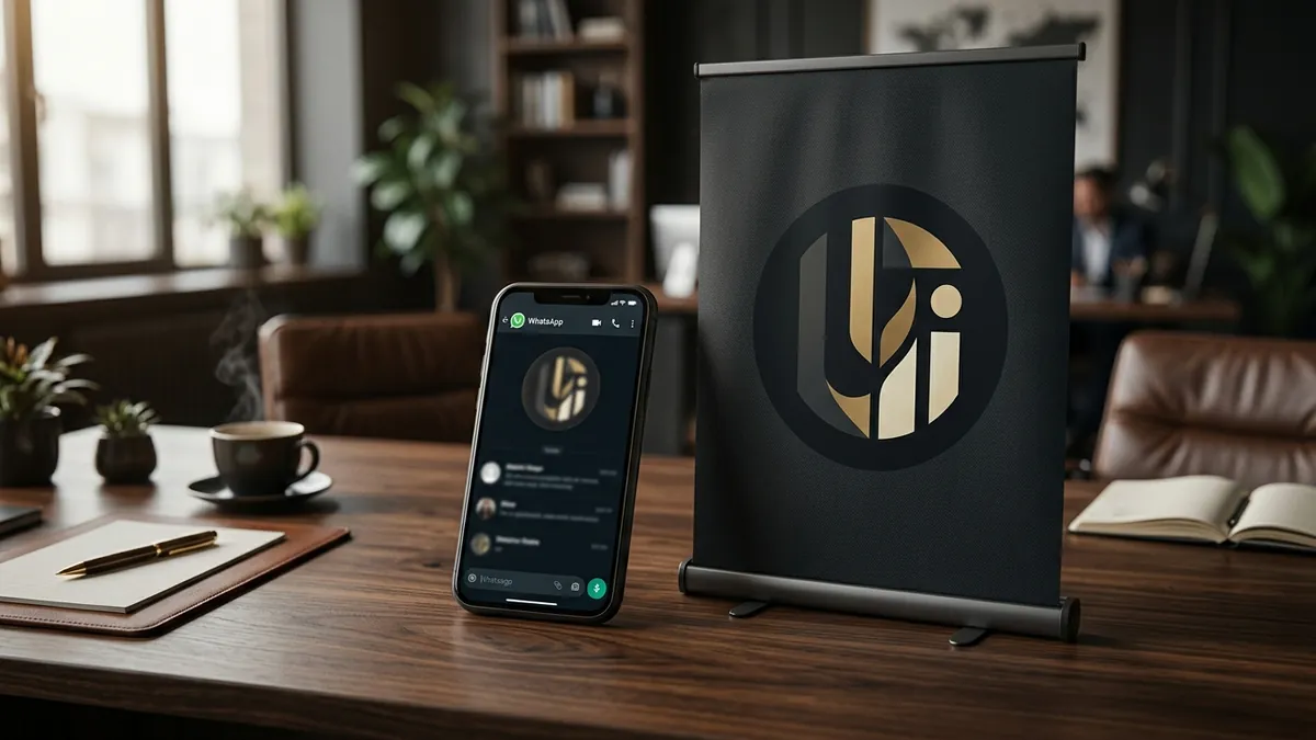
Most business owners I meet have spent good money on a logo. A designer made it, it looked sharp on the presentation slide, and everyone approved it. Then it went live. On the website header it looked fine. On the brochure it looked fine. But the moment someone shrinks it to a WhatsApp DP, a packaging stamp, a pen, or a favicon in a browser tab — it becomes a smudge. That smudge is your brand identity in the real world.
This is one of the most common and most ignored problems in Indian MSME branding. A logo that only works at large sizes is not a finished logo. It is a half-done job. The designer may not have told you this. You may not have thought to test it. But the problem shows up every single day — every time someone searches for your business on a browser, every time your packaging label is printed small, every time your WhatsApp profile appears in a group chat with fifty other vendors.
Why does this happen? Usually because the logo was designed with too many elements. A detailed illustration, a thin decorative font, a tagline in tiny text, a border or outer ring — all of these collapse into each other the moment you reduce the size. What looked elegant at A4 size becomes an unreadable cluster at 40 pixels. This is a scalability failure, and it is a design problem, not a printing problem.
I have seen this with manufacturers who put their logo on every carton they ship. At large size on the carton, it reads well. But the same logo on the sticky label on each individual product? Completely unreadable. Buyers and distributors see that label and form an impression — often a cheap one — before they even open the box. You spent years building the business. The logo is undermining you in three seconds.
The solution is not to redesign your logo from scratch every time this comes up. The real fix is to build what is called a logo system — at least two or three versions of your logo. A full version for large formats: banners, hoardings, presentations, website hero section. A simplified version for medium formats: letterheads, business cards, social media posts. And a mark or icon version — just the symbol or initial — for small formats: favicon, WhatsApp profile, app icon, embossed stamp. Most professional brand identity projects include all three. If yours did not, that is worth revisiting. I work through exactly this kind of audit in my one-to-one consultation, where we look at how your logo actually performs across all the places your brand shows up.
Testing your logo for scalability is simple. Take your logo file and drag it into a browser tab — does it show up clearly as a favicon? Shrink it to a 40x40 pixel square on your screen — can you still read it or recognise it? Put it on a pen or a small label — does it hold together? If it fails any of these, you have a scalability problem. Most founders have never run this test. Do it today, it takes ten minutes.
Typography is another culprit. Many logos use thin, stylised or script fonts because they look premium at large sizes. But thin strokes disappear at small sizes. Script fonts lose their letter shapes and become scribble. If your brand name is the main identity element in your logo — which is true for most service businesses and many product brands — the font choice needs to work at every size, not just the size your designer previewed on screen.
Colour also behaves differently at small sizes. A logo that uses a gradient or multiple colours may look rich and layered on a website. But at small sizes, gradients blend into a muddy single tone, and multiple colours fight each other. A strong logo has a version that works in single colour — all black or all white — because that is what gets embossed, stamped, screen printed or engraved on physical items. If your logo cannot survive single colour reproduction, it is not ready for the real world. If you want to understand how these decisions connect to your overall brand positioning, my business growth workshops cover visual identity as part of a broader brand strategy, not as a standalone design exercise.
What I tell every founder I work with is this: your logo is not a one-time asset you create and forget. It is something that works for you or against you every single day — on screens, on products, on documents, on packaging, in browser tabs, in WhatsApp chats. A logo that only looks good on your visiting card and your banner flex is doing about twenty percent of the job. Get the other eighty percent right and you will immediately start looking more consistent, more credible and more premium — without changing anything else about your business.
Want to understand where your business growth is stuck?
Book a Business Growth Diagnostic with Abhijit JK — an honest, focused 60-minute one-to-one session with Abhijit JK on your brand, website and growth.
Book a Business Growth Diagnostic