Why Your Logo Does Not Work at Small Sizes
Most business owners I meet have a logo they are fairly proud of. It was designed when they started. It looks decent on their visiting card and their shop signage. But the moment I ask them to show me their WhatsApp Business profile, or I open their website on my phone, the logo is either unreadable, pixelated or just a jumbled shape that means nothing. This is one of the most common and most ignored problems in Indian MSME branding.
The root cause is simple. Most logos in India are designed once — for print. A flex banner, a letterhead, maybe a brochure. The designer hands over a JPEG, the client is happy, and the job is considered done. Nobody tests how that logo behaves at 32x32 pixels on a browser favicon, or as a small circle on a WhatsApp chat, or as a tiny icon inside an Instagram post. At those sizes, fine details disappear, thin fonts become unreadable and complex illustrations turn into noise.
I have seen this with manufacturers who have been in business for twenty years. A beautifully detailed logo — with a gear, a factory illustration, the full company name in English and Kannada, a tagline, and a border — designed to sit proudly on a wall. That same logo, when shrunk to fit a mobile screen app icon, looks like a grey smudge. The brand signals nothing at the moment it needs to signal the most.
Here is what a scalable logo actually needs. First, it must work in a single colour — ideally solid black or solid white. If your logo only looks good with gradients and multiple colours, it will fail on embroidery, on stamps, on fax headers, on dark backgrounds. Second, the typography inside the logo must be legible at small sizes. Decorative fonts, thin strokes, and very condensed typefaces collapse below a certain size. Third, the composition must be simple enough to recognise as a thumbnail. Think of the logos you remember — they are almost always geometric, clean and uncluttered.
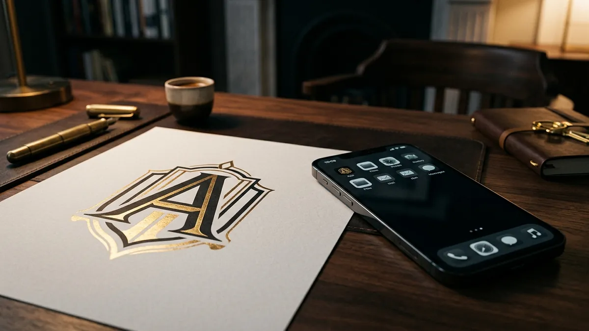
The practical fix is to design what professionals call a responsive logo system. You need at least three versions. The primary logo — full name, icon, tagline — for large formats like banners and presentations. A compact version — just the icon and the short brand name — for medium formats like website headers and business cards. And a mark-only version — just the icon or the first letter, treated as a symbol — for small formats like favicons, app icons, social media profile pictures and WhatsApp. If your current designer never gave you these three, that is the conversation to have. If you are not sure where to start, a one-to-one consultation can help you audit what you have and decide what actually needs to change.
Colour also plays a role here that most people underestimate. A logo that uses four colours may look rich on a billboard. At small sizes, those four colours compete with each other and the eye cannot settle on a focal point. One or two colours, used with intention, communicate faster. This is especially important in digital environments where your logo appears alongside dozens of other visual signals — notifications, UI buttons, other brand icons. The logo that reads clearly and instantly wins attention. The one that requires a second look has already lost it.
File format matters too, and this trips up a lot of Indian business owners. If your designer gave you only a JPEG or a PNG of your logo, you do not own a proper logo file. A logo must exist as a vector file — typically an AI, EPS or SVG format — so it can be scaled to any size without losing sharpness. A JPEG is a photograph of your logo, not the logo itself. Many businesses I have worked with had to go back and redo the entire design because nobody kept the original editable file. Always ask for the source file. Always.
One more thing worth saying. A logo that does not scale is not just a design problem — it is a trust problem. When a buyer sees your logo as a fuzzy, unreadable mess on their phone screen, they register it unconsciously as a signal that you are not professional, even if they cannot explain why. Premium brands look sharp everywhere. If your logo falls apart at small sizes, it is quietly working against every other effort you are making to appear credible and established. I cover this and other identity issues in detail at the business growth workshops I run for founders and MSME teams.
The good news is that this is one of the most fixable brand problems there is. You do not need to reinvent your logo from scratch. Most of the time, a skilled designer can simplify your existing logo, create the compact and mark-only versions, and hand you a proper vector file set — all without touching the core identity your business has built recognition around. Start by pulling up your logo on your phone right now. Look at it honestly. If you would not feel confident showing it to a premium client, that is your answer.
Want to understand where your business growth is stuck?
Book a Business Growth Diagnostic with Abhijit JK — an honest, focused 60-minute one-to-one session with Abhijit JK on your brand, website and growth.
Book a Business Growth Diagnostic