Why Your Visual Identity Looks Different Everywhere
Most business owners I meet have spent real money on a logo. Some had it designed by a professional. Others used a freelancer they found online. A few designed it themselves on Canva. But almost every single one of them has the same problem — their logo looks one way on their visiting card, slightly different on their letterhead, stretched out on their Instagram profile, and completely unrecognisable on their van or shop board. The business has one name but looks like four different brands depending on where you see it.
This is not just an aesthetic issue. When a buyer sees your Instagram page, then visits your website, then receives a proposal from you — and all three look visually different — their brain quietly registers something. It reads as disorganised. It reads as small. Even if your work is world-class, the inconsistency in how you look is silently telling people that you may not have a serious operation behind you. Trust is built or broken in these micro-moments before anyone speaks to you.
I have seen this pattern play out repeatedly with manufacturers, service businesses and retail brands across Bengaluru and beyond. The problem usually starts at the very beginning. A logo gets made, but nothing else gets defined. No one writes down which shade of blue it is. No one specifies what font should be used in marketing materials. No one decides how much white space should surround the logo. So every time someone needs to create something new — a social media post, a banner, a brochure — they guess. And every guess takes the brand slightly further from looking like a real brand.
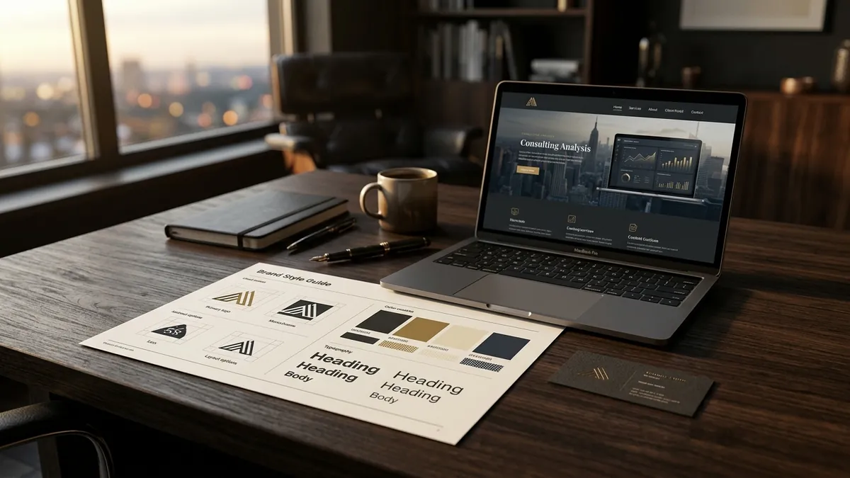
The fix is not expensive. It is a brand style guide. Not a 60-page PDF that no one reads. Just a simple, one-page reference document that your team, your designer and your printer can all follow. It should include three things at minimum: your exact logo files in the correct formats, your exact brand colours with the hex code and Pantone reference, and the two or three fonts your brand uses. That is it. If you have this, you eliminate 80 percent of the inconsistency most Indian businesses live with every day. If you want to build this properly for your business, a one-to-one consultation can help you put this together in a single focused session.
There is also a practical reason why logos end up looking wrong everywhere. Most founders only have a JPEG of their logo saved somewhere on their phone or laptop. JPEG files are fine for printing on paper but they break down on digital screens, especially on dark backgrounds. When your designer exports a logo in PNG with a transparent background, in both light and dark versions, and in both horizontal and stacked layouts — you suddenly have the right tool for every situation. Most logo projects I review were never delivered this way. The client received one file and has been stretching and squishing it ever since.
Colour is where the biggest invisible damage happens. A business picks a green for their brand. It looks one shade on the laptop screen. A slightly different shade on the mobile. A completely different shade when printed on a flex banner. And yet another shade on a visiting card printed at a local press. None of this gets corrected because no one has the exact colour code to give the printer or the social media manager. The brand slowly develops multiple personalities. If you want to understand how colour decisions affect buyer perception at a deeper level, I have covered this in detail in the business growth workshops I run for founders.
Typography is the other silent culprit. Once a brand has a defined typeface, every communication feels like it belongs to the same family. But most businesses use whatever font comes default in their software. Proposals go out in Times New Roman. Instagram posts use a free Canva font. The website uses something the developer picked. None of these were chosen intentionally and none of them match. To a buyer who has seen professional brands up close, this signals that yours is a business still finding its footing. Font discipline is one of the lowest-cost and highest-impact things you can fix this month.
One thing I always tell founders: you do not need to redo your entire brand to fix this. You just need to standardise what you already have. Take your existing logo. Get the files cleaned up and exported correctly. Pick two fonts — one for headings, one for body text. Lock your colours. Write it on a single sheet and share it with everyone who ever creates anything for your brand. That one action will immediately make your business look more put-together across every platform. If you want to see how I approach brand identity for Indian businesses, you can read more on the about Abhijit page.
Visual identity consistency is not about perfection. It is about recognition. When your customer sees your colours and layout on an Instagram ad, then gets a proposal from you with the same visual language, then walks into your store or office and sees it reflected there too — something shifts. They stop seeing a vendor and start seeing a brand. That shift in perception is what makes buyers stop negotiating on price and start asking when they can begin. It is one of the most underestimated levers a founder has, and it costs almost nothing to pull.
Want to understand where your business growth is stuck?
Book a Business Growth Diagnostic with Abhijit JK — an honest, focused 60-minute one-to-one session with Abhijit JK on your brand, website and growth.
Book a Business Growth Diagnostic