Why Your Business Card Still Decides If You Get the Deal
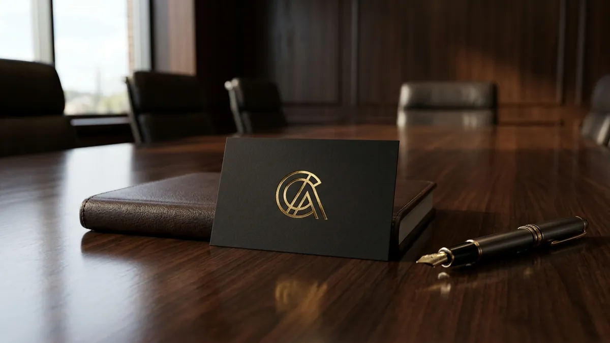
Most business owners I meet have spent serious money on their office, their product, sometimes even a decent website. But when they hand me their visiting card, it tells a completely different story. Thin paper, a logo that looks stretched, a font that belongs on a 2003 PowerPoint slide, and four phone numbers because they are not sure which one they actually use. That card is the last thing the other person holds after you walk away. It is the physical summary of your brand.
Here is what actually happens in a B2B meeting in India. You pitch well. The conversation goes nicely. There is interest. Then you hand over the card. The other person glances at it for two seconds. If it feels cheap, something shifts. They do not say anything. But the trust level drops a little. By the time they follow up — or decide not to — that card has already done its work, quietly, against you.
I have seen this pattern with manufacturers, consultants, chartered accountants, architects, interior designers, and factory owners across Bengaluru, Pune, Coimbatore and Surat. The business is solid. The work is good. But the card looks like it was designed by a relative for free in 2015 and printed at the nearest print shop in a hurry. The design has not been touched since. Meanwhile the founder wonders why corporate clients do not take them as seriously as they should.
The most common mistake is treating the business card as an information sheet. Name, designation, phone, email, website, address, WhatsApp, social handles — all crammed in because the founder is afraid to leave anything out. A business card is not a brochure. It has one job: make the person curious enough to reach out. Everything else is noise. If your card has more than four lines of information on it, it has too much. Strip it back. Let the design breathe.
The second mistake is using a logo that was never built for small sizes. Many logos are designed once for a letterhead or a banner and then scaled down blindly onto a card. At visiting card size, thin lines disappear, letter spacing collapses, gradients look muddy. A proper brand analysis will almost always flag this — your logo needs a version that works at small sizes without losing its clarity. If your logo cannot hold itself at 3 centimetres wide, it is not a complete logo system.
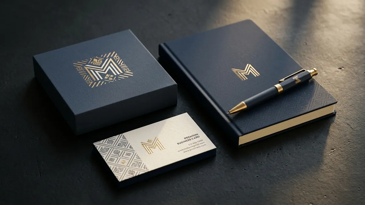
Paper quality is a branding decision, not a printing cost. A 250 GSM matte card with spot UV on the logo tells someone — before they read a word — that you take your business seriously. A 130 GSM glossy card from a bulk print order tells them you do not. I am not saying spend a fortune. I am saying understand that the paper is part of the message. If you are positioning your business as premium, your card stock needs to match that. Consistency between what you say and what you hand over is what builds trust. This is exactly what we work through in a one-to-one consultation — making sure every touchpoint is saying the same thing.
Colour and typography on a card matter more than most people realise. Your card should use the same colour codes, the same fonts, and the same tone as your website and your packaging. When those three things match, a client who has seen your Instagram, visited your site and now holds your card feels a coherent experience. When they do not match — different shades of blue, a different font, a different tagline — it creates a subtle unease. The brand feels inconsistent, and inconsistency reads as unreliability. If you have not audited this across your materials, a business growth diagnostic is a good place to start.
One thing that works very well for Indian founders in B2B businesses is putting one strong, specific line on the back of the card. Not a list of services. One line that says exactly what problem you solve for whom. Something like — 'We help auto component manufacturers reduce rejection rates on the shop floor' or 'Financial clarity for founders crossing 5 crore revenue.' That one line does more selling than any sales brochure. It gives the person something to remember you by. It starts the next conversation.
Your visiting card is not a small thing. It is often the only physical piece of your brand that stays with a potential client after the meeting ends. If you have not looked at it critically in the last two years, pull it out right now. Ask yourself honestly: does this card make me look like the kind of business I want to be? If the answer is no — even a quiet no — that is worth fixing this month. Not next quarter. This month. Because somewhere right now, someone is looking at your card and making a decision.
Want to understand where your business growth is stuck?
Book a Business Growth Diagnostic with Abhijit JK — an honest, focused 60-minute one-to-one session with Abhijit JK on your brand, website and growth.
Book a Business Growth Diagnostic