Why Your Business Card Still Decides If You Get the Deal
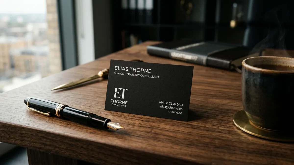
Most business owners I meet carry a business card that was designed at a print shop for ₹500 in an afternoon. White card, blue text, company logo in the top-left corner, phone number, email, designation. Done. And they wonder why the prospect they just met does not follow up. The card is rarely the only reason — but it is often the first signal a buyer uses to judge whether you are serious about your business.
Here is the real problem. In India, the business card is not just contact information. It is a physical object the other person holds, looks at, turns over, and puts somewhere — their wallet, their desk, or the bin near the reception. That 10-second handling tells them something about you even before they read a single word. The weight of the card, the finish, the colour choices, the font — all of it communicates. Most of the time, what it communicates is: we did not think about this very hard.
I have seen this with manufacturers and service businesses across Bengaluru and other cities. A company doing ₹5–8 crore in annual revenue, a founder who has built something genuinely good, walks into a meeting with a flimsy card printed on thin stock with a stretched logo that was clearly designed in PowerPoint. The buyer on the other side of the table — often a procurement head or a senior decision-maker — registers this instantly. Not consciously, but it adds up. If you did not pay attention to your own card, will you pay attention to their order?
The card has three jobs. First, it has to survive physically — thick enough not to bend, finished well enough not to look dirty after two days in a wallet. Second, it has to be readable — the right font size, enough contrast between text and background, nothing so decorative that a phone number takes effort to read. Third, and most importantly, it has to look like it belongs to the same business the person just heard you describe. If you told them you run a premium textile sourcing firm and your card looks like it was made for a neighbourhood grocery, there is a gap. That gap creates doubt.
Colour and typography on a business card are not decoration — they are the whole message. A card with three fonts, four colours, and a gradient background tells the buyer your business has no clear identity. A card with one clean typeface, a considered colour palette, and breathing room between elements tells them someone thought about how this business presents itself. That kind of thinking transfers — buyers assume you think the same way about your products, your processes, and your commitments. This connection between visual choices and perceived competence is something I explore in depth in my one-to-one consultation sessions with founders who are preparing for larger buyers or premium market segments.
The back of the card is also almost always wasted. Most founders leave it blank or slap a QR code there without thinking. The back is real estate. It can carry a one-line description of what you do — not your tagline, but a clear functional statement. 'Industrial Packaging for Food and Pharma Export' or 'Financial Advisory for Family-Owned Businesses in South India.' Something specific. Something that makes the person who picks up your card three days later remember exactly why they kept it. If you are unsure what that line should be, it usually means your brand message needs clarity before your card does — and that is a broader positioning problem worth solving properly.
There are practical decisions that make a large difference without requiring a large budget. 350 GSM or above card stock instantly feels more serious than 250 GSM. A matte laminate finish photographs better, holds up longer, and does not show fingerprints. Spot UV on your logo — a gloss coating on just the logo against a matte card — is a detail that almost always gets noticed and costs very little extra. Single-colour printing on a well-chosen coloured card stock can look more premium than a full-colour design on white. These are not expensive choices. They are intentional ones. I cover the relationship between these kinds of design decisions and brand perception in my business growth workshops for MSME founders and their teams.
The deeper issue is that founders often treat the business card as an afterthought — something to order before an exhibition or a new quarter begins. It gets outsourced to whoever designed the letterhead, who outsourced it to whoever is cheapest on the print platform. Nobody asks: what do we want this card to make someone feel? Nobody connects it to the visual identity already in place. And so it ends up mismatched — a different shade of your brand colour, a different font weight, a logo that was stretched to fit the template. Consistency across every physical and digital touchpoint is not a luxury for large companies. It is the exact thing that makes a small business look like it is ready for bigger business.
If you want to take one action this week, pull out your current business card and place it next to your website, your letterhead, and your WhatsApp display picture. Ask yourself honestly: do these four things look like they belong to the same company? Do they use the same colours, the same typeface, the same visual language? If the answer is no — or even 'sort of' — that inconsistency is costing you trust every single day. Start with the card because it is tangible, fast to fix, and one of the few brand materials you physically put into another person's hands. Get it right, and it starts working for you without you having to say a word. You can explore how your full visual identity fits together by visiting the about Abhijit page or reaching out directly through the contact page.
Want to understand where your business growth is stuck?
Book a Business Growth Diagnostic with Abhijit JK — an honest, focused 60-minute one-to-one session with Abhijit JK on your brand, website and growth.
Book a Business Growth Diagnostic