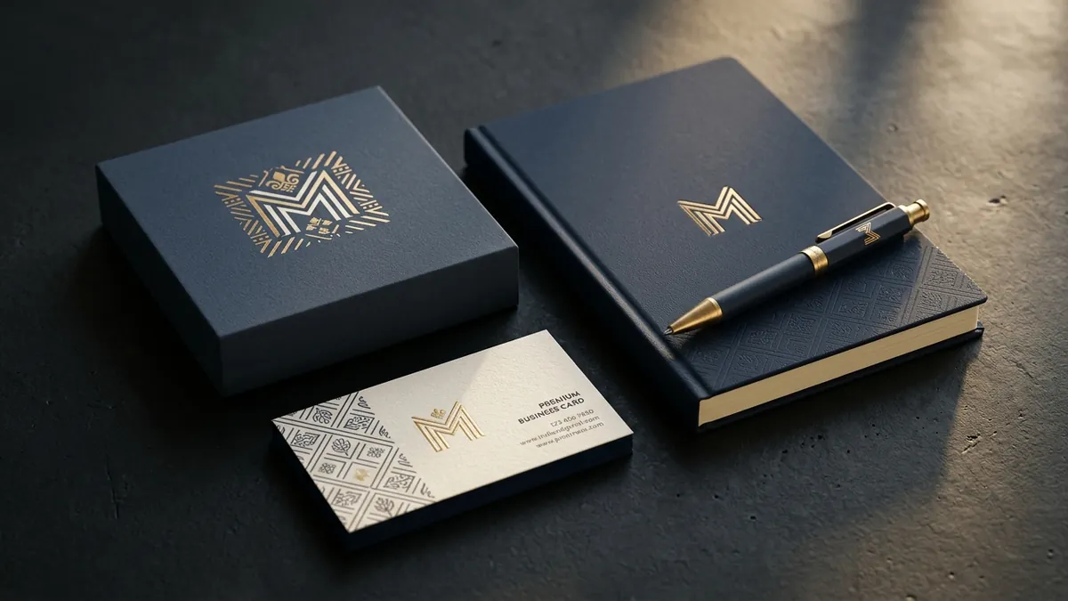
Why Your Logo Looks Different Every Time You Use It
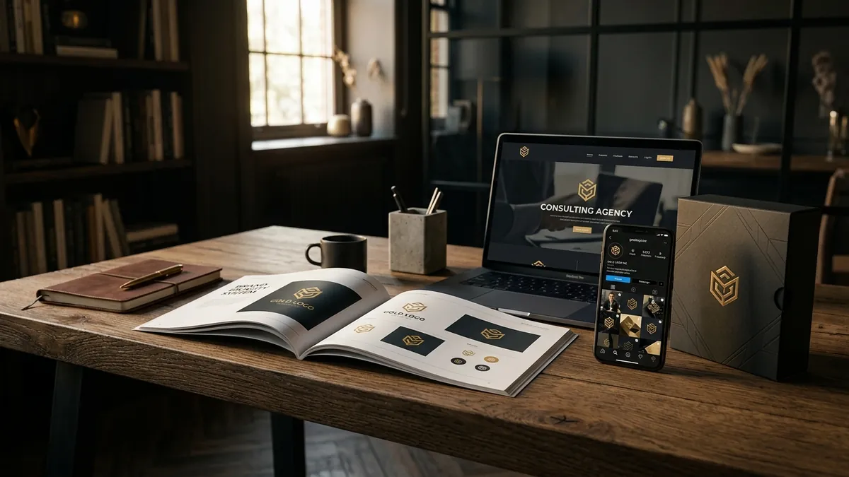
Most business owners I meet have a logo. But when I ask them to show it to me across different places — their website, their WhatsApp catalogue, their shop banner, their invoice — I see four or five different versions of the same logo. Different shades of blue. Stretched horizontally. White background on one, dark background on another with no contrast. Sometimes the tagline is there, sometimes it's missing. This is one of the most common and most damaging things happening to Indian business brands today.
The problem is not that the logo is bad. The problem is that no one ever decided how it should be used. When the designer handed over the final file, they probably gave a JPEG. Maybe a PNG. And then the business owner forwarded that file to a printer, a web developer, a social media vendor and an intern — and each person used it their own way. Three years later, your brand looks like four different companies.
Here is why this matters more than most founders think. Your customer does not consciously notice that your logo looks different on your website versus your packaging. But their brain registers it. Inconsistency reads as disorganisation. It signals that nobody is in charge. And when a buyer is deciding between your brand and a competitor, these subconscious signals push them toward the option that feels more put-together — even if your product is genuinely better. I have seen this happen with textile manufacturers, food brands, clinics and interior designers across Bengaluru and beyond.
The root cause is almost always the same — there is no brand style guide. No document that says: here is the logo in its correct colours, here are the exact colour codes, here is the minimum size it can appear at, here is what backgrounds it works on, here is what you must never do with it. Without this document, every vendor, every freelancer, every new team member makes their own judgment call. And judgment calls add up to chaos over time. If you want to understand the full picture of where your brand identity stands today, a proper brand analysis is the right starting point.
Creating a basic logo usage guide is not complicated. You do not need a 60-page brand bible. For most MSMEs and small businesses, four to five pages is enough. It should include the logo in its primary version, a reversed version for dark backgrounds, a single-colour version for embroidery or stamps, the exact Pantone or HEX colour codes, and a clear list of don'ts — don't stretch, don't recolour, don't add a drop shadow, don't place it on a clashing background. Share this document with every vendor and every team member who touches your brand. Make it non-negotiable.
File formats also cause a lot of the damage. If you are only working with a JPEG or a low-resolution PNG, every resize makes the logo blurry or pixelated. Your designer should give you an SVG or an EPS file — these are vector formats that can be scaled to any size without losing quality. If you do not have these files and your original designer is no longer reachable, that is a problem worth solving now. I have worked with founders who spent good money on a logo five years ago and have no usable master file today. Do not let that be your situation. If your brand assets are in a bad state, booking a one-to-one consultation can help you figure out exactly what needs to be fixed and in what order.
There is also the question of colour accuracy. Most businesses have no idea what their official brand colours are in HEX for digital use, CMYK for print or Pantone for manufacturing. So a banner printer uses one shade and the packaging vendor uses another and your website designer picks something that looks close on screen. Over time, your brand accumulates a dozen slightly different versions of your colour. This is especially damaging for food brands, cosmetics, apparel and any business where packaging is a key part of the customer experience.
The fix is straightforward but it requires someone in the business to take ownership. Audit every place your logo currently appears. Collect every version that exists. Pick the correct master version. Get the proper vector files. Write a one-page logo usage guide. Distribute it. And then check every new piece of design work against it before it goes out. This is not a one-time task — it is a habit. Businesses that build this habit early look noticeably more credible than those that don't. If you want to think about this as part of a bigger brand and business growth plan, the 2-day business growth workshop covers brand identity alongside strategy and positioning in a structured way.
Your logo is often the first thing a potential customer sees. It appears on your Google Business Profile, your social media, your packaging, your invoices and your office signage. Every time it looks slightly different, you are asking your customer to do a small piece of extra work — to confirm that yes, this is the same company. Most customers do not do that work. They just move on. Getting your logo consistent across every touchpoint is one of the cheapest, highest-impact things you can do for your brand this month. It does not require a redesign. It requires discipline.
Want to understand where your business growth is stuck?
Book a Business Growth Diagnostic with Abhijit JK — an honest, focused 60-minute one-to-one session with Abhijit JK on your brand, website and growth.
Book a Business Growth Diagnostic