Why Your Product Packaging Looks Busy But Says Nothing
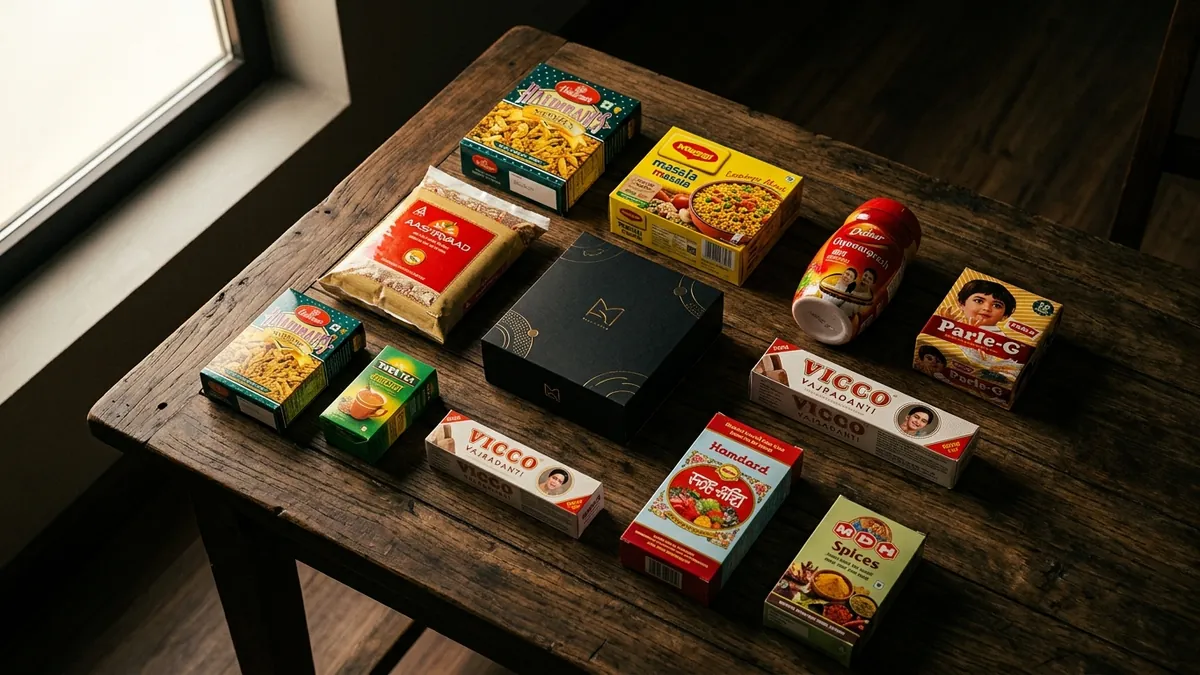
Pick up any product from a mid-sized Indian manufacturer or small food brand. Look at the front panel. You will likely see: a logo, a product name, a tagline, an 'Est. year', a quality badge, a certification seal, a hero image, a phone number, and sometimes the founder's photo. All on a 10×15 cm label. This is what I call busy packaging — and most business owners genuinely believe more information means more trust.
It does not. In fact, it does the opposite. When a buyer's eye lands on your product — on a shelf, on a website, or in a WhatsApp catalogue photo — they have about two seconds to decide if they are interested. If nothing stands out, the eye moves on. Busy packaging creates visual noise. The brain reads it as confusion, not confidence. And confused buyers do not buy.
Most business owners I meet built their packaging by addition. Every year, something new got added. A new certification came in — it went on the label. Someone said add a QR code — it went on. A designer suggested a new element — it stayed. Nobody ever removed anything. Nobody asked: what is the one thing this package needs to say? That single question is where packaging strategy starts.
The real job of your front panel is not to explain your product. It is to stop the right buyer and make them pick it up. That is it. Everything else — ingredients, usage instructions, certifications, contact details — belongs on the back or side panel. The front panel should have three things working together: a clear product name, a visual that creates desire or recognition, and a colour and typography combination that feels right for your category. If your front panel has more than five distinct elements, it is already overcrowded.
I have seen this specific problem with food brands, ayurvedic products, hardware packaging and even garment tags. A spice brand from Coimbatore I worked with had eleven elements on a 100g pouch front — including a map of India. When we stripped it to four elements and gave the chilli image room to breathe, their modern trade pickup improved within two months. The product had not changed. The quality had not changed. Only the packaging signal had changed. If you want to understand where your brand identity currently stands, a brand analysis is a good place to begin honestly.
Typography is a major contributor to the busy feeling that most founders overlook. When you use three different fonts — one for the brand name, one for the product name, one for the tagline — in three different weights and sizes, there is no visual hierarchy. The eye does not know where to start. Good packaging uses two fonts maximum. One for the brand, one for everything else. The size difference between your brand name and product name should be deliberate, not accidental. If you have been told your packaging 'looks unprofessional' but could not figure out why, the typography system — or lack of one — is usually the reason.
Colour is the other issue. Many founders choose packaging colours based on what they personally like, or what was easy for the printer to produce. But colour in packaging does one specific job: it signals category and quality to the buyer before they read a single word. Dark packaging with gold accents signals premium. Bright primary colours signal mass market and affordability. Muted, earthy tones signal natural or organic. If your positioning and your colour palette are giving contradictory signals, buyers feel something is off — even if they cannot name it. They just put the product back. This is one of the areas we go deep into during a one-to-one consultation, especially for product businesses trying to move upmarket.
The fix does not require a full rebrand or expensive new printing. Start with an audit. Print your current packaging, put it on a table, and stand two metres away. What is the first thing your eye lands on? Is it the most important thing? Now photograph it on a white background and look at the image on your phone. This is roughly how it will look in an online catalogue. Is it clear? Is it compelling? Can you tell in two seconds what the product is and who it is for? If the answer is no to any of these, you have work to do. A business growth diagnostic can help you see this problem in context of your overall brand, not just the label.
Packaging is not decoration. It is your silent salesperson on every shelf, every courier box, every unboxing moment. When it is busy, it works against you. When it is clear, it earns trust before a single conversation happens. The businesses I have seen grow their distribution — modern trade, online, exports — almost always had packaging that communicated one thing powerfully. Not ten things weakly. Start there.
Want to understand where your business growth is stuck?
Book a Business Growth Diagnostic with Abhijit JK — an honest, focused 60-minute one-to-one session with Abhijit JK on your brand, website and growth.
Book a Business Growth Diagnostic