Why Your Typography Makes Clients Trust You Less
Most business owners I meet spend weeks deciding on a logo colour. Then they pick fonts in fifteen minutes. Usually whatever looks 'nice' on screen that day, or whatever the designer suggested without much explanation. That decision — made quickly, without a real framework — ends up doing quiet damage to how the business is perceived every single day.
Typography is not decoration. It is communication before a single word is read. The moment someone opens your brochure, lands on your website, or receives your invoice, the fonts on that page are already signalling something about your business. Are you organised? Are you professional? Do you take detail seriously? Clients cannot explain why they feel uneasy about a brand. But often, inconsistent or careless typography is exactly why.
Here is what I see repeatedly with Indian manufacturers and service businesses: they use four or five different fonts across their materials. The letterhead has one font. The website has another. The WhatsApp catalogue uses a third. The packaging — if they have any — uses something completely different. No single font is terrible in isolation. But together, they make the brand look assembled in a hurry, by different people, with no one in charge. That is not the impression you want to leave when you are trying to win a ₹10 lakh contract or a bulk order from a new buyer.
There is also the readability problem. Many Indian business owners choose fonts based on how they look in a heading — decorative, stylish, distinctive. But those same fonts become unreadable at smaller sizes, on mobile screens, or when printed on uncoated paper. A client struggling to read your product spec sheet or your email signature is not going to tell you about it. They will just feel a low-level friction. And friction kills trust. If you want to understand where your current visual identity is actually breaking down, a brand analysis will show you exactly that.
The fix does not require a complete rebrand. It requires a decision and a standard. Most professional brands operate with two fonts — one for headings, one for body text. That is it. A strong geometric sans-serif for headings. A clean, readable serif or neutral sans for body copy. These two work together. They are set as the standard. And then every single piece of communication — digital, print, packaging, signage — uses only those two. The visual consistency that results from this simple decision is something clients feel even when they cannot name it.
Colour and font work together too. A bold, heavy typeface paired with a muted earthy palette signals a very different kind of business than a thin, elegant typeface on a white background. Neither is wrong. But they need to match what your business actually is and who it is speaking to. A pharmaceutical company and a boutique food brand should not be using the same typographic personality, even if both want to look premium. I cover this connection between type, colour and brand positioning in my 2-day business growth workshop — it is one of those things that clicks fastest when you see real examples side by side.
One thing founders often miss is how typography behaves on screen versus in print. A font that looks authoritative on a desktop website can look completely different on a mobile screen if it is not web-optimised. Similarly, a font that is clean on screen might bleed and blur on low-quality print stock. Before you lock in your typography, test it across every medium your brand actually uses. WhatsApp flyers, email, printed proposals, packaging labels, outdoor signage — all of these behave differently. If you are unsure how to evaluate this for your specific business, a one-to-one consultation is often the fastest way to get clear answers without months of trial and error.
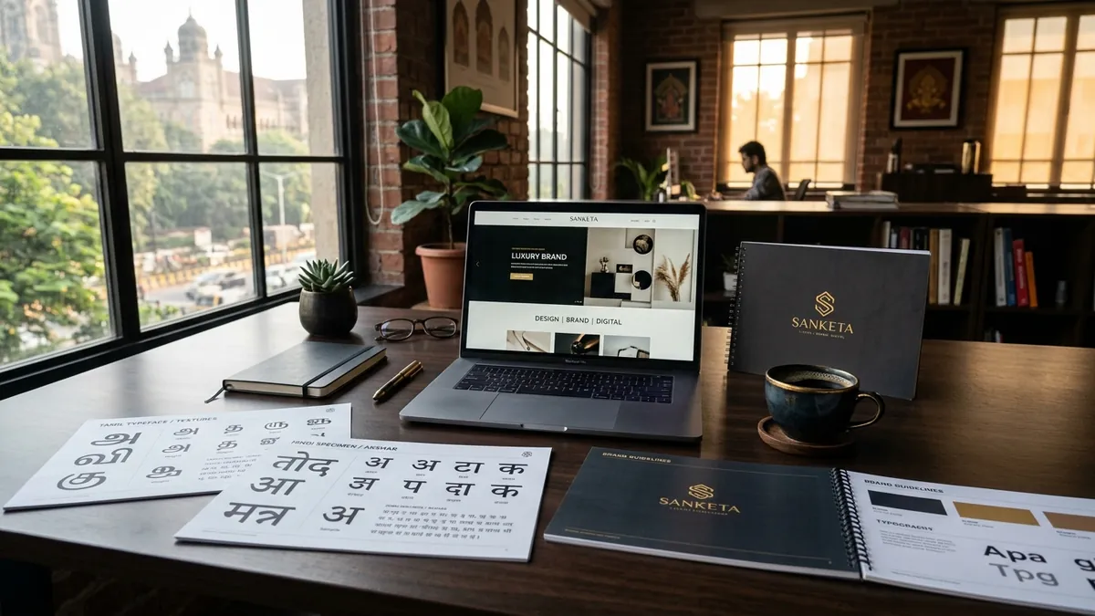
Here is what to do this month. Pull together five to six pieces of your current brand communication — your website header, a brochure, your email signature, a social media post, your invoice, and your visiting card if you still use one. Look at them together on a table or a screen. Count how many different fonts appear. If it is more than two or three, you have a problem. Write down every font name you find. Then ask yourself honestly — do these fonts say the same thing about the business? If the answer is no, that is where to start.
Typography is one of those brand elements that clients absorb without noticing. When it is right, it quietly builds confidence. When it is wrong, it quietly erodes it. The businesses I have worked with that made even this one change — committing to two fonts, applied consistently — reported that their materials started converting better. Not because the content changed. Because the brand started looking like it had someone in charge. That alone is worth more than most founders realise.
Want to understand where your business growth is stuck?
Book a Business Growth Diagnostic with Abhijit JK — an honest, focused 60-minute one-to-one session with Abhijit JK on your brand, website and growth.
Book a Business Growth Diagnostic