Why Your Packaging Design Loses the Sale at the Shelf
Most business owners I meet who sell physical products spend months perfecting the product inside the box. The formulation, the quality, the pricing. Then they hand the packaging job to a local printer who gives them a template with their logo slapped on it. And they wonder why their product sits at the back of the shelf while a competitor with an inferior product sells out every week.
Packaging is not decoration. It is the first sales conversation your product has without you in the room. At a retail shelf, in a gifting store, on a WhatsApp catalogue image or in an unboxing video — the packaging speaks before the buyer reads a single word. If it looks weak, cluttered or generic, the buyer's brain has already moved on. This happens in under three seconds. I have seen this with food brands, personal care manufacturers and even industrial product companies trying to enter modern trade or e-commerce.
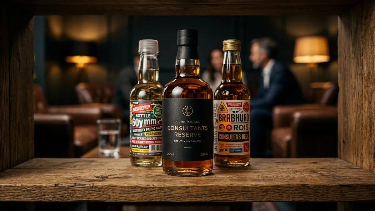
The most common mistake I see is what I call the 'information overload' problem. The founder wants everything on the pack — certifications, ingredients, tagline, founder story, social handles, QR code, awards, and the product name — all fighting for space on a 200 ml bottle or a 100 gram pouch. The result is a pack that says everything and communicates nothing. The buyer cannot find the one thing they came looking for: what is this product and why should I trust it.
The second mistake is colour confusion. Founders often pick colours they personally like, or worse, they copy what seems to be working for a large brand and dilute it into something unrecognisable. Colour in packaging is not about taste — it is about category signalling and shelf contrast. A premium ayurvedic brand using neon green might feel energetic to the founder but breaks every expectation a buyer has about natural, calm and trustworthy. If you have been reading about how colour choices affect brand perception, you will know this goes deeper than most founders realise.
Typography is equally guilty. I have reviewed packaging from at least forty Indian product brands in the last three years and a majority use three or more fonts on a single label, often mixing a bold display font with a thin script and a standard system font for the fine print. The result looks inconsistent and cheap — even when the product inside costs more than the premium competitor next to it. One clear font family, used with discipline, signals confidence. Confidence signals quality. Quality signals price justification. This is the chain that packaging typography either builds or breaks.
So what should a founder actually do? Start by standing where your buyer stands. Go to the retail shelf, the online listing page or the gifting counter where your product will actually live. Look at what surrounds it. Now ask: does my packaging stand out without screaming? Does the buyer know in two seconds what this product is and who it is for? Can they find the key information — variant, quantity, key benefit — without hunting? If the answer to any of these is no, your packaging is costing you sales right now. I work through exactly this kind of audit in my one-to-one consultation with product brand founders before we touch any design brief.
Once you have that visual audit done, build your packaging brief around three priorities only: category clarity, shelf contrast and trust signals. Category clarity means a buyer from ten feet away should know if this is a face wash, a health supplement or a masala blend. Shelf contrast means your colour and structure should make the pack visible among its neighbours, not invisible. Trust signals mean things like clean typography, quality paper or material, and brand consistency — not a wall of text about certifications that nobody reads at the point of purchase. If your brand is still figuring out its core identity, I would recommend sorting that foundation first before spending money on packaging redesign.
One thing that works particularly well for Indian MSME product brands is investing in a proper brand packaging guide — even a simple two-page document — before going to the printer. This document should specify your exact colours in print codes (CMYK, Pantone if applicable), your font hierarchy, minimum logo size on pack, and clear zones for information. Without this, every reprint and every new SKU will drift slightly. That drift compounds over time into a brand that looks incoherent across its own product range. I have covered this kind of system-building in my business growth workshops for manufacturers and product founders.
The bottom line is this: your packaging is working for you or against you every single day on that shelf, in that delivery box, in that photo your customer shares online. It is a selling tool, not a formality. Treat it that way, brief it that way, and invest in it the way you would invest in your best salesperson. Because at the moment of purchase, when you are not in the room, your packaging is the only one doing the talking.
Want to understand where your business growth is stuck?
Book a Business Growth Diagnostic with Abhijit JK — an honest, focused 60-minute one-to-one session with Abhijit JK on your brand, website and growth.
Book a Business Growth Diagnostic